Why This Manga-Panel Portrait Technique Works So Well
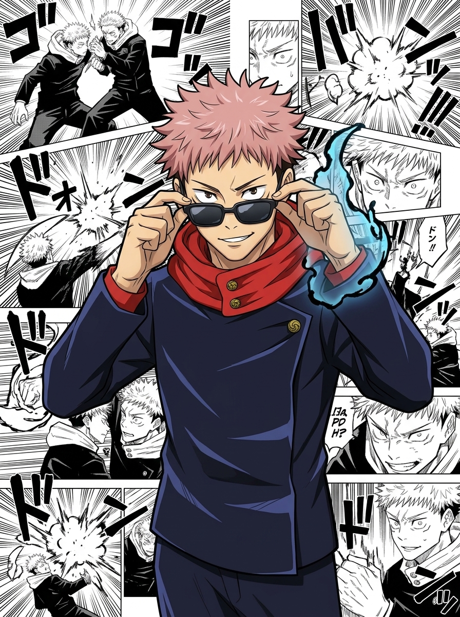
The effect works because it weaponizes contrast. Your character stays in its original full-color rendering style — no reinterpretation, no style blending — while the background is a dense mosaic of classic monochrome manga panels. The visual tension between color and ink draws the eye straight to the character, making even a side character feel like a cover-worthy protagonist.
What elevates this beyond a simple background swap is the layered overlap: the character physically breaks the panel grid, giving the composition a 3D poster quality. Paired with a low-angle medium shot and the confident sunglasses pose, the result reads like official JJK promotional art rather than fan-generated content.
The background panels aren't random — they're packed with speed lines, dramatic close-ups, and Japanese onomatopoeia (ゴゴゴ, ドン), the exact visual grammar readers associate with peak shonen intensity.
Key Insight: The power of this composition comes from keeping the character's original art style untouched. Any attempt to blend or "match" the manga aesthetic breaks the contrast that makes the poster pop.
How to Customize Your Jujutsu Kaisen Manga Style Portrait
Tip 1: Upload a different JJK character to make it yours
The demo uses Yuji Itadori as the reference, but the prompt is fully character-agnostic. Upload any JJK character you love — Gojo, Megumi, Nobara, Sukuna, or even your own OC — and the model will lock onto that image, preserving their exact outfit, hairstyle, and color palette against the same manga panel backdrop. Just replace the uploaded image; no prompt edits needed.
Change: swap the uploaded reference image only
Tip 2: Adjust background panel density and era
The "dense collage" instruction fills the background wall-to-wall. You can dial this back to a sparse 3–4 panel grid for a cleaner editorial look, or specify panels from a particular arc (e.g., Shibuya Incident, Culling Game) to add narrative context without changing the monochrome rule.
Change: [Background] section — panel density and content description
Tip 3: Shift composition angle for different characters
Slightly low-angle works well for tall, imposing characters like Gojo or Sukuna. For shorter or younger characters, try a straight-on eye-level shot to avoid unnatural proportions. A tighter crop (chest-up instead of waist-up) also emphasizes facial expression over body language.
Change: [Composition] — camera height and crop description
Common Pitfall: Describing the character's appearance in the prompt instead of relying solely on the uploaded reference image. The model already has the reference — adding redundant text descriptions can cause it to drift toward a generic interpretation rather than your specific character.
Frequently Asked Questions
Can I use this with non-JJK anime characters?
Yes. The prompt is character-agnostic — it locks onto whatever image you upload. Characters from Chainsaw Man, Demon Slayer, or any anime with a distinct color art style will work, as long as the character's original rendering style contrasts well against black-and-white manga panels.
Why does the prompt forbid merging the character's art style with the background?
If the model tries to blend styles, the character loses its original identity and the color-vs-monochrome contrast — the whole visual hook — disappears. Explicitly blocking style merging forces the model to treat the character and background as two separate visual layers.
What aspect ratio gives the best poster result?
2:3 portrait (e.g., 832×1248) is ideal for a manga poster feel, giving the background panels enough vertical real estate to feel dense. Square (1:1) works for social media thumbnails but compresses the low-angle composition. Avoid landscape — the character will appear small against the panel collage.