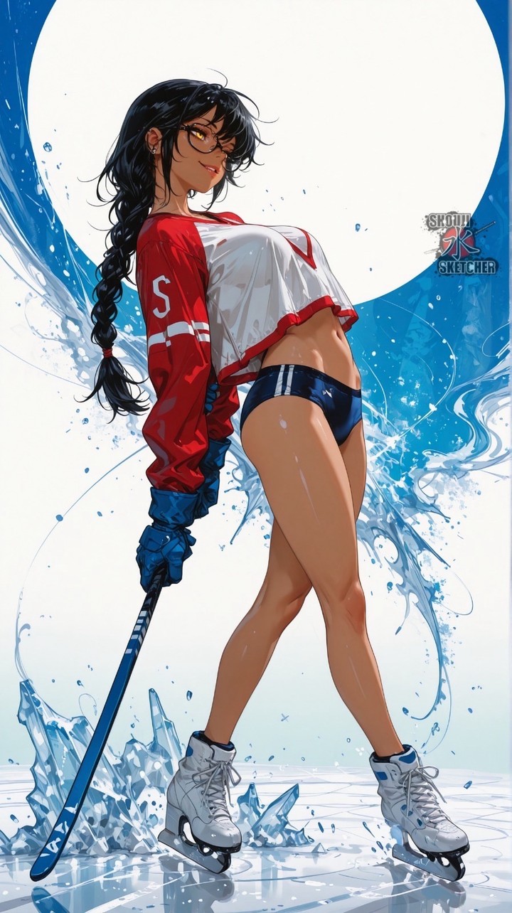
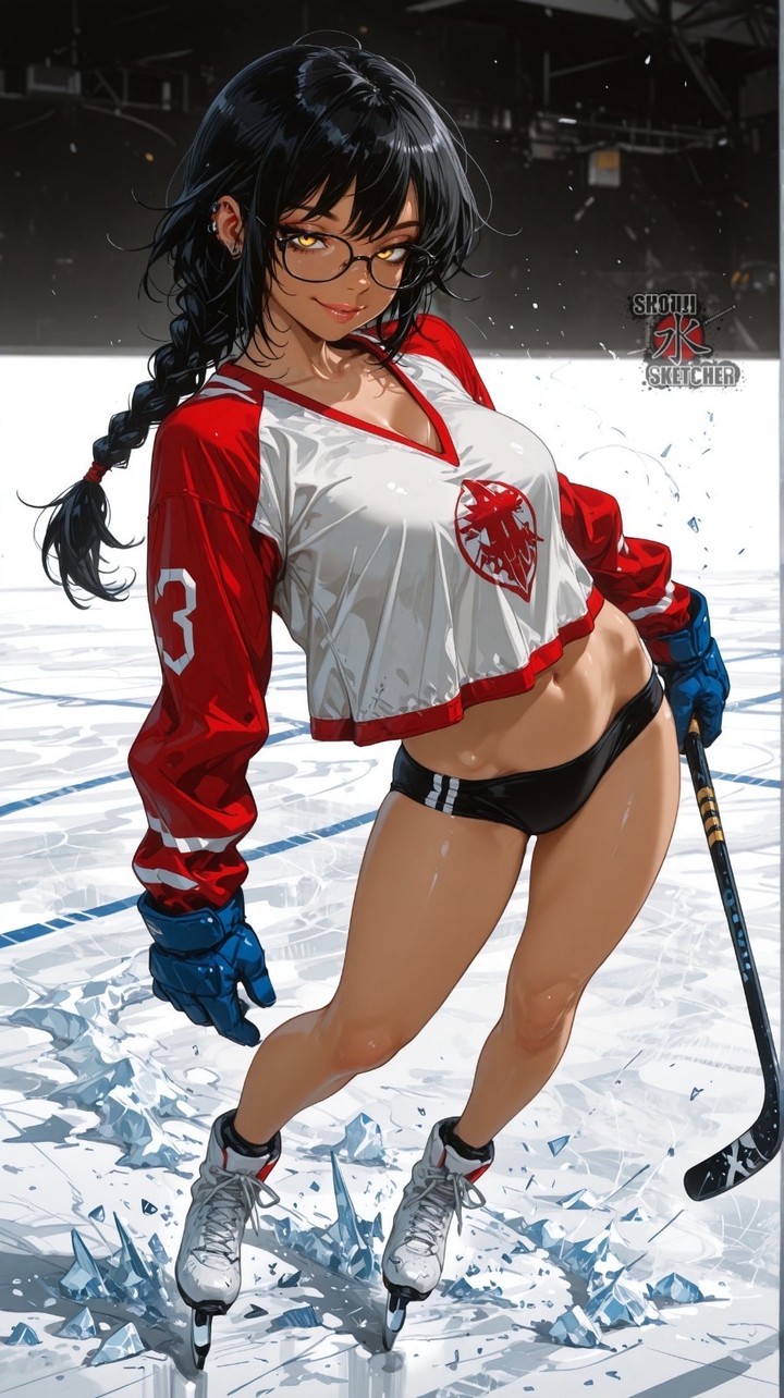
This image works by fusing athletic equipment, anime glamour, and graphic poster composition into one instantly readable character piece. At first glance it is about a woman on skates holding a hockey stick, but the success of the image comes from how the artist stylizes every element, the pose, the wardrobe, the ice, and the background circle, into one cohesive fantasy of sporty confidence.
The pose is doing most of the heavy lifting. Instead of showing the subject in motion or mid-game, the image uses a static leaning posture with one hip pushed forward and the torso arched back. That turns the character from a simple athlete into a poster icon. It is not trying to capture realism the way sports photography would. It is building an attitude: playful, flirtatious, self-aware, and visually theatrical.
Wardrobe contrast is another major reason the image stands out. The oversized cropped hockey jersey suggests team sport and impact, while the fitted shorts and exposed midriff steer the image toward character glamour. That combination, athletic uniform mixed with stylized fashion framing, is common in anime and game art because it preserves recognizability while maximizing silhouette appeal.
The hockey stick is important because it anchors the theme immediately. Without it, the image could drift into generic skating or fantasy-sports territory. With it, the viewer instantly understands the visual language: this is hockey-inspired character art, not just an ice princess variation. The stick also gives the composition a useful diagonal line that balances the tall standing pose.
The skates and ice shards reinforce that idea. The cracked ice at the feet gives the scene physical contact and energy, while the splash-like blue forms behind the subject create movement without needing an action pose. This is a clever design move because it keeps the body readable and elegant while still implying speed, impact, and cold atmosphere.
The giant circular background is one of the strongest design decisions. It acts almost like a spotlight, moon, or poster halo, isolating the figure against a clean high-key shape. This makes the silhouette read instantly and gives the image a professional key-art feeling. In prompt design terms, a strong circular framing element is useful because it simplifies composition and makes the subject feel staged rather than lost in a cluttered environment.
Color handling is also very efficient. Red, white, and blue are doing all the work here. The red jersey provides heat and attention, the white backdrop and skates keep the image bright, and the blue ice effects pull everything into a cold sports setting. The palette feels patriotic, clean, and energetic, but more importantly, it is limited enough that the character remains the center of gravity.
Hair and facial styling add the final layer of personality. The long dark braid, loose bangs, glasses, and relaxed smirk make the figure feel specific. Those details stop the image from becoming a generic sports mascot. Instead, it reads like character art from a larger fictional world, where the viewer can imagine attitude, backstory, and visual identity beyond the single frame.
From a prompt-building perspective, this image depends on a few stable anchors: cropped hockey jersey, hockey stick, figure skates, ice shards, large circular backdrop, anime rendering, and a confident leaning full-body pose. If those are preserved, the concept remains recognizable even if colors, hair, or background styling change. If too many of those anchors are removed, the image loses its unique hybrid identity.
Overall, the illustration succeeds because it does not choose between sports, beauty, and graphic design. It combines them. The result feels clean, bold, and immediately memorable, more like premium character key art than a literal sports scene, which is exactly why it works so well as a visual prompt reference.