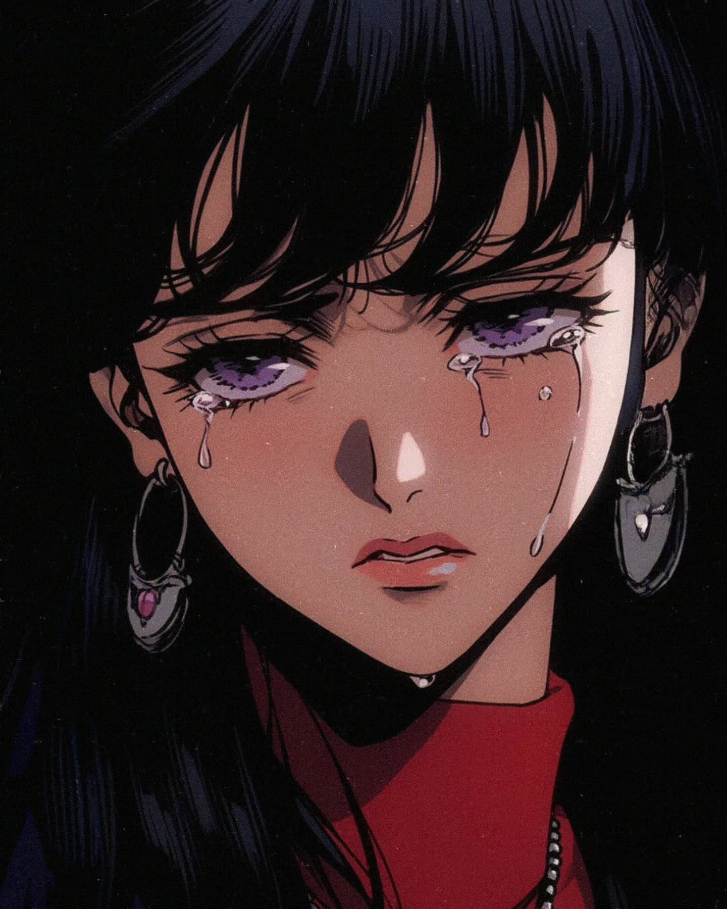
This image works because it does not overperform sadness. The face is close, the mouth is quiet, and the tears do the heavy lifting. That restraint matters. A lot of emotional art becomes loud too quickly, but this portrait stays controlled. The result feels more intimate because it trusts the viewer to read small signals.
The tears are the real focal device here. They catch light more strongly than almost anything else in the frame, which means the sadness is not only readable as expression but also as texture. That is one of the reasons the image lingers. It turns emotion into a visible surface rather than leaving it as a vague mood.
For creators, the useful lesson is that emotional virality often comes from one sharpened facial feature plus one clean color system. In this case, the violet eyes, black hair, and red collar create enough visual identity that the portrait stays memorable even though the composition is very simple.
| Signal | Evidence (from this image) | Mechanism | Replication Action |
|---|---|---|---|
| Controlled sadness | Soft expression, slightly parted lips, no screaming or distortion | Restraint makes the emotion feel more believable and more shareable | Keep the face quiet and let the tears carry the intensity |
| Wet-light contrast | Tears catch bright highlights against deep hair shadows | Highlighting the tears turns emotion into a visual texture | Make tear droplets reflective enough to read instantly at small sizes |
| Color identity | Violet eyes and red collar stand out within a mostly dark portrait | Small color anchors make a simple close-up memorable | Choose two accent colors only and let the rest of the frame stay dark and controlled |
This look is strongest for melancholic portrait art, heartbreak edits, emotional character studies, sad-girl anime mood posts, and cover visuals that need tenderness without spectacle. It works when the goal is emotional closeness rather than theatrical despair.
This setup is less suited to comedic posts, high-action scenes, or images that need plot information. Its strength is emotional compression.
The most effective choice here is how little the image tries to explain. There is no room, no rain, no extra symbolism, no dramatic hand gesture. The entire frame is built around the face and the tears. That concentration is why the portrait feels private. It gives the viewer almost nothing to hide behind.
The earrings and red collar are also doing more work than they seem. They keep the portrait from dissolving into generic sadness by giving the face a small style identity. Without them, the image would still be emotional, but it would be less specific and less memorable. Small accessories matter when the crop is this tight.
| Observed | Why it matters | How to recreate |
|---|---|---|
| Tears on both cheeks | Make the emotion legible instantly | Use a few thick tear paths instead of many tiny droplets |
| Violet eyes with wet highlights | Create a strong emotional anchor | Pick one unusual eye color and make it luminous enough to hold focus |
| Black hair surrounding the face | Builds contrast and intimacy | Let the hair and shadow darken the edges of the composition |
| Red high-neck collar | Adds memory and style to the close-up | Use one visible garment accent even in a very tight portrait crop |
| Prompt chunk | What it controls | Swap ideas (EN, 2-3 options) |
|---|---|---|
| Eye treatment | Emotional identity and color memory | "violet wet eyes", "grey-lilac sorrowful gaze", "glossy tired anime eyes" |
| Tear design | How visible the sadness is in-feed | "thick reflective tears", "clean tear streams", "bright tear highlights" |
| Hair framing | Depth and contrast around the face | "black curtain hair", "soft dark bangs", "shadowed long hair frame" |
| Accessory accent | Specificity and memory value | "heart earrings", "silver drop earrings", "small gem hoops" |
| Collar color | Secondary identity anchor | "red high neck", "wine turtleneck", "deep crimson collar" |
| Finish | Prevents generic portrait drift | "retro shojo anime", "grainy emotional close-up", "nostalgic cel portrait" |
Lock three things first: the tears, the violet eyes, and the tight crop. Those are the identity anchors. If one shifts too much, the image stops feeling like this specific kind of emotional portrait and becomes generic sad anime art.
That last point matters because portraits this tight get weaker when they explain too much. The power comes from emotional concentration.
If you want a colder version, keep the same face and tears but shift the collar toward black and the eyes toward grey-violet. If you want a softer heartbreak version, preserve the crop and brighten the skin slightly while keeping the tears glossy.