
Most AI product visuals fail for the same reason: they look like polished brand assets when they should feel like events. This poster does the opposite. It frames a model launch as if it were a high-stakes intelligence bulletin, mixing the emotional grammar of breaking-news design with the visual language of futuristic compute systems. The result is much more memorable than a conventional startup announcement card.
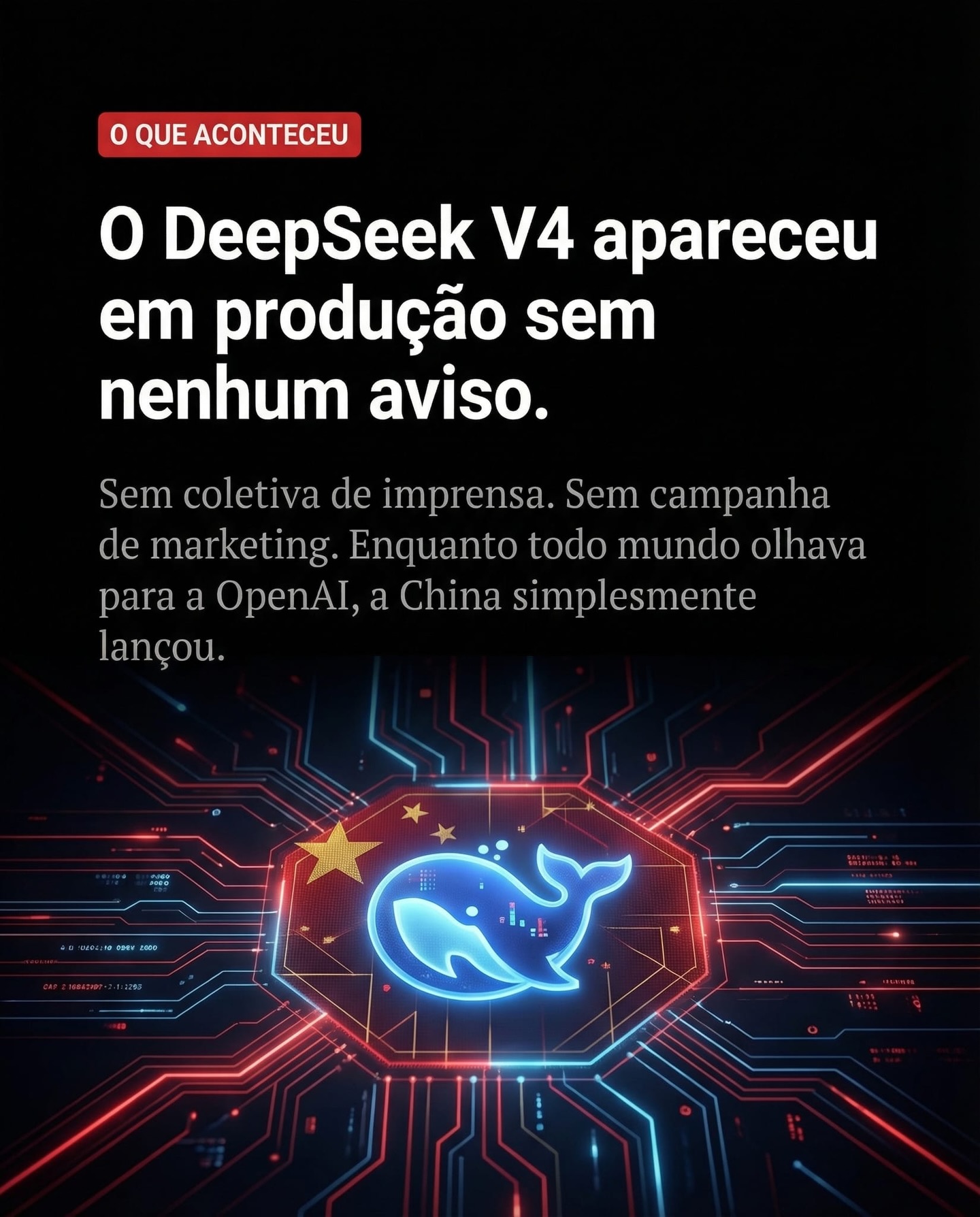
The poster is built around urgency. A black background creates immediate seriousness. A red badge at the top signals alert status. Large Portuguese headline text dominates the upper field, treating the announcement as a public revelation rather than an internal product milestone. Below that, the composition shifts into a vivid red-and-blue circuit explosion centered around a glowing whale-like emblem. The transition from flat headline space to dense visual infrastructure is what gives the piece its impact.
At a glance, the image communicates three things without asking the viewer to stop and decode detail. First, something significant has happened. Second, the event relates to AI or deep technical infrastructure. Third, the release is being framed as sudden, strategic, and possibly disruptive. That three-step read is a sign of strong information hierarchy. The designer did not simply make something visually exciting; they made something instantly legible.
That matters because social-first AI visuals are usually consumed under severe time pressure. A user scrolling a feed may only give the image one second of attention. In that window, the poster needs to provide a topic, a mood, and a directional claim. This one does. It feels urgent before it feels explanatory, and that ordering is exactly what makes it effective as a launch graphic.
Brand graphics typically prioritize polish, consistency, and visual friendliness. News graphics prioritize hierarchy, alert signals, and rapid comprehension. This image leans decisively toward the second category, and that is why it feels sharper than a generic AI cover. The red badge, oversized headline, and dark field all borrow from the visual behavior of emergency updates and financial-news alerts.
That choice is particularly effective for AI launch storytelling because the category itself is crowded. If every new model release is announced in the same calm product-marketing tone, nothing feels consequential. By shifting into a “quiet launch, major implication” framing, the poster creates narrative tension. It implies that something powerful has happened without requiring a dramatic illustration of robots, faces, or abstract glowing brains.
The Portuguese copy also helps. Even for viewers who do not read the language fluently, the visual density and typographic arrangement signal that the text matters. It looks editorial, not decorative. That distinction is important. Decorative text supports a picture. Editorial text carries argument. This poster is clearly in the second camp.
In practical design terms, that means the image is functioning more like a magazine cover or a news explainer card than a promotional social tile. That is a powerful reference model for anyone building AI-related launch art. If the goal is authority, not merely attention, editorial framing is often more effective than pure branding.
The black background does far more than provide contrast. It creates authority. It also slows the image down in a good way. Bright tech visuals often become noisy when they try to look futuristic. This composition avoids that trap by giving the headline large areas of quiet black space. That emptiness is not wasted space. It is what allows the typography and the circuitry to feel deliberate.
Black also increases the perceived intensity of the red and blue circuit elements. Because the center emblem and surrounding motherboard-like spread emerge from darkness, they feel active, electric, and almost secretive. A lighter background would have made the same components feel flatter and more productized. Here they feel consequential.
There is a psychological dimension too. Black in technology visuals often implies depth, infrastructure, and system-level seriousness. It suggests that the subject belongs below the visible surface, in the layer where computation, architecture, and strategy happen. That is exactly the right tone for a model launch positioned as tactically significant.
Anyone trying to recreate this style should pay attention to that lesson: futuristic does not mean bright everywhere. Often the strongest high-tech posters are built from darkness plus a few very controlled luminous accents.
The center symbol gives the poster an identity anchor. Without it, the circuitry would remain impressive but abstract. With it, the viewer has a focal point that behaves like a logo, a core module, and a narrative center all at once. The glowing blue whale-like mark becomes the image’s “why,” while the circuitry becomes the image’s “how.”
That division is useful. In strong information design, a central symbol can absorb brand recognition while the surrounding system visual explains power, reach, or complexity. This poster follows that principle effectively. The emblem feels protected and amplified by the surrounding red-blue board structure, as if the underlying infrastructure is announcing or energizing it.
The small Chinese flag motif above the core module adds another layer of interpretation. It subtly signals geopolitical context, origin, and strategic implication without taking over the composition. That kind of small but loaded symbol is often more effective than overt map-based or propaganda-style visual cues because it allows the audience to infer meaning rather than have it forced on them.
As a prompt-writing lesson, the central emblem should not be described as a generic logo. It should be described as a luminous symbolic core around which the rest of the system radiates. That framing helps preserve focal hierarchy in generated outputs.
The upper headline block is what makes this image work in a feed. It is large, dominant, and aggressive enough to establish the topic immediately. If the typography were reduced, the poster would become just another cyber-tech graphic. Instead, the text claims the upper field and tells the viewer how to read the entire composition.
The smaller body copy beneath the headline is also well judged. It provides enough secondary context to imply that the announcement is analytical, not merely emotional. That matters because without secondary copy the poster might feel sensationalist. With it, the image feels like a serious editorial reaction to a meaningful AI release.
Spacing is crucial here. The headline does not sit too close to the central circuit structure, and the body text has enough room to breathe. Those spacing decisions create trust. Crowded posters feel rushed. Well-spaced posters feel controlled, even when the message is urgent.
This is one of the clearest lessons from the design: hierarchy beats ornament. The circuitry is visually exciting, but the typography is what turns the image into a message.
| Design Layer | What It Communicates | Why It Matters |
|---|---|---|
| Red badge | Alert, urgency, bulletin tone | Creates a breaking-news frame immediately |
| Large headline | Main claim or narrative hook | Lets viewers grasp the subject in one glance |
| Secondary paragraph | Context and interpretation | Adds authority and analytical weight |
| Central emblem | Identity anchor and focal point | Stops the image from becoming purely abstract |
| Red-blue circuitry | Infrastructure, energy, technical scale | Makes the announcement feel system-level and consequential |
The red-and-blue pairing is more than a simple color contrast. It creates ideological and energetic tension inside the image. Blue suggests intelligence, core compute, and technological clarity. Red introduces urgency, warning, competition, and escalation. By arranging both around the same emblem, the design produces a feeling of controlled conflict.
This is especially useful for AI launch imagery because the category lives in contradiction. New models are marketed as tools, but they are often discussed as power shifts. Blue alone would make the visual too calm. Red alone would make it too aggressive. Together they imply strategic motion.
The circuit symmetry is also important. Although the palette is high contrast, the layout remains orderly. That order prevents the poster from becoming chaotic. It says: this is a disruptive event, but it is still a system. Strong tech posters often need that balance between excitement and structure.
For prompt creation, terms like symmetrical motherboard spread, blue core illumination, red signal pathways, electric circuitry bloom, and high-contrast dark tech poster are more useful than vague futuristic language. Specificity helps control tone.
To build an image in this direction, start by deciding whether the piece is a campaign ad or a news poster. If it is the latter, every visual choice should serve hierarchy first. Use a dark background, a small urgent badge, a large headline block, and a central symbolic anchor. Only after those are stable should you add circuitry or glow effects.
Second, keep the environment abstract and intentional. This kind of visual does not need a room, a skyline, or futuristic architecture. In fact, those additions usually weaken the piece. A pure digital field with negative space is stronger because it keeps all the attention on the idea of release, system, and consequence.
Third, write the copy area into the composition prompt. A lot of generated “poster” images fail because the model creates decorative shapes where meaningful text blocks should exist. Phrases like large editorial headline occupying upper half, smaller explanatory paragraph beneath, and clean social-cover hierarchy help protect the layout.
Finally, treat the emblem and circuitry as linked. The circuitry should not be random decoration. It should appear to radiate from, frame, or activate the emblem. That makes the visual feel like a technological announcement rather than a cyber wallpaper.
This DeepSeek-style poster succeeds because it understands that product announcements compete for attention differently than ordinary design work. In a crowded AI environment, being clean is not enough. Being futuristic is not enough. The image has to feel consequential. Here, consequence is created through news grammar, dark contrast, disciplined typography, and a central technological symbol surrounded by controlled infrastructure.
The poster does not ask the audience to admire style in isolation. It asks them to feel that a significant release has landed quietly but forcefully. That is a much stronger emotional frame than generic hype. For anyone building launch visuals, AI analysis covers, or social-first technology posters, this is a useful lesson: if you want the announcement to feel important, the design itself must behave like important information.