How cyborggirll Made This AI Builder Prompt Section Thumbnail Breakdown — and How to Recreate It
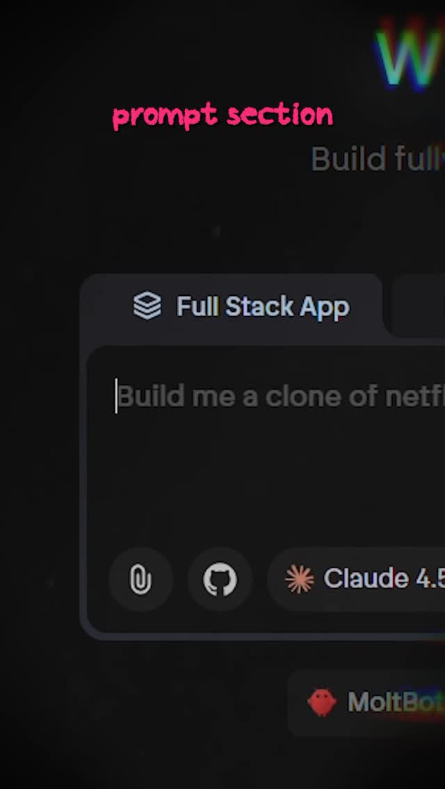
This image works because it makes one part of a software interface feel like the whole story. Instead of trying to show the entire product, it isolates the exact area where the user’s intent enters the system: the prompt field. That is the smart move. In AI-builder content, the audience often cares less about the full dashboard than about the one place where the magic appears to begin.
The Core Hook
The hook is clarity. The image tells the viewer, almost instantly, “this is the part you need to pay attention to.” The pink caption acts like a teacher’s finger. The dark UI makes the prompt box feel more important. And the partial text inside the field suggests a real use case rather than a generic empty state. Altogether, the frame feels educational, actionable, and relevant.
This works especially well in AI-tool content because the prompt field has become a symbolic object. It represents leverage, automation, and creative control. When a creator highlights it directly, the audience knows the video is likely to explain a method rather than just showcase a result.
Signal Table
| Signal | Evidence (from this image) | Mechanism | Replication Action |
|---|---|---|---|
| Single-point focus | The frame isolates one prompt input box rather than the full product | Focus improves comprehension and click clarity | Choose one functional UI area and crop around it tightly |
| Tutorial framing | The pink “prompt section” label tells viewers what matters | Instructional labels make screenshots feel purposeful | Add one small guiding caption instead of many annotations |
| Productive possibility | The typed request implies a real app-building prompt | Partial real-world examples increase aspiration and relevance | Show the beginning of a practical prompt, not just an empty field |
| Dark-mode credibility | The interface uses modern charcoal UI panels and subtle chips | Dark SaaS visuals are strongly associated with advanced digital workflows | Use a clean dark interface if you want the tool to feel modern and capable |
| Context without overload | Only a few chips and adjacent panels are visible around the box | Partial context keeps the crop believable without diluting the focus | Leave hints of the full product, but make one module dominate the frame |
Aesthetic Read
The image belongs to a new class of creator visuals where software itself becomes the content subject. Not the finished output. Not the founder story. The interface. That is an important shift. It means viewers increasingly want to understand workflow, not just admire results.
The dark crop and pink heading also create a useful contrast between seriousness and accessibility. The software looks capable. The caption feels friendly. That balance keeps the frame from feeling too technical or too casual. It feels like the viewer is being shown the one thing that actually matters.
Where This Format Transfers Well
This structure works for prompt-writing tutorials, AI workflow breakdowns, no-code builder explainers, automation walkthroughs, app-clone demos, and “watch me build this” content. It also translates well to image generators, code copilots, slide builders, and agent tools because most of them contain a similar intent-entry surface.
The transferable principle is simple: find the interface element that represents user agency, then frame that element as the hero.
Prompt Technique Breakdown
| Prompt chunk | What it controls | Swap ideas (EN, 2–3 options) |
|---|---|---|
| dark AI builder prompt input field | Defines the core software object | image-generator prompt box; agent-task entry field; no-code workflow builder input |
| pink instructional caption | Turns the crop into a tutorial rather than a raw screenshot | “start here”; “important”; “this part” |
| partial typed request in the field | Adds practical context and aspiration | “Build me a landing page…”; “Create an AI agent…”; “Generate a dashboard for…” |
| small chips and tool icons below | Signals a real modern workflow system | model selector row; attachments bar; tool toggle strip |
| tight vertical crop | Keeps attention fixed on the part that matters | left-panel crop; centered modal crop; sidebar-plus-input crop |
Remix Playbook
Lock four elements first: one prompt field, one small teaching label, one partial real-world example, and one dark uncluttered UI. These are the components that make the image feel useful instead of decorative. Once they are in place, you can adapt the format across many tools and workflows.
Use a one-change rule for iteration. Change only the tool type, or the example prompt, or the tutorial label, or the crop position. For example, keep the same dark UI logic and pink caption, but switch from a full-stack app builder to an image-generation prompt box. Or keep the same prompt field, but change the topic from app cloning to startup landing-page generation. Controlled variation helps build a clear educational brand.
If a version feels too empty, add one more contextual chip instead of zooming out. If it feels too busy, crop tighter and simplify the label. The best result should feel like a creator has frozen the one part of the interface where outcomes begin.