Forest fashion🧚
Animated with @klingai_official
Are you serious about learning how to create AI visuals at a professional level? In my course, I teach everything I use in my own process:
• How I build concepts and visual storytelling
• The exact tools, prompts, and workflows I use
• How to refine, edit, and create a portfolio that gets noticed
This is the full system I used to grow Dreamfall Art and work with brands.
If you want access —
Comment “COURSE” below and I’ll send you the link directly.
#midjourney #aiart #art #conceptart #midjourneyart #aiartwork #aicommunity #fantasyart #digitalart #fashion #ai #fashionstyle #beauty
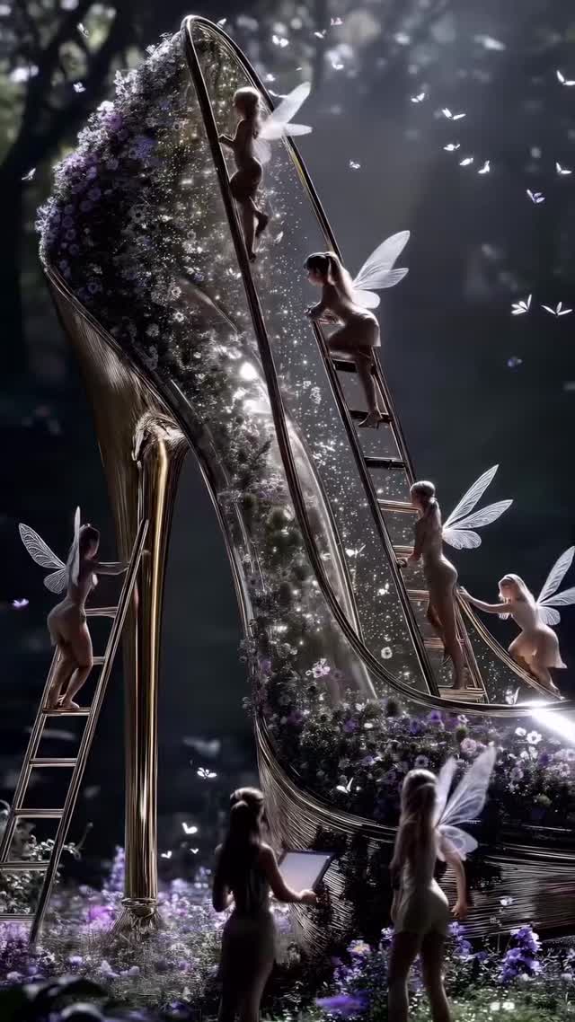
How dreamfall.art Built This Fairy Glass Heel AI Art
This image wins because it compresses contrast into one frame: a familiar luxury symbol (the glass heel) is turned into a tiny world with active characters, and that scale reversal creates instant curiosity before the viewer even reads the caption. You do not need context to understand the tension: small fairies are climbing, carrying, and arranging inside a giant reflective object. That single contrast gives the post a clean stop-scroll trigger.
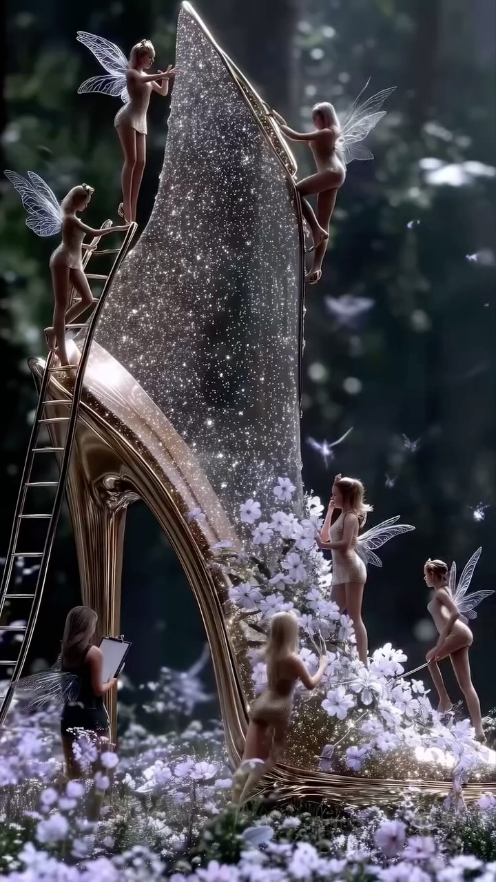
The second driver is texture hierarchy. The creator stacks reflective glass, glowing particles, translucent wings, and soft flowers, so every swipe or pause reveals another micro-detail. On Instagram, this matters because users reward images that keep attention for a few extra seconds. The frame is dark enough to feel cinematic, but the highlights are strategically bright, so the eye keeps jumping between rim light, glitter clusters, and silhouette edges.
The final growth lever is category bridging. This image belongs to fantasy art, but it also borrows fashion language: heel shape, editorial composition, controlled palette, polished finish. That crossover expands audience reach beyond pure AI art viewers into fashion and beauty explorers, which helps explain the strong like-to-comment behavior and the remix potential for creators looking for signature visual identity.
Where This Style Fits Best
Beauty or fashion concept teasers: perfect because luxury object geometry already carries aspirational cues. Change accent flowers to match brand color.
Course or service promotion for AI creators: strong proof-of-craft image that justifies premium positioning. Add one signature motif that repeats across your feed.
Seasonal campaign visuals: easy to re-theme by swapping flora, particles, and ambient color while preserving composition.
Music cover or mood-poster content: cinematic darkness and glow work well for emotional storytelling. Tune contrast based on genre tone.
Not Ideal Scenarios
Direct product detail ads: fantasy abstraction can hide functional product information.
Minimalist brand systems: this look is intentionally rich and may conflict with strict clean-grid identity.
Fast meme cycles: production depth is high; turnaround speed is lower than simple trend formats.
Transfer Recipes
Recipe 1
Keep: giant reflective hero object, moonlit rim lighting, particle haze.
Change: object category (perfume bottle), character type (mini stylists), flower species.
Slot template (EN): {hero_object} in {night_scene}, tiny {character_type} climbing {support_props}, {palette} highlights
Aesthetic Read: What Makes It Feel Premium Instead of Random
The image feels intentional because each visual layer has a clear job. The glass shoe is not only the subject; it is also a light engine. Reflections on the heel stem and edge trims create a clean contour that keeps the silhouette readable even in a dark scene. The background stays soft and low-information, so the composition avoids noise while still suggesting a deep forest space.
Color is tightly constrained to deep blue-black, silver-white, and lilac accents. That two-to-three color strategy gives cohesion and allows tiny bright points to feel expensive rather than chaotic. The fairies are posed as workers inside a luxury artifact, which injects narrative motion and keeps the frame from becoming a static beauty render.
Depth is also engineered carefully. Foreground figures are darker and partially silhouetted, midground action happens on the ladders, and the top arch catches the strongest glow. This front-mid-back layering produces cinematic readability on mobile screens where details can easily collapse. The result is a piece that looks magical but still obeys practical composition rules creators can replicate.
Prompt Control Blocks You Can Reuse
Prompt chunk
What it controls
Swap ideas (EN, 2-3 options)
"miniature winged figures around oversized glass stiletto"
"cool moonbeam from upper-right, reflective fill, rim-lit wings"
Directionality and mood consistency
dawn side-light + warm fill; backlit sunset haze; studio spotlight + hard rim
"deep navy forest bokeh with floating particles"
Background simplicity and atmosphere
misty cathedral interior; dark botanical greenhouse; twilight shoreline fog
"silver-white glitter with lilac floral accents"
Palette discipline and premium finish
emerald + champagne; rose gold + ivory; cobalt + pearl
"85mm portrait feel, shallow-moderate depth"
Compression and subject separation
50mm for broader scene context; 105mm for tighter elegance; 35mm for more environmental storytelling
Remix Playbook: Converge First, Then Stylize
Baseline Lock (lock these first): 1) scale relationship between tiny characters and the hero object, 2) lighting direction from upper-right, 3) left-weighted composition with diagonal flow through the shoe arch.
One-change rule: change only 1-2 knobs per run so you can see which variable caused improvement or drift.