I come here too much.
I come here too much.
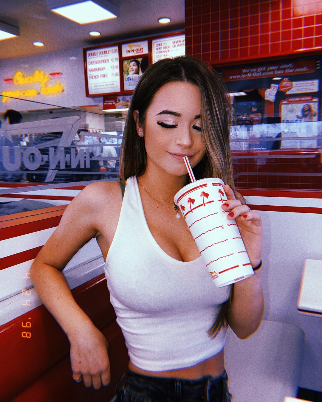
This image works because it treats a very ordinary place like a recognizable aesthetic stage. Fast-food interiors are usually considered too common to feel special, but that is exactly what makes them useful. The red booths, branded cup, menu boards, and tile wall already carry a complete visual identity. Instead of fighting that identity, the image leans into it and lets the location do half the storytelling.
The caption says “I come here too much,” and that line helps the post feel lived-in rather than staged. It turns the restaurant into a recurring personal setting instead of a one-off backdrop. That is a useful creator lesson: repetition can strengthen a post when the location itself is visually iconic. Familiar places often outperform generic “pretty” places because they feel more believable and more tied to personality.
The retro timestamp effect is also doing quiet work here. It nudges the image away from polished influencer content and toward casual memory. That matters because nostalgia is often built from small framing devices, not only from old cameras or vintage clothes. A simple throwback cue can make a brand-new image feel like a remembered moment.
| Signal | Evidence (from this image) | Mechanism | Replication Action |
|---|---|---|---|
| Instant location recognition | Red-and-white booth, palm-tree cup, menu boards | The setting reads immediately without extra explanation | Choose locations with strong built-in brand or color identity |
| Everyday behavior | Sipping from the drink instead of posing at the camera | Natural action makes the frame feel less staged | Give the subject one small task like sipping, stirring, unwrapping, or reaching |
| Nostalgic framing cue | Date-stamp style digits in the corner | Small retro signals add emotional texture and memory value | Add one subtle throwback edit rather than overloading the image with filters |
This style fits diner content, road-trip posts, Americana moodboards, casual food-and-fashion content, and creator feeds built around repeatable lifestyle places. It also transfers well to gas stations, donut shops, laundromats, and convenience stores, where the environment already has strong visual branding.
It is less ideal for luxury food storytelling or minimalist cafe aesthetics. The strength here is graphic familiarity, not refinement.
{iconic chain interior} {casual seated action} {retro timestamp} {everyday Americana mood}{color-coded food space} {simple portrait} {recognizable cup or tray} {throwback edit}{familiar local spot} {one habitual gesture} {soft retro cue} {personal routine energy}The image is strong because the restaurant is not treated as background filler. The red booth, white cup, and menu signage create a tightly controlled visual system. The white top echoes the cup, the red booth echoes the branding, and the timestamp adds a nostalgic hinge that pulls the whole thing toward memory rather than advertising. That is why the image feels personal even though the brand cues are obvious.
| Prompt chunk | What it controls | Swap ideas (EN, 2-3 options) |
|---|---|---|
| In-N-Out style red-and-white interior | Location identity and color palette | retro diner booth; pizza counter with red accents; convenience-store soda station |
| sipping from a branded cup | Natural action and lifestyle realism | holding fries; opening ketchup; resting hand on milkshake |
| subtle timestamp snapshot edit | Nostalgia and casual-photo feeling | disposable-camera grain; mini date imprint; soft flash throwback edit |
| bright everyday overhead lighting | Believability and mundane charm | fluorescent diner light; daytime storefront spill; warm late-evening fast-food glow |
Lock these three things first: the recognizable restaurant palette, the small habitual action, and the subtle retro framing device. Those are the identity anchors. After that, change only one thing at a time.