I've been thinkin' 'bout you all day
I've been thinkin' 'bout you all day
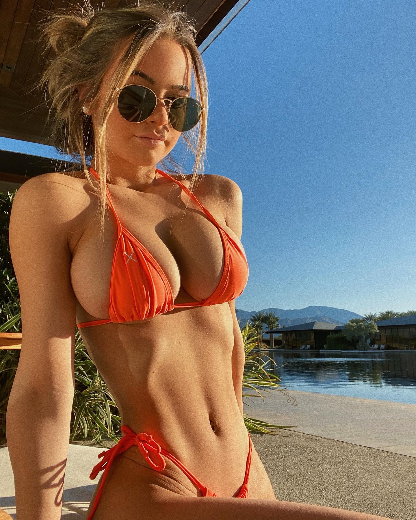
This image works because it commits to a very simple visual equation: bright sun, one dominant wardrobe color, and a background that instantly signals destination. A lot of resort content fails because the location is expensive but the frame is cluttered. Here, the frame stays clean. The pool, the mountains, and the blue sky do enough world-building on their own, so the image feels aspirational without looking busy.
For small creators, that is the key lesson. You do not need ten luxury signals in one frame. You need one or two strong ones that read immediately. In this case, the strongest signals are the hard desert sun, the reflective water, and the orange styling choice. Those three elements create a memorable scroll-stop because they separate the post from the softer beige-and-white resort aesthetic that dominates most travel feeds.
The second reason it performs is contrast structure. The wardrobe color cuts sharply against the blue sky and neutral architecture, which makes the image readable even on a fast scroll. The sunglasses and loose tied-up hair also help. They keep the picture from becoming too polished or too staged, and that slight casual edge makes the post feel more believable.
| Signal | Evidence (from this image) | Mechanism | Replication Action |
|---|---|---|---|
| Destination clarity | Reflective pool, mountains, sparse palms, low resort buildings | The viewer understands the setting instantly | Choose one background angle that shows water, architecture, and horizon in a single frame |
| Color contrast | Orange wardrobe against blue sky and neutral stone | High readability improves stop power in-feed | Pick one accent color and keep the environment mostly neutral |
| Hard light confidence | Crisp midday shadows and bright highlights | Clear sunlight adds energy and place specificity | Shoot when the sun is directional enough to create visible edge contrast |
This visual language fits resort content, desert travel posts, poolside fashion images, and creator campaigns where the goal is to signal warmth, confidence, and location value fast. It also transfers well to hotel collaborations because the environment is part of the story, not just the backdrop.
It is less effective for cozy lifestyle content, low-light indoor posts, or soft romantic travel imagery. Hard sunlight and sharp blue-orange contrast communicate energy and clarity, not softness. If your brand voice is gentler, the same setup would need lighter styling and softer timing.
{resort setting} {accent color wardrobe} {sun accessory} {clear midday light}{open water scene} {travel styling} {clean skyline or ridge} {bright directional sun}{sunlit destination} {warm accent wardrobe} {minimal architecture} {vacation mood}The image reads as strong because the palette is disciplined. Blue sky, orange styling, tan stone, dark glasses. That is basically the whole system. The hard light helps define the setting, while the pool reflection gives depth without clutter. The composition also leaves enough sky to create breathing room, which stops the frame from feeling cramped even though the crop is fairly tight. There is nothing ornamental here, and that restraint is part of why the photo feels premium.
| Prompt chunk | What it controls | Swap ideas (EN, 2-3 options) |
|---|---|---|
| luxury desert-resort pool with mountain horizon | Travel setting and destination identity | Mediterranean hotel pool; modern rooftop plunge pool; lakefront spa resort |
| hard midday sunlight with crisp shadows | Energy level and time-of-day feel | golden-hour side light; overcast resort light; late-morning bright sun |
| orange wardrobe against blue sky | Color story and feed readability | white against turquoise water; yellow against sandstone; black against pale concrete |
| casual vacation portrait with sunglasses | Persona and styling tone | editorial travel portrait; relaxed candid poolside look; sporty resort mood |
Lock these three things first: the light direction, the clean pool-and-horizon background, and the color contrast between wardrobe and sky. Then iterate slowly. Do not change the location, pose, and color palette all at once. Start from one strong baseline image and make only one or two changes per run.