Tarkana nasıl ulaşabiliriz ? Videomuzu elden ele uzatma şansımız var mı acaba?
Tarkana nasıl ulaşabiliriz ? Videomuzu elden ele uzatma şansımız var mı acaba?
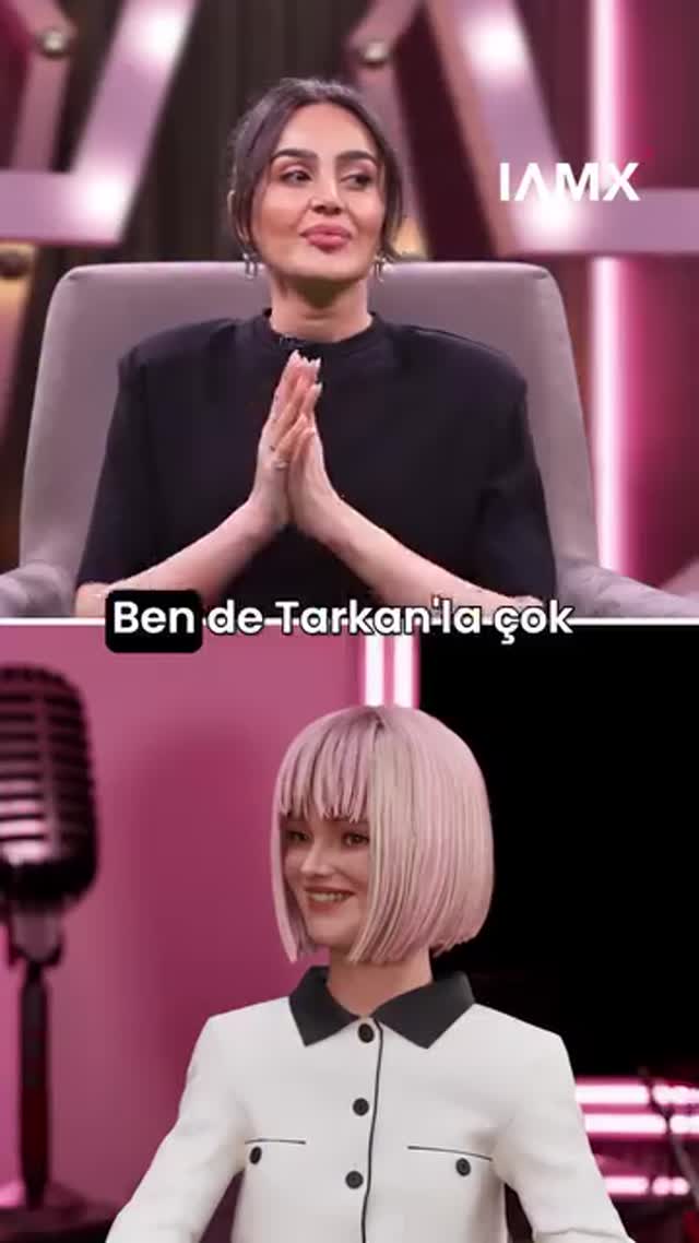
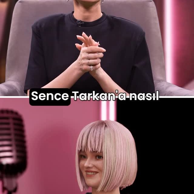
This image format is powerful because it creates built-in comparison. The top panel shows a real studio conversation moment. The bottom panel mirrors the scene through a virtual persona. That instant contrast gives viewers a reason to pause: they want to decode the relationship between the two identities.
The design is efficient. Pink studio continuity ties both panels together, while wardrobe and facial style differences make the contrast obvious. Add one subtitle line and a corner logo, and the frame becomes both narrative and branded without extra clutter.
For creators exploring AI identity storytelling, this is one of the most scalable visual formats: same set language, two identity layers, one conversational hook.
| Signal | Evidence (from this image) | Mechanism | Replication Action |
|---|---|---|---|
| Dual identity tension | Real person in top panel, virtual avatar in bottom panel | Comparison naturally drives curiosity and comments | Use split layout whenever showing “human vs digital persona” narratives |
| Visual continuity | Shared pink studio mood in both halves | Keeps comparison coherent instead of chaotic | Lock one shared environment palette across both panels |
| Caption hook | Single subtitle line across center | Adds conversational context and pause behavior | Use one concise quote that invites “what happens next?” |
| Brand memory | IAMX logo top-right | Subtle identity reinforcement across episodes | Place a small consistent brand marker in a fixed corner |
{top speaker frame} + {bottom response frame} + {shared set palette} + {center subtitle}{real present self} vs {styled future self} in {matching studio mood}{human speaker} + {animated tutor} + {single phrase subtitle} + {clean split-screen}The frame is successful because it uses structure as storytelling. The horizontal split line is not only visual design; it defines narrative roles. Top panel reads as “source reality,” bottom panel reads as “digital reflection.” This semantic clarity helps audiences interpret quickly and engage deeply.
Color and wardrobe do additional work. Black attire in the top panel feels grounded and human; white-black graphic outfit in the bottom panel feels designed and digital. Together they create a coherent contrast without visual conflict.
| Prompt chunk | What it controls | Swap ideas (EN, 2-3 options) |
|---|---|---|
| Layout primitive | Narrative format | “stacked split-screen”, “left-right split”, “picture-in-picture compare” |
| Role assignment | Audience interpretation | “real top / virtual bottom”, “host top / guest bottom”, “before / after persona” |
| Set continuity | Visual cohesion | “shared pink studio”, “shared blue neon room”, “shared minimal gray set” |
| Subtitle strategy | Retention hook | “single quote center line”, “question prompt subtitle”, “reaction caption strip” |
| Brand marker | Series recall | “top-right logo”, “corner badge”, “small channel text lockup” |
| Character styling contrast | Human vs digital differentiation | “natural human styling vs clean CG avatar”, “casual vs futuristic”, “real skin vs stylized render” |
Baseline lock: (1) clear split layout, (2) one shared environment hue, (3) one subtitle hook line.
This method keeps the format consistent while improving clarity and engagement step by step.