🎤 Alarax’tan (@iamxalara) ezber bozan bir an…
Bir TEDx sahnesinde ilk kez bir yapay zekâ konuştu.
İnsan–makine etkileşimi, yaratıcılık ve geleceğin sınırları tek bir anlatıda buluştu.
Bu yalnızca bir konuşma değil, dönüm noktasıydı!
📍11 Ekim’de, Bilkent Odeon’da!
#TEDxBilkent #alarax #AnkaraEtkinlikleri #bilkentuniversity #tedx
How iamxalara Made This TEDx Bilkent Speaker AI Art - and How to Recreate It
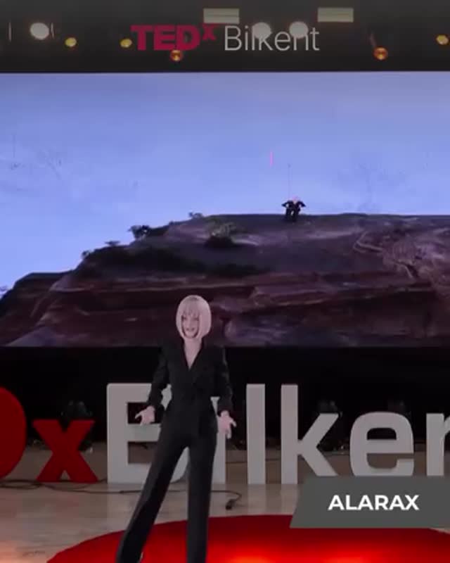
This is the kind of image that carries weight before anyone reads a caption. A big stage. A recognizable conference-style layout. A massive screen backdrop. Even if viewers don’t know the specific event, they recognize the format: “someone is speaking on a serious stage.” That borrowed authority is a growth cheat code—because it reduces doubt and raises perceived relevance instantly.
What makes the frame especially reusable is the structure: a clean presenter silhouette in the lower half, giant visuals in the upper half, and a small nameplate that functions like a broadcast lower-third. The backdrop landscape adds scale and drama without adding clutter. And the red circle carpet is classic: it marks the “center” of the story. For creators, this is a lesson in making your content look bigger than your budget by locking a few high-signal design cues.
Why it travels: the signals that trigger trust
Authority content isn’t only about credentials; it’s about readability. This frame communicates “stage + talk + identity” in one glance: the presenter, the event signage, and the nameplate. That makes it highly shareable for announcements, launches, and “I’m building something” moments.
Signal
Evidence (from this image)
Mechanism
Replication Action
Borrowed authority
TED-style stage layout and signage
Viewers assume the message is worth attention
Use an event-like frame: stage letters, spotlighting, and a clear “header” at the top
Scale + drama
Huge landscape screen above a small presenter
Contrast creates cinematic impact without extra props
Put one large background visual behind a simple silhouette; avoid busy slides
Identity clarity
Lower-right nameplate (“ALARAX”)
Names stick when they appear like broadcast graphics
Always include a small consistent lower-third label: name, product, or topic tag
Center-of-story marker
Red circular carpet
Spatial focus tells the eye where the “main idea” lives
Add one geometric anchor (circle, platform, spotlight pool) under the subject
Use cases & transfers
Best-fit scenarios
Launch announcements: pair the still with a short “what’s new” caption and a single link.
Speaker/guest promos: one frame that says “I speak / I teach / I present.”
Product keynote teasers: keep the stage; swap the screen visual for a clean hero image.
Conference recap reels: use the still as the cover and cut to 3–5 micro-moments.
Credibility-building posts: “what I learned,” “my thesis,” “my framework” works well here.
Not ideal
Personal diary content: the authority vibe can feel too formal for casual life updates.
Highly technical tutorials: you’ll need diagrams and close-up screens, not a wide stage.
Comedy skits: this framing reads serious by default.
Transfers (3 recipes)
Transfer 1: “Startup demo day”
Keep: wide stage framing, top header text, lower-third nameplate
Change: screen becomes a single product UI hero; wardrobe becomes blazer
Slot template: “{product} {one-line promise} {proof point} {call to action}”
Transfer 2: “Artist statement talk”
Keep: big backdrop visual + small presenter silhouette, geometric floor anchor
Change: screen becomes one artwork close-up; nameplate becomes the artwork title
Slot template: “{work title} {theme} {process detail} {what you want viewers to feel}”
Change: header becomes course/topic; screen becomes a single big metaphor image
Slot template: “{topic} {why it matters} {one surprising insight} {when/where}”
Aesthetic read: the stage design choices worth copying
The genius here is restraint at scale. The presenter is a clean dark silhouette, which makes them readable from far away. The backdrop is one big image—not a busy slide deck—so it feels cinematic. The foreground letters create a “brand wall” effect, and the red accents (the carpet and the event mark) give you a built-in highlight color. This is how you make a frame look expensive: not by adding elements, but by choosing one dominant element per layer.
Observed
Recreate it
Three-layer depth (letters → presenter → screen)
Prompt distinct depth layers and keep the presenter separated from the screen by lighting contrast
One massive backdrop visual
Use a single hero image on the screen; avoid text-heavy slides
Geometric floor anchor
Add a red circle carpet or spotlight pool under the subject
Small identity label
Use a consistent lower-third nameplate with 1–2 words only
Event lighting realism
Keep slight softness/compression like a real video still; avoid studio-perfect sharpness
Prompt technique breakdown (build the frame like blocks)
Prompt chunk
What it controls
Swap ideas
“TEDx-style stage with large letters and red accents”
Authority + recognizability
“demo day stage”, “award ceremony stage”, “museum talk stage”
“topic header + date”, “series title badge”, “speaker name + handle”
Remix steps (iterate like a director)
Baseline lock: (1) wide stage composition with letters, (2) single massive backdrop image, (3) red floor anchor.
One-change rule: change only one knob per run: backdrop image or header text or wardrobe silhouette.
Example 4-step iteration:
Run 1: match stage geometry (letters + carpet + screen) and keep presenter centered.
Run 2: keep seed; refine the backdrop image to a single clean visual with strong horizon line.
Run 3: keep lighting; make the presenter silhouette cleaner (black wardrobe, clear edges).
Run 4: add the lower-third nameplate and tune it to 1–2 words only for maximum recall.
Starter prompt block you can paste and remix
wide keynote stage, vertical 9:16, large white 3D letters spelling "Bilkent" across the stage front with a large red "x" on the left, red circular carpet center stage, single presenter standing on the carpet in a black tailored jumpsuit, short blonde bob hair, arms slightly open, huge LED screen backdrop showing a rocky desert landscape with pale sky, top header text "TEDx Bilkent" (TEDx red, Bilkent white), realistic stage spotlights, add grey trapezoid lower-right nameplate with white text "ALARAX", photorealistic video still