The Crystal Prism: How imma.gram Built This AI Art
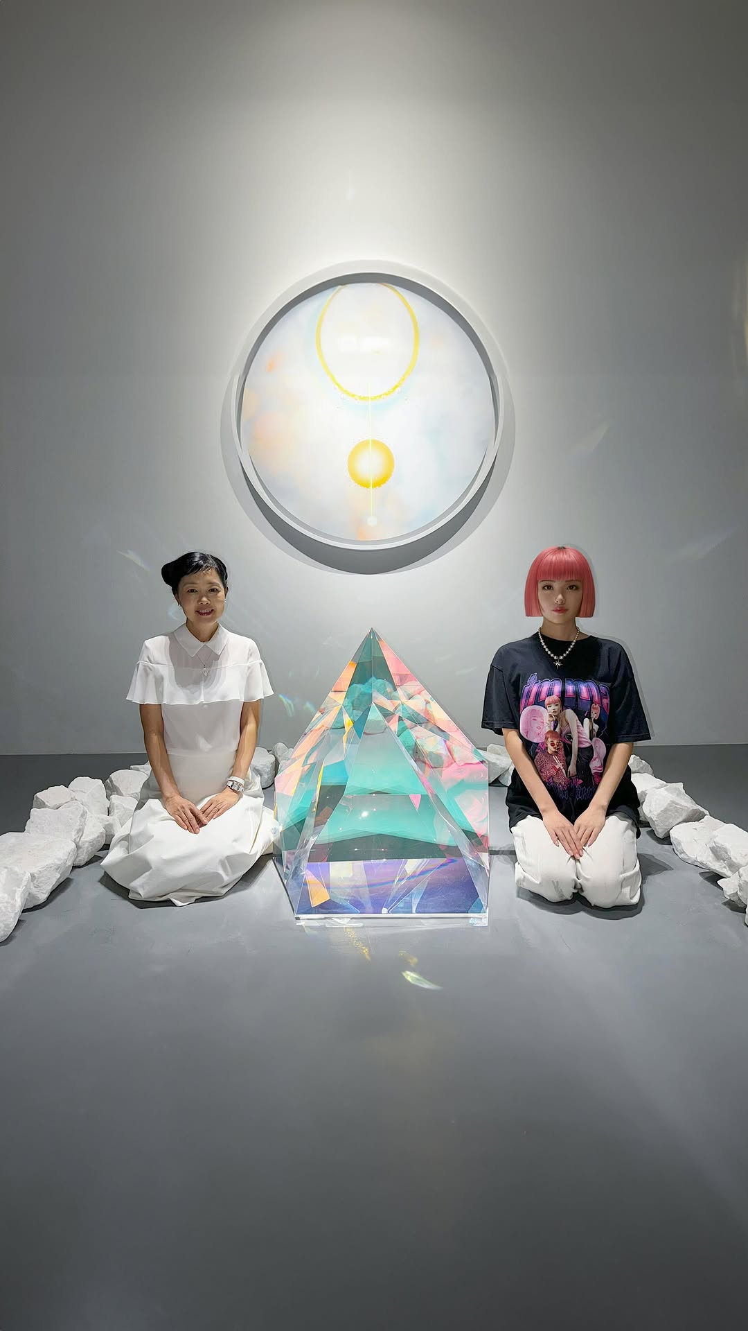
In a carousel full of life updates—events, travel, fashion week energy—the best slides are often the quiet ones. A single crystal sculpture on a white pedestal is a visual breath. It slows the scroll and signals taste. Even if the caption is chaotic (busy days, projects, stress eating, exhibitions), the image itself feels calm and curated.
This is why gallery photos work as creator content: they communicate “I’m living” without showing your face, and they let the audience project meaning. The rainbow refractions make it feel magical, but the composition stays minimal. That balance—wonder + restraint—is what gets saves.
Why it went viral (signals and mechanisms)
| Signal |
Evidence (from this image) |
Mechanism |
Replication Action |
| Minimalism with payoff |
One object, clean wall, strong negative space |
Feels premium; easier to save as inspiration |
Limit the frame to one hero object and remove background noise |
| Optical “wow” detail |
Rainbow caustics and refractions in the crystal |
Gives the image a satisfying second look |
Chase light effects: prisms, glass, water reflections, or mirrors |
| Carousel pacing |
This works as a calm slide between louder moments |
Rhythm keeps viewers swiping; contrast sustains attention |
Insert 1–2 “quiet” still-life frames in every life-update carousel |
| Taste signaling |
Gallery/exhibition vibe, clean composition |
Signals cultural curiosity and aesthetic intent |
Frame art objects like product photography: clean background, controlled light |
Best-fit scenarios
- Life-update carousels: “busy lately” posts that need visual breathing room.
- Art and culture diaries: exhibitions, installations, AR performances, museum visits.
- Brand moodboards: “this is the vibe” slides without a product shot.
- Creator identity building: consistent taste cues across months.
Not ideal
- Direct tutorials: the image is mood-first, not step-first.
- Hard selling: minimal art can feel disconnected from an aggressive CTA.
- Comedy-first feeds: the tone reads calm and editorial.
Transfers (exactly 3)
-
Recipe 1: The “quiet slide” system
- Keep: one-object still life, negative space, controlled light
- Change: hero object (crystal → ceramic → metal sculpture)
- Slot template: “gallery still life of {one object}, clean wall, soft spotlight”
-
Recipe 2: Light-effect series
- Keep: minimal background and pedestal framing
- Change: the optical effect (prism dispersion → mirror reflections → water caustics)
- Slot template: “minimal still life + {light effect} as the highlight”
-
Recipe 3: Caption-contrast pairing
- Keep: calm visual
- Change: caption tone (busy/stressed/overwhelmed) to create contrast
- Slot template: “calm image + caption: ‘been busy lately…’”
Aesthetic read: why the refraction feels “transcending”
The object is basically a light machine. Facets slice the environment into clean geometry, and the sphere inside acts like a lens. The rainbow caustics on the base are proof that the light is real and directional. That’s why the image feels almost spiritual without any obvious symbolism—your brain reads “physics” as “magic.”
| Observed |
Evidence in the image |
Recreate instruction (prompt knob) |
| Negative space calm |
Large gray wall area |
“clean matte gray wall, minimal background, lots of space” |
| Hero object clarity |
Single crystal sculpture dominates |
“one hero object, tight still-life framing” |
| Prismatic dispersion |
Rainbow bands on the base |
“vivid spectral caustics, prismatic dispersion” |
| Pedestal logic |
White pedestal edge grounds the scene |
“white pedestal, gallery documentation vibe” |
| Controlled speculars |
Facets have highlights but keep detail |
“controlled highlights, preserve glass facet detail” |
Prompt technique breakdown (still-life controls)
| Prompt chunk |
What it controls |
Swap ideas (EN, 2–3 options) |
| Hero object material |
Whether it feels magical |
“crystal glass”, “polished metal”, “glazed ceramic” |
| Light direction |
Caustics and highlights |
“side spotlight”, “top spotlight”, “window light” |
| Background discipline |
Premium vs cluttered |
“matte gray wall”, “white wall”, “dark charcoal wall” |
| Composition placement |
Editorial tension |
“subject right with negative space left”, “centered”, “left-aligned” |
Prompt skeleton
photoreal gallery still life, one crystal sculpture on white pedestal,
matte gray wall, directional spotlight, rainbow prismatic caustics,
negative space composition, 9:16
Remix steps (turn it into a recurring format)
Baseline lock
- Set: pedestal + matte wall, no clutter.
- Light: one directional source to create caustics.
- Rule: one hero object only.
One-change rule
Change one knob per run: object material OR light direction. Keep framing and background locked.
Example 4-step iteration sequence
- Run 1: crystal prism with rainbow dispersion (current template).
- Run 2: change only the light direction (side → top) to move the caustics.
- Run 3: change only the hero object (crystal → mirror sphere) and keep the set identical.
- Run 4: change only the wall tone (gray → charcoal) for a darker editorial version.