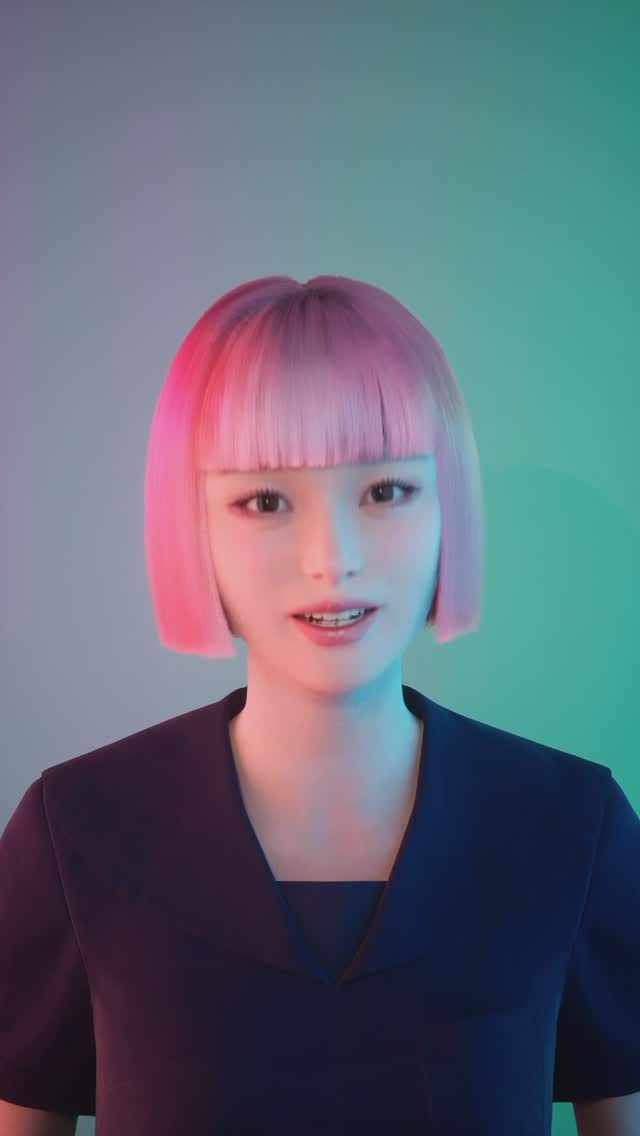
hi humans!🧠
ご存知の方もいると思いますが、今回abemaで新しく始まるハッシュタグハウスにゲームマスターとして参加させていただいておりますっ🧠⚡🏠
ゲームマスターって何?
って思うよね?
そう思った人は是非見てみてっ☺️
あたしもいろいろ初めてのことだったけど、ゲームマスターとして裏で見させてもらって、わぁインフルエンサーの裏側ってこんなにも大変でいろいろ考えてるんだって、本当に勉強にもなったし、感動もしたし、人間ドラマって楽しいなって思いました🥺
壮絶な戦い、ドラマを是非見てくださいっ🧠
Hi humans! 🧠
Some of you might already know? but I'm excited to announce that I'll be a game master in the new reality TV show HASHTAG HOUSE on Abema, a streaming platform in Japan! 🧠⚡🏠
What’s a game master... you ask?
You gotta watch it to find out ☺️
It’s all new to me too, but getting to observe from behind the scenes as a game master, I realized just how tough and thought-provoking the behind-the-scenes of being an influencer can be. It was really educational and inspiring. and I find out...human drama is pretty...fun!! 🥺
Don’t miss the INTENSE human drama, go watch it! 🧠
How imma.gram Made This Digital Human AI Portrait — and How to Recreate It
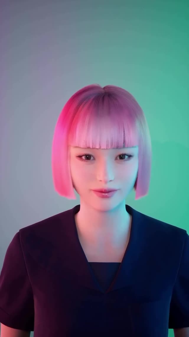
This image works because it borrows a familiar “clean corporate headshot” silhouette, then breaks expectation with candy-colored gel lighting and a perfectly controlled hair gradient. The result lands in a sweet spot: futuristic enough to stop the scroll, but simple enough to read instantly on a phone.
Why this look catches attention (without shouting)
There’s a quiet confidence in how little is happening: one subject, one jacket, one seamless background. That simplicity creates room for the color story to do the heavy lifting. A magenta key from the left and a teal kicker from the right turn a plain studio into a “tech aura” in a single glance. People don’t need to decode props or context—your brain gets the vibe immediately.
What really sells it is discipline. The haircut is geometric, the bangs are measured, the jacket is wrinkle-free, and the background is a smooth gradient with no distractions. In a feed full of messy real-world lighting, that level of control reads as premium. It also reads as intentional: viewers assume there’s a concept, a brand, and a larger story behind the image—even if the post is simply an announcement.
Finally, this is a strong example of “approachable futurism.” The face is softly lit and emotionally neutral, not alien or aggressive. The lighting is bold, but the shadows are gentle. That combo lowers threat and raises curiosity—exactly what you want when you’re inviting people to click, watch, or learn more.
Lock a two-gel setup: “magenta key left, teal rim right,” keep shadows soft
Premium control
Seamless gradient background, no props, clean wardrobe
Minimalism increases perceived production value and brand intention
Remove clutter; force “plain seamless wall, smooth gradient, no objects”
Human-friendly futurism
Soft expression, gentle contrast, mild bloom
Curiosity without intimidation improves click-through on announcements
Dial down contrast; add “gentle fill, low-contrast, subtle bloom”
Where this style fits (and where it doesn’t)
Best-fit scenarios
Show / launch announcement: The clean headshot reads as “official,” while the gels add “new season energy.” Change only the background hue to match your brand palette.
Virtual creator identity: If you’re building a consistent persona, this lighting becomes a recognizable signature. Keep the haircut and gel directions consistent across posts.
Product teaser (software / AI / audio): The teal-magenta look maps to “digital.” Swap the blazer for a simple tee or hoodie to match your audience.
Podcast guest card: Works great as a thumbnail—high readability at small size. Add text later in a separate layout, not inside the generated image.
Not ideal
High-emotion storytelling posts: This look is intentionally composed; it can feel too polished for raw confession-style content.
Outdoor lifestyle aesthetics: The studio gradient and gel lighting can clash with “sunlight realism” unless you fully commit to a stylized world.
Complex scene narratives: If your message needs props, setting, or action, this minimal portrait may under-communicate context.
The magic is the contrast between geometry and glow. The haircut is almost architectural—straight bangs, blunt edges, no flyaways—so it can hold bold color without looking messy. The face is shaded softly, with the kind of fill you’d use for a friendly interview, while the gels supply the “future” narrative. Because shadows are gentle, the image stays flattering even under saturated hues.
The background matters more than it looks. It’s not a flat gray; it’s a controlled gradient that leans teal on one side, giving the subject a halo of separation. That single move creates depth without adding objects. The wardrobe is equally strategic: a dark blazer absorbs attention and keeps your eye on the face and hair, letting the palette feel intentional instead of chaotic.
Observed → Recreate (evidence table)
Observed
How to recreate it (prompt + knob)
Magenta light from viewer-left, teal edge from viewer-right
Prompt: “magenta key left, teal rim right, soft gel lighting, gentle fill”; lower contrast / add bloom
Perfectly blunt bob with straight bangs
Prompt: “blunt chin-length bob, straight micro-fringe bangs, no layers, no waves”; tighten with negative prompt “no messy hair”
Seamless studio gradient background
Prompt: “plain seamless wall, smooth cool gray gradient, teal glow on right, no texture”; avoid props
Premium minimal wardrobe that doesn’t compete
Prompt: “tailored deep navy blazer, matte fabric, minimal wrinkles”; keep logos banned
Lighting direction: magenta-left key, teal-right rim, soft fill
Hair silhouette: blunt bob + straight bangs (no layers)
One-change rule
Once the baseline matches, change only one knob per run—either wardrobe, background hue, or expression. If you change hair, lighting, and lens all at once, you’ll never know what broke the vibe.
Example 4-step iteration sequence
Run 1 (match the structure): lock centered crop + blunt bob + seamless gradient; ignore exact colors.
Run 2 (match the gels): enforce “magenta key left, teal rim right,” lower contrast, add subtle bloom.
Run 3 (polish the palette): correct hair gradient (magenta → lavender) and background teal glow placement.
Run 4 (brand adaptation): swap wardrobe or background hue to your brand, keeping the same light directions.