Announcing the Invideo x Minimax Effects Challenge winners!
Thank you to everyone who entered. The talent was next level. After reviewing thousands of submissions, here are the top creators from the Invideo x Minimax Effects Challenge.
Most Creative Use (Gold) $1,500 cash prize
@crea.dei
Most Creative Use (Silver) $1,000 cash prize
@d_studioproject
Most Viewed (Bronze) $500 cash prize
@d_studioproject
Bonus Winners:
@mo_iai_ @Coccomeloni on X @prompt.soru @daengtinggi_83 @fashsplash.ai @gilang7211 @mahamdiayyoub @tchanully_ @emekaike_yakure on TikTok @aiternak
Congratulations to all the winners! Our team will be in touch shortly regarding your prizes.
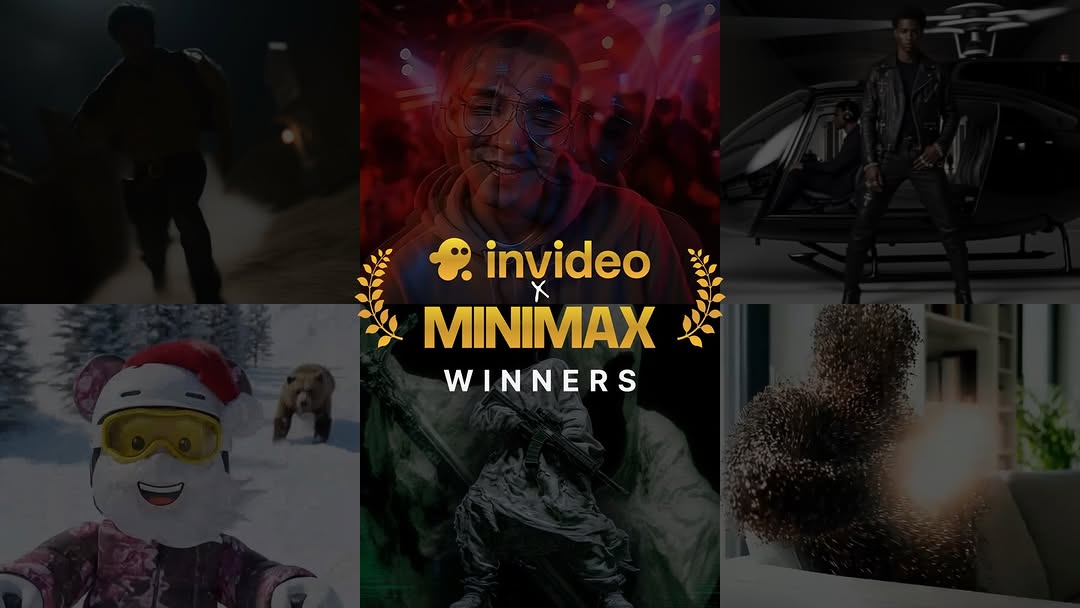
How invideo.io Built This Minimax Effects Challenge Winners Graphic
This image is not just an announcement card. It packages recognition, social proof, and content diversity into one shareable visual, which is why this format often outperforms generic brand updates.
Why this announcement style spreads
The strongest mechanism here is compressed proof. A single frame shows multiple creator outputs, signaling that the challenge was real, broad, and competitive. Viewers do not need to click through immediately to understand participation depth. That instant proof of activity improves trust in both brand and campaign legitimacy.
The second mechanism is status design. The central title stack with laurels creates a trophy-like visual language. It feels ceremonial without being overly formal. In creator ecosystems, recognition visuals are growth multipliers because winners repost them, participants compare them, and future participants imagine themselves inside them.
The third mechanism is genre diversity. The six-panel collage includes very different aesthetics: dark cinematic, portrait, fashion-tech, playful snow scene, abstract visual. This tells potential users that the tool supports many styles, which reduces perceived creative constraints and increases trial intent.
Signal
Evidence (from this image)
Mechanism
Replication Action
Participation Proof
Six distinct creator visuals in one composition
Shows challenge scale and output quality instantly
Use a multi-panel winners card instead of a text-only winner list
Recognition Symbolism
Laurel icons and "WINNERS" hierarchy in center
Adds prestige and motivates resharing by winners
Build one ceremonial lockup with consistent typographic hierarchy
Capability Breadth
Panels range from portrait to abstract to character style
Reduces fear that tool is limited to one niche
Curate finalists across contrasting visual categories
Brand Anchor
Centered brand names in high-contrast gold/white
Keeps campaign ownership clear during repost cycles
Place brand lockup in center column, not corner watermark
Where this format fits and where it does not
Best-fit scenarios
Challenge winner reveal: Best use case for celebrating outcomes while advertising capability range.
Community milestone recap: Works for hackathons, prompt battles, and creator tournaments.
Quarterly creator showcase: Useful for highlighting top user-generated outputs and inspiring new submissions.
Partnership activation recap: Effective when two brands need equal visibility in one asset.
Not ideal scenarios
Single hero launch: If one product visual must dominate, a collage can dilute focus.
Detailed educational tutorial: This style is celebration-first, not instruction-first.
Minimal luxury branding: Dense multi-panel storytelling can conflict with ultra-minimal brand language.
Transfers (exactly 3)
Hackathon Winners Board
Keep: multi-panel proof plus central recognition lockup.
Change: visual panels to product demos and prototype screenshots.
Aesthetic read: why this graphic feels credible and premium
The layout succeeds through center-weighted hierarchy. The middle column carries both emotional face detail and title lockup, while side panels provide breadth. This keeps the design readable on mobile: users first parse "who won," then scan visual evidence. Dark tonal treatment across panels creates cohesion despite style diversity. Gold accents and laurels inject achievement symbolism without requiring heavy decoration. The design is effective because it balances celebration and product proof in the same glance.
Observed
Concrete evidence
Recreate move
Center-first hierarchy
Title stack overlays middle column
Reserve center for lockup; keep side panels as supporting proof
Cohesive tonality
Most panels are dark with selective highlights
Apply one global grading direction before adding text
Recognition iconography
Laurel graphics around campaign title
Add one symbolic reward motif to reinforce achievement
Style diversity signal
Portrait, character, abstract, and cinematic scenes together
Pick finalists from different visual genres intentionally
"all realistic" / "all stylized" / "before-after pairs"
Remix execution playbook
Baseline lock
Center recognition lockup with clear hierarchy
Fixed panel count and grid structure
One unified color-grade direction across all panels
One-change rule
When optimizing, adjust one variable at a time: panel diversity, text scale, or accent color. If all three change together, performance attribution becomes noisy.
Four-step sequence
Run 1: Keep layout fixed, test panel curation (broad genre mix vs narrow style mix).
Run 2: Keep winning curation, test title scale for mobile readability.
Run 3: Keep typography winner, test one accent color variant (gold vs electric blue).
Run 4: Keep visual winners, test caption framing (celebration-first vs creator-credit-first).
Pre-publish checks
Can users understand the announcement in under one second?
Does the collage prove quality and variety at the same time?
Is brand ownership still obvious after screenshot reposting?