Where did your eyes go first… my face or feet? ❤️👇
Where did your eyes go first… my face or feet? ❤️👇
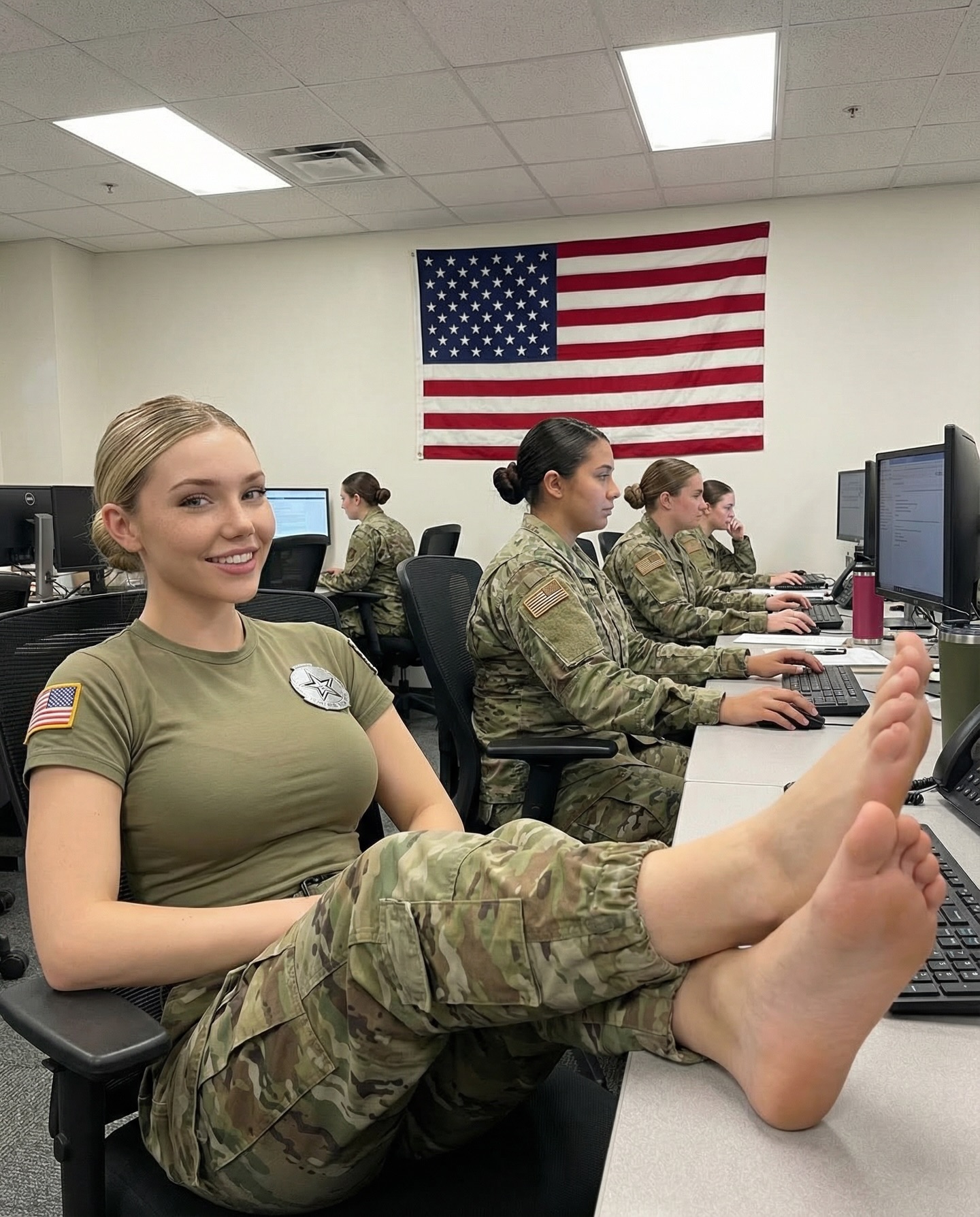
There are posts that win because they’re epic—and posts that win because they understand how people actually look at a screen. This one is a clean example: an office computer lab, a big wall flag, a relaxed foreground subject, and a caption that forces the viewer to admit where their attention went first.
The setting is routine on purpose: fluorescent ceiling panels, rows of monitors, people working in the background. That “real job” texture builds trust. Then the foreground breaks the rhythm with a single, obvious compositional cue: feet placed closest to the lens, creating instant depth and a strong visual hook.
The caption turns that visual hook into participation. “Where did your eyes go first… my face or feet?” isn’t asking for a thoughtful answer—it’s inviting a confession. Viewers reply because the prompt is binary, playful, and low-stakes. The comments become a game, not a debate.
Finally, the frame is readable at scroll speed: face on the left, foreground cue on the right, and a giant flag acting like a headline above the whole scene. It’s structured, not cluttered.
| Signal | Evidence (from this image) | Mechanism | Replication Action |
|---|---|---|---|
| Caption-as-confession | Binary question: “face or feet?” | Low-effort participation drives comments | Write a 2-option caption that references two visible focal points; keep it under 12 words |
| Foreground attention cue | One element placed closest to lens (strong perspective) | Viewers notice the cue, then realize they noticed it | Move one object/gesture 20–30% closer to camera than the face; lock camera angle low/neutral |
| Authenticity backdrop | Real office: monitors on, desks, people working | Believability increases shares and saves | Keep 3–5 “proof objects” (screens, phone, papers) visible; avoid studio cleanliness |
| Headline anchor | Large flag centered on the back wall | Instant context at scroll speed | Add one big background banner (flag/logo/board) above the subjects and keep it unobstructed |
Keep: real workplace background + monitors on.
Change: {foreground cue} (coffee mug, camera, clipboard), {caption pair}.
Slot template (EN): “office/workplace photo, {foreground_cue} closest to lens, subject smiling, busy background with screens on, overhead fluorescent lighting”
Keep: binary caption that references two visible points.
Change: {option A} vs {option B} (smile vs shoes, eyes vs badge, desk vs screen).
Slot template (EN): “Caption: ‘Be honest—{option_a} or {option_b}?’ Make both options clearly visible in the frame.”
Keep: headline banner above the scene.
Change: {banner} (flag, logo wall, schedule board), {room layout}.
Slot template (EN): “centered wall banner behind subjects, clean geometry, foreground subject left, depth cue on right”
Fluorescent office lighting is honest. It removes drama and makes the image feel documentary. That’s useful when your hook is a subtle composition trick rather than a cinematic look. The muted palette (olive/camo/gray) keeps the frame calm, while the flag provides a bold, high-contrast anchor that prevents the background from feeling bland.
Notice how the room stays legible: you can recognize the workstation rhythm, the monitors, the chairs. That legibility is part of the aesthetic—it’s what makes the moment feel like a real day, not a staged shoot.
| Prompt chunk | What it controls | Swap ideas (EN, 2–3 options) |
|---|---|---|
| Foreground cue | Creates the attention funnel | “feet on desk in foreground” / “coffee mug near lens” / “camera placed in foreground” |
| Workplace proof objects | Maintains authenticity | “monitors on with text UI” / “desk phone” / “papers on desk” |
| Background anchor banner | Instant context and hierarchy | “large wall flag” / “logo wall” / “schedule board” |
| Lighting profile | Keeps the documentary feel | “overhead fluorescent” / “neutral white balance” / “low contrast” |
| Depth-of-field choice | Keeps the room recognizable | “moderate depth of field” / “background readable” / “no extreme bokeh” |
portrait smartphone photo, office computer lab, single subject smiling in foreground, one strong foreground attention cue near lens, busy background with uniformed people working at computers, large wall flag behind, overhead fluorescent lighting, crisp documentary realismChange only 1–2 knobs per run. If you change the room layout, don’t also change the cue and the caption—otherwise you won’t know what made the post work.