Who wants an army girl? ❤️🥰
Who wants an army girl? ❤️🥰
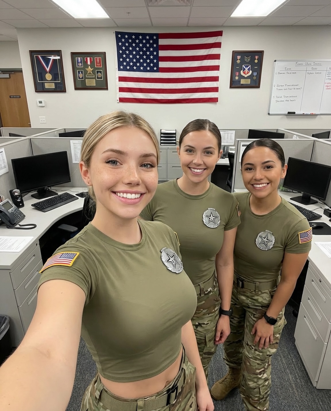
This post is proof that you don’t need scenery to get engagement—you need evidence. The trio smiles are the human layer, but the background is doing serious work: a large wall flag, framed medal displays, and a whiteboard note that reads like an inside reference (“Team Green”). Those cues make viewers pause, scan, and ask questions. And questions turn into comments.
When an image feels specific, audiences treat it as real. Here, the cubicle setting is unmistakable—gray partitions, desks, monitors, carpet. It’s not glamorous, which is exactly why the smiles feel authentic. The post reads like a quick moment captured during a normal day.
The wall composition adds “officialness” without needing any explanation. A big flag centered high functions like a header on a web page. The framed medal displays act like credibility badges. Even if viewers can’t name what they’re looking at, they can feel that it signals achievement and structure.
And then the micro-hook: “Team Green” on the whiteboard. It’s just legible enough to create curiosity. People love content that feels like they’re peeking into a team’s world.
| Signal | Evidence (from this image) | Mechanism | Replication Action |
|---|---|---|---|
| Background “header” element | Large flag centered on the wall above the trio | Creates instant hierarchy and improves thumbnail readability | Place one bold element in the top third (banner, logo wall, scoreboard) and keep it centered |
| Credibility frames | Framed medal/ribbon displays flanking the flag | Signals achievement; makes viewers zoom and scan | Add 1–2 “award/achievement” props (frames, certificates, trophies) in the background |
| Inside-reference text | Whiteboard includes “Team Green” | Creates curiosity and conversation (“what does that mean?”) | Include one short readable phrase on a board/sign; keep it subtle but legible |
| Trio formation | One anchor face in the foreground with two behind | Fast decoding; makes the scene feel like a friendly unit | Use “center/left anchor + two supports” and keep faces large in frame |
Recipe 1: “Kitchen scoreboard”
Recipe 2: “Gym challenge board”
Recipe 3: “Backstage call sheet wall”
What makes this look “official” isn’t the outfits—it’s the wall design. The centered flag acts like a title. The framed displays act like subheadings. The whiteboard note is the footnote. Meanwhile, the cubicles and monitors keep it grounded in real work. This is basically a well-designed slide, captured as a selfie.
| Observed (concrete) | How to recreate in prompt/control |
|---|---|
| Large header element centered high | “banner/flag centered in top third, aligned above subjects” |
| Two framed displays on both sides | “two framed award displays flanking the header” |
| Whiteboard phrase creates curiosity | “whiteboard with short phrase readable-ish (‘Team Green’)” |
| Office evidence remains visible | “cubicle partitions, monitors, keyboards, desk edges, office carpet” |
| Wide-angle selfie with an anchor face | “arm’s-length wide-angle selfie, one subject closest to lens” |
| Prompt chunk | What it controls | Swap ideas (EN, 2–3 options) |
|---|---|---|
| Header element clause | Hierarchy and clickability | “banner centered”, “logo wall”, “scoreboard above” |
| Credibility props | Why viewers zoom | “framed medals”, “certificates”, “trophy shelf” |
| Short readable phrase | Curiosity and comments | “Team Green”, “Week 12 Goals”, “Today’s Challenge” |
| Trio geometry map | Who anchors the frame | “left anchor”, “center anchor”, “one closer to lens” |
| Fluorescent lighting sentence | Legibility | “cool office lighting”, “soft window fill”, “even indoor light” |
vertical wide-angle smartphone selfie in a cubicle office, three women smiling with one anchor subject closest to lens, olive t-shirts with circular star chest patches and U.S. flag sleeve patches, multicam pants and web belts, large wall flag centered above them, framed award displays flanking the flag, whiteboard with “Team Green” note, gray partitions and monitors visible, cool fluorescent lighting, deep-ish focusKeep the wall hierarchy fixed while you change only one thing per run: swap the phrase, or swap the framed displays, or swap the trio’s expression energy. That’s how you build a repeatable format that still feels fresh.