🇮🇩
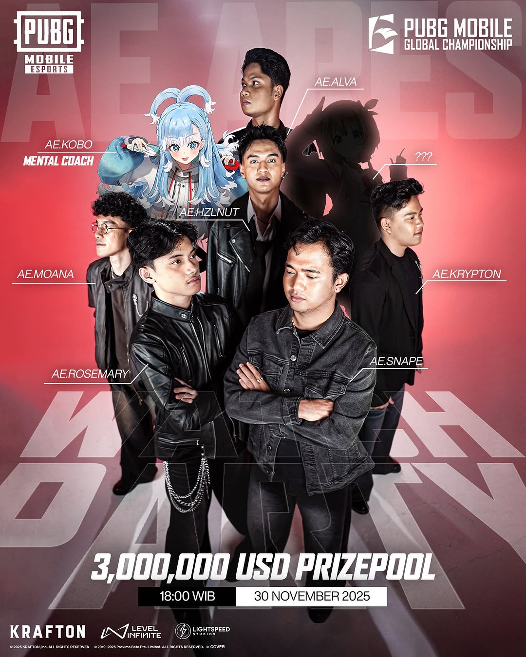
COACH KOBO otw gembleng & kasih moral support buat @alteregoesports sebagai tim Indo satu-satunya geyzt di PUBG Mobile Global Championship 2025! lets go kobokerz kita nobar di YouTube tanggal 30 nanti 😎
#PMGC2025 #NORESTFORARES #PUBGMESPORTS #PUBGMOBILEINDONESIA #PR
Why kobokanaeru Went Viral With This PMGC 2025 Alter Ego Post
This visual works because it combines three communities in one frame: esports fans, anime-adjacent internet culture, and creator-fan audience. The player lineup gives competitive credibility, while the mascot and mystery silhouette create story hooks beyond match performance.
For creators and teams, this is a strong reminder: championship posts should not just inform. They should worldbuild.
Why this can go viral
The first mechanism is layered identity design. Real players, a virtual mascot, and an unknown slot create conversation loops (“who is ???”, “why this coach character?”, “which role each player?”). Curiosity expands comments.
The second mechanism is commercial clarity. Prize pool and date are large, so the post works as both hype content and functional event reminder. Utility plus hype usually drives better save behavior.
Signal
Evidence (from this image)
Mechanism
Replication Action
Narrative layering
6 players + mascot + mystery silhouette
Creates speculation and repeat viewing
Add one unresolved element to roster visuals
Information hierarchy
Top logos, center cast, bottom prize/date strip
Viewers get story and schedule in one read
Design clear top-middle-bottom content blocks
Visual authority
Red-black championship palette with bold typography
Signals high-stakes tournament context
Use one dominant event color system consistently
Best-fit scenarios
Tournament reveal posters: ideal for major event entry announcements.
Roster identity campaigns: strong for introducing team personality.
Watch-party promotions: useful when time/date must remain visible.
Cross-culture esports branding: works when anime/virtual elements are part of fandom language.
Not ideal
Simple single-player stat recaps.
Minimalist luxury branding styles.
Posts where full readability must survive tiny thumbnail sizes only.
The design is effective because it balances aggression with structure. Black outfits unify the team silhouette, while red background energy pushes urgency. White typography gives clear anchors so the frame never becomes visual chaos. The mascot injects color contrast and cultural flavor without breaking brand coherence.
Observed
Recreate
Why it matters
Pyramid depth lineup
Place one lead foreground figure with staggered supporting cast