💐New Original Song Coming Soon✨ Lagu yang aku buat dengan para membership ku 🩵 #KoboFondMemories
💐New Original Song Coming Soon✨ Lagu yang aku buat dengan para membership ku 🩵 #KoboFondMemories
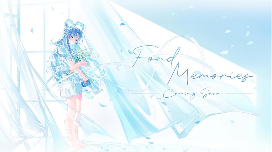
This image is a strong pre-release cover because it sells mood before information. The pale blue-white world, flowing curtains, and handwritten title immediately signal emotion and memory. Viewers do not need details about tempo or genre to understand the feeling: this project is gentle, reflective, and personal.
The composition is also built for announcement clarity. Character on the left, title on the right, and plenty of breathing room in between. That separation keeps the poster readable in both feed and story crops. For music creators, this is crucial: teaser art must carry identity fast, even at small thumbnail size.
| Signal | Evidence (from this image) | Mechanism | Replication Action |
|---|---|---|---|
| Mood-first positioning | High-key pastel scene and nostalgic title phrase “Fond Memories” | Emotional framing increases save and anticipation behavior | Lead with atmosphere in teaser phase, not dense factual copy |
| Clear layout hierarchy | Character left, title/subtitle right | Fast scan path improves readability on mobile | Split hero art and text zones early in composition planning |
| Signature palette consistency | White + pale cyan with selective deep blue accents | Color coherence builds visual identity memory | Restrict teaser palette to one primary family plus one accent depth tone |
| Motion-in-still illusion | Flowing curtains and drifting particles | Subtle movement cues make static art feel alive | Add 2-3 directional flow elements even for still announcement images |
Keep: left-character/right-title layout and high-key softness.
Change: palette from cyan to lavender or peach for different song tone.
{character_left}, {title_right}, high-key pastel {palette}, subtitle='Coming Soon'Keep: flowing fabric and airborne particles.
Change: indoor window to seaside balcony or train window scene.
airy scene with flowing cloth, drifting particles, nostalgic teaser typographyKeep: script typography hierarchy.
Change: wording for campaign stage (teaser, pre-save, out now).
main script title '{campaign_title}', secondary script '{campaign_stage}', elegant spacingThe most effective choice here is controlled softness. The image avoids hard edges and strong shadows, which supports the emotional concept of memory. Curtains and ribbons act like visual echo lines, guiding the eye while reinforcing fragility and tenderness. This is a useful design language for songs centered on nostalgia, gratitude, or fan connection.
Typography also does more than label. The handwritten script mirrors the flowing shapes in the art, so text feels integrated rather than pasted on top. For creators, this is a high-leverage lesson: match text style to motion language in the image.
| Observed | How to Recreate |
|---|---|
| High-key pastel atmosphere with low contrast | Use diffused light prompts and limit dark-value density |
| Left-anchored character leaves right text zone | Compose with explicit thirds and reserved copy area |
| Flow cues from curtains and particles | Add directional fabric motion and light particle drift |
| Script typography harmonizes with image curves | Choose calligraphic font style that follows scene rhythm |
| Prompt chunk | What it controls | Swap ideas (EN, 2-3 options) |
|---|---|---|
| single blue-haired anime character in airy dress | Hero identity and emotional tone | "silver-haired" / "short bob" / "twin-tail variant" |
| window + flowing translucent curtains | Motion feeling and atmosphere | "sheer fabric ribbons" / "paper streamers" / "light fog drifts" |
| high-key cyan-white palette | Nostalgic softness and brand consistency | "lavender-white" / "peach-cream" / "mint-ivory" |
| left character / right script title layout | Announcement readability and hierarchy | "center title" / "top-right title" / "bottom-right title" |
| coming-soon subtitle with thin divider lines | Campaign stage cue and polish | "pre-save now" / "release date" / "out now" |
This lets you identify whether engagement lift comes from copy stage, color mood, or motion cues.