How kyraonig Made This Floral Trends Editorial Cover — and How to Recreate It
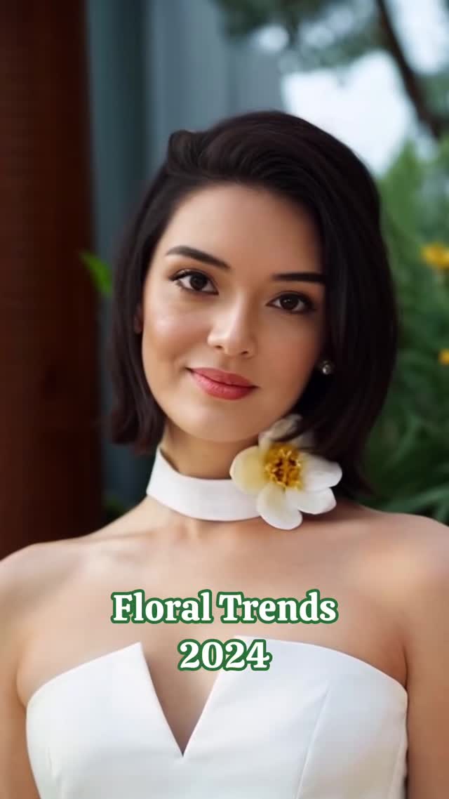
This kind of image performs like a clean “promise slide.” Before anyone reads your caption, the frame already tells them what they’re getting: a trend roundup, a refined aesthetic, and a calm, confident tone. The model’s expression is friendly but not goofy, the styling is minimal, and the headline is readable on a phone. It’s not trying to entertain—it’s trying to make your content feel trustworthy.
That’s why it works for growth. People share and save content that looks like it will make them smarter (or make their taste look better). A high-end editorial portrait plus a simple, specific headline turns a long caption into something that feels skimmable. The image becomes the packaging for the idea.
Why this format gets saved (and how to rebuild the same effect)
| Signal |
Evidence (from this image) |
Mechanism |
Replication Action |
| Clear promise headline |
“Floral Trends 2024” is short, centered, and high-contrast |
Instant topic clarity = more saves, because viewers expect structured info |
Keep the headline to 3–6 words, reserve the lower third, and use one readable display font |
| Editorial credibility |
Photoreal portrait, clean retouch, shallow depth of field |
“Magazine” cues make the content feel curated (not random) |
Lock portrait lens feel (70–105mm) and add “editorial fashion photography, crisp eyes, creamy bokeh” |
| A single iconic prop |
White orchid choker is the only statement accessory |
Creates a memorable symbol tied to the topic (florals) without clutter |
Use one hero prop that matches the theme; forbid extra accessories in the prompt |
| Quiet background |
Greenery is blurred; edges are simple |
Attention stays on face + headline, improving thumb-stopping readability |
Push background blur and keep the palette limited to 2–3 dominant colors |
Best-fit scenarios
- Trend carousels: use this as Slide 1, then follow with numbered “micro-trends” on Slides 2–8. Keep the cover minimal.
- Pinterest pins: the portrait + headline reads like a magazine cover, which is a native Pinterest language. Slightly enlarge the text for pin layouts.
- Newsletter headers: works as a banner when you keep the subject centered and avoid busy props.
- Brand moodboards: post a “seasonal direction” cover, then show styling examples underneath.
Not ideal
- Comedy-first pages: the polished tone can feel too serious unless you deliberately subvert it.
- Dense educational topics: if your content needs charts or multi-step logic, a single headline may overpromise.
- Product-heavy launches: this composition prioritizes face and mood; product details will get ignored.
Transfers (exactly 3)
-
Recipe 1: Change the flower language
- Keep: editorial portrait, shallow DOF, clean lower-third headline, neutral dress
- Change: flower type + accessory placement (choker → hair clip → corsage)
- Slot template: “{portrait_subject} in {neutral_wardrobe} with {flower_accessory}, headline: {trend topic + year}”
-
Recipe 2: Swap the wardrobe silhouette
- Keep: lighting, lens feel, background blur, headline style
- Change: outfit silhouette and fabric (blazer, slip dress, knit set)
- Slot template: “editorial portrait, {silhouette} in {fabric}, {one hero prop}, lower-third headline: {topic}”
-
Recipe 3: Turn it into a series cover system
- Keep: composition grid (face top half, text bottom third), limited palette
- Change: headline topic and accent color (green → blue → burgundy) per episode
- Slot template: “same portrait style, accent color {color}, headline: {series name + episode topic}”
Aesthetic read (what you should copy, not just admire)
The power here is restraint. The dress is white and simple, which gives the headline room to be the only “graphic.” The greenery behind the subject provides a soft fashion-context cue (fresh, seasonal) without pulling focus. And the orchid choker is basically a visual keyword: it makes the topic feel embodied, not just typed.
If you want your AI images to feel premium, stop adding things. Pick one hero prop, one fabric story, and one lighting story. Then protect those choices across every variation. Consistency is what turns a single good image into a repeatable content format.
| Observed |
Evidence in the image |
Recreate instruction (prompt knob) |
| High-key minimal styling |
White dress + white choker; no extra jewelry |
“neutral wardrobe, minimal accessories, one statement prop only” |
| Portrait-lens polish |
Face feels natural; background melts into bokeh |
“85mm portrait feel, shallow depth of field, creamy bokeh, crisp eyes” |
| Theme embodied as prop |
Orchid choker visually screams ‘floral’ |
“hero flower accessory (orchid), placed at neck, realistic petals” |
| Readable headline system |
Lower-third centered serif text with subtle outline |
“lower-third headline, one display font, subtle outline/emboss for readability” |
| Limited palette |
White + green dominates; yellow is a small accent |
“2–3 dominant colors, clean contrast, avoid neon accents” |
Prompt technique breakdown (build it like a layout system)
| Prompt chunk |
What it controls |
Swap ideas (EN, 2–3 options) |
| Subject casting |
Age vibe, confidence level, relatability |
“editorial model”, “approachable lifestyle creator”, “androgynous fashion muse” |
| Wardrobe silhouette |
Formality and season signal |
“tailored blazer”, “silk slip dress”, “knit co-ord set” |
| Hero floral prop |
Theme clarity without extra text |
“orchid choker”, “rose hair clip”, “daisy corsage” |
| Background cleanliness |
Readability of the headline and premium feel |
“blurred garden”, “soft studio backdrop”, “window-side greenery bokeh” |
| Lighting direction |
Beauty vs drama |
“soft window light”, “overcast outdoor light”, “gentle golden hour” |
| Typography rule |
Whether it reads like a magazine cover |
“serif headline”, “all-caps modern serif”, “classic editorial display font” |
A reusable cover prompt skeleton
editorial portrait, {subject}, {neutral wardrobe}, {one hero prop},
soft window daylight, 85mm portrait feel, shallow depth of field,
leave lower-third space, headline: “{topic} {year}”, serif display font
Remix steps (a quick playbook)
Baseline lock
- Grid: face in the top half, headline anchored in the lower third.
- Lens + blur: portrait compression and creamy bokeh.
- Theme prop: one floral accessory that carries the topic.
One-change rule
Change only one or two variables per run (prop OR background OR headline). If you swap everything, you lose the system.
Example 4-step iteration sequence
- Run 1: match the template exactly (white wardrobe, orchid choker, green serif headline).
- Run 2: change only the headline topic (e.g., “Summer Fabrics 2024”).
- Run 3: change only the hero prop (orchid → rose) while keeping lighting and lens constant.
- Run 4: change only the background setting (garden → studio) and keep the palette limited.