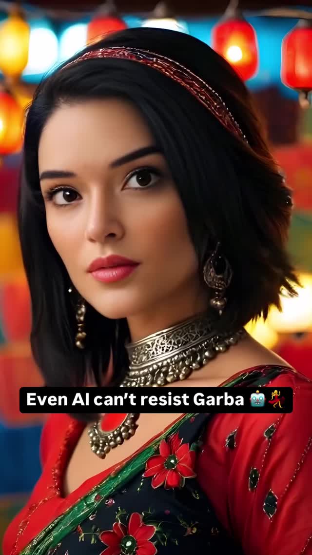
Even I couldn’t resist Garba 🤖💃
Even I couldn’t resist Garba 🤖💃
This post is a smart mashup: a glamorous festival portrait plus a cheeky self-aware line that reminds you the subject is AI. You get tradition, pop energy, and a little wink—all in one frame.
The caption is the hook, but the image is the proof. “Even AI can’t resist Garba” lands because it’s specific (Garba is not a generic “dance” word) and playful (the robot + dancer emojis turn it into a meme). Specificity makes people pause; playfulness makes them share. It also gives the audience a clear comment path: they can tag friends, name the festival vibe, or respond with their own “AI can’t resist…” remix.
Visually, this is classic portrait psychology: sharp eyes, soft skin rolloff, and a background that looks expensive. Lantern bokeh does two jobs at once—it signals celebration, and it creates a depth layer that makes the subject feel “real” even when you know it’s generated. The jewelry and red blouse are high-contrast anchors that read instantly at thumbnail size, while the teal background keeps the reds from overwhelming the frame.
The most underrated decision is the caption placement: a single black pill at the bottom. It feels native to social platforms, doesn’t fight the face, and gives the viewer something to read after they’ve already decided the image is beautiful. That sequencing—beauty first, wink second—is why it’s sticky.
| Signal | Evidence (from this image) | Mechanism | Replication Action |
|---|---|---|---|
| Cultural specificity | Uses “Garba” (not generic “dance”) | Specific references create identity-based sharing and tagging | Pick one precise cultural cue (dance/style/holiday) and commit visually |
| Cinematic depth | Lantern bokeh + sharp eyes | Premium look increases dwell time and perceived effort | Lock “85mm portrait, shallow DOF, warm lantern bokeh” |
| Self-aware twist | “Even AI can’t…” + emojis | Meta captions invite remixes and playful comments | Write a “meta line” that’s easy to copy: “Even AI can’t resist {thing}” |
| Readable caption UI | Black pill bottom caption, clean font | Reduces friction; feels native to Reels/Stories aesthetics | Use a single caption block; keep it off the face and high contrast |
Transfer 1: Street-festival neon portrait
Transfer 2: Wedding-season elegance
Transfer 3: Dance challenge cover
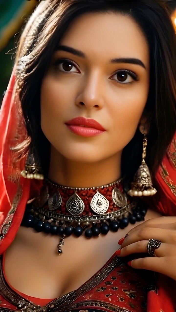
This image is built on contrast: warm reds and amber lanterns against a cooler teal backdrop. That pairing keeps the palette festive but not flat. The jewelry is dense and reflective, which gives micro-sparkle and “handmade” richness—exactly what you want for a cultural celebration vibe. The red headband quietly echoes the blouse so the look feels intentional from top to bottom.
Technically, it’s a portrait you can trust: the eyes are the sharpest point, skin is softly rolled off (no harsh pores), and the background is abstracted into light shapes. That’s a proven recipe for scroll-stop glamour.
| Observed | How to recreate it (prompt + knob) |
|---|---|
| Lantern bokeh celebration cue | Prompt “hanging lanterns, warm bokeh circles, teal ambient background”; use shallow DOF |
| Red + teal palette balance | Lock dominant reds in wardrobe; add “teal background accent” to prevent monotone warmth |
| Jewelry reads expensive | Specify “oxidized-silver engraved choker, layered necklace, ornate earrings”; increase specular realism |
| Face-first hierarchy | Keep eyes as the sharpest focus point; avoid text over the face |
| Caption feels native | Use a single bottom pill; bold white sans-serif; short line with emojis if desired |
| Prompt chunk | What it controls | Swap ideas (EN, 2–3 options) |
|---|---|---|
| Background practicals (bokeh) | Festive context and perceived production value | “lantern bokeh” / “fairy lights bokeh” / “neon sign bokeh” |
| Wardrobe color anchor | Thumbnail readability and mood | “red blouse” / “emerald outfit” / “golden sari” |
| Jewelry specificity | Authentic-looking detail density | “oxidized silver choker” / “gold filigree set” / “minimal pearl set” |
| Lens + DOF | Portrait hierarchy: eyes sharp, background abstract | “85mm shallow DOF” / “50mm natural portrait” / “close crop beauty shot” |
| Caption UI block | How meme-like vs editorial the post feels | “bottom black pill” / “top headline” / “no text, caption-only” |
{bottom_caption_text} in a black rounded rectangle, cinematic 85mm portrait, sharp eyes, warm lantern bokeh background with teal ambient tones, festive wardrobe with one bold color, ornate jewelry, soft warm key lightChange one knob at a time: either the caption line, the wardrobe color, or the background bokeh type. Keep the lens/DOF constant so your series feels like it belongs together.