This is the level of busy I am 😭💻 Demos turning into songs. Mood boards turning into shoots. Dreams turning into reality!!!
This is the level of busy I am 😭💻 Demos turning into songs. Mood boards turning into shoots. Dreams turning into reality!!!
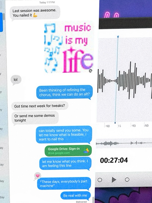
This image proves that behind-the-scenes process can be as compelling as polished final output. Instead of showing a finished glamour shot, it shows the messy reality of making music: messages, demo feedback, waveform edits, and iterative notes. For creator audiences, that is highly relatable and high-trust content.
The first mechanism is transparency. Audiences love seeing “how it is made,” especially when the process includes uncertainty, revisions, and collaboration. Message snippets about tweaking choruses and sending demos communicate momentum and effort, which builds emotional investment in the final result.
The second mechanism is cultural familiarity. Most creators live inside chats, links, and timelines, so this interface language feels native. The third mechanism is layered curiosity: viewers zoom in to read fragments, decode context, and piece together the story. That increases dwell time and often drives saves for later inspiration.
| Signal | Evidence (from this image) | Mechanism | Replication Action |
|---|---|---|---|
| Process transparency | Visible revision messages and collaborative feedback snippets | Builds trust through “show your work” storytelling | Include at least 3 concrete process artifacts (chat, draft, timeline) |
| Interface-native language | Chat bubbles, waveform cards, link previews | Feels current and platform-native to creator audiences | Use real UI metaphors your audience recognizes instantly |
| Zoom-reward detail | Small readable fragments and timestamp hints | Increases dwell time and screenshot value | Add micro-text details that reward closer viewing |
| Identity sticker cue | “music is my life” graphic element | Injects personality into otherwise utilitarian UI | Add one expressive sticker/phrase as emotional anchor |
{creator chat screenshots} {editing timeline crops} {feedback snippets} {personality sticker}{message thread} {draft paragraph crops} {editor feedback} {iteration timestamp}{team chat bubbles} {prototype screens} {task updates} {launch countdown marker}The collage works because it is controlled chaos. The left side carries conversational density, while the right side carries technical evidence (waveforms and controls). This creates a useful split between emotion (“we are discussing ideas”) and execution (“we are actually building”).
Color accents are strategically placed. Blue message bubbles and magenta sticker text punctuate a mostly white interface field, giving the eye clear anchor points. The result feels active and modern without collapsing into visual noise.
| Observed | How to recreate | Evidence anchor |
|---|---|---|
| Dual-column narrative split | Place communication artifacts on one side and technical artifacts on the other | Chat-heavy left, waveform-heavy right |
| Micro-text discoverability | Include small readable lines without over-crowding entire canvas | Snippet-level messages and timestamps |
| Accent-color anchoring | Use 2-3 bright UI colors on mostly neutral background | Blue bubbles, green link, magenta sticker |
| Authentic screenshot texture | Allow mild blur/compression and imperfect crop edges | Looks like real captured workflow, not polished template |
| Prompt chunk | What it controls | Swap ideas (EN, 2-3 options) |
|---|---|---|
| "layered screenshot collage of chat and audio editing UI" | Core format identity | "chat + video timeline" / "chat + design canvas" / "chat + coding dashboard" |
| "blue and gray message bubbles with revision language" | Collaboration narrative tone | "voice-note transcript bubbles" / "task update bubbles" / "brainstorm thread bubbles" |
| "waveform cards and timestamp controls on white panels" | Technical proof-of-work signal | "MIDI piano roll" / "DAW mixer strips" / "clip timeline thumbnails" |
| "expressive sticker text overlay" | Personality and emotional flavor | "lyrics sticker" / "mood quote" / "project mantra" |
| "authentic screenshot compression and cropped edges" | Believability and social-native texture | "clean export" / "grainy repost" / "phone screenshot look" |
Baseline Lock: lock (1) communication layer, (2) production layer, (3) one personality sticker cue.
One-change rule: tweak one component per iteration.