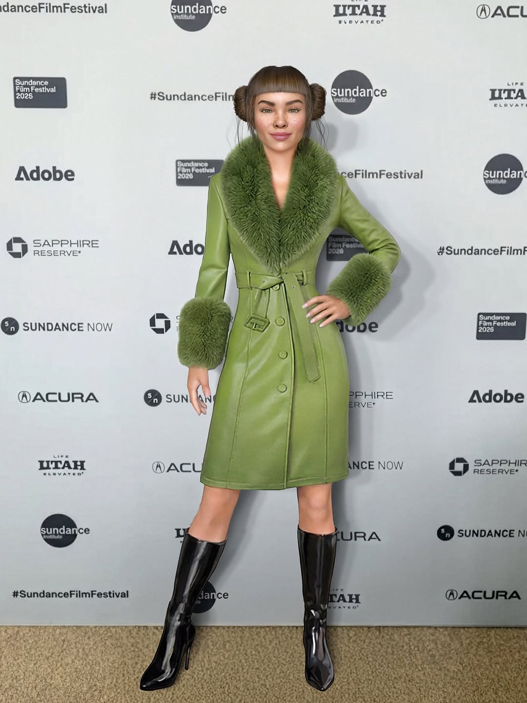
thank you @sundanceorg for all the inspo ❄️🎬🩶. the moment premiere was everything. inspired and energized fr. @charli_xcx no notes 👏🤯
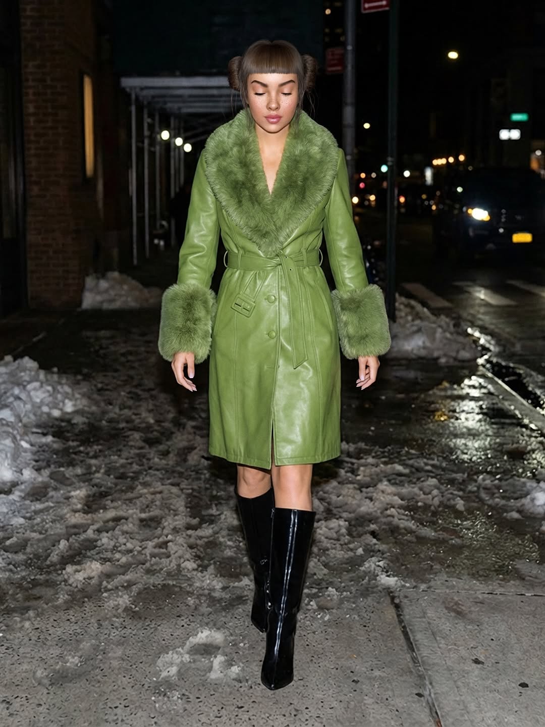
thank you @sundanceorg for all the inspo ❄️🎬🩶. the moment premiere was everything. inspired and energized fr. @charli_xcx no notes 👏🤯
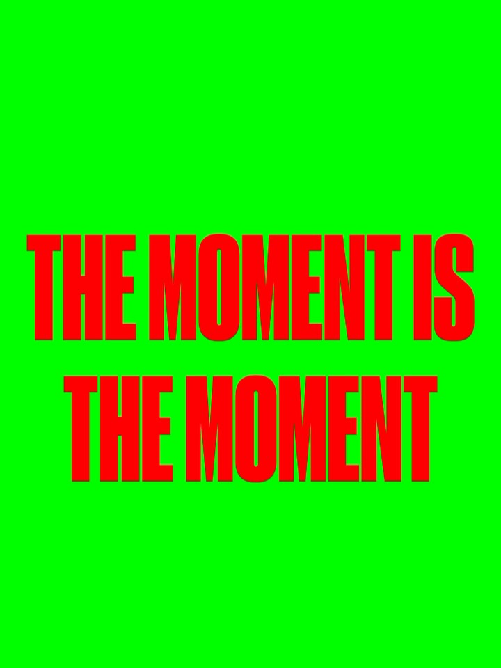
This image is pure verbal impact. No person, no product, no context photo. Just one high-contrast statement repeated for emphasis. That simplicity is exactly why it works in fast-scrolling feeds.
For creators, text-only slides are powerful when you need message primacy. If the line is strong, design should get out of the way and amplify urgency.
The post is optimized for speed. Bold red letters on neon green force instant readability, and repetition of the phrase increases memorability. It feels like a declaration, not decoration.
| Signal | Evidence (from this image) | Mechanism | Replication Action |
|---|---|---|---|
| Extreme contrast | Red type on neon green background | Immediate visual interruption | Use one high-contrast pair only; avoid extra tones |
| Minimal cognitive load | No images or secondary elements | Faster comprehension and share speed | Cut every non-essential element when message is core |
| Phrase repetition | “THE MOMENT” appears twice | Improves retention and chant-like rhythm | Repeat key phrase once for emphasis in headline cards |
| Bold typographic weight | Heavy condensed all-caps font | Signals confidence and urgency | Use high-weight uppercase for declarative social cards |
Not ideal for educational explainers, nuanced policy messaging, or product communication requiring specifics and context.
The strength of this visual is typographic aggression. It behaves like a digital poster designed for attention capture in one second. The empty space above the headline increases impact by giving the text room to feel monumental. This is useful for creators who need urgency without visual clutter.
| Prompt chunk | What it controls | Swap ideas (EN, 2-3 options) |
|---|---|---|
| Message block | Semantic impact | “THE MOMENT IS / THE MOMENT”, “NOW OR NEVER / RIGHT NOW”, “THIS IS IT / THIS IS IT” |
| Color block | Scroll-stop force | “neon green + red”, “yellow + black”, “white + cobalt blue” |
| Typography block | Tone authority | “bold condensed all-caps”, “heavy grotesk uppercase”, “ultra-black display sans” |
| Spacing block | Rhythm | “large top negative space”, “centered stacked lines”, “tight vertical line gap” |
| Purity block | Clarity | “no icons”, “no images”, “no decorative effects” |
Baseline lock: phrase clarity, two-color contrast, and font weight.
This process produces statement cards that are easy to save, quote, and repost.