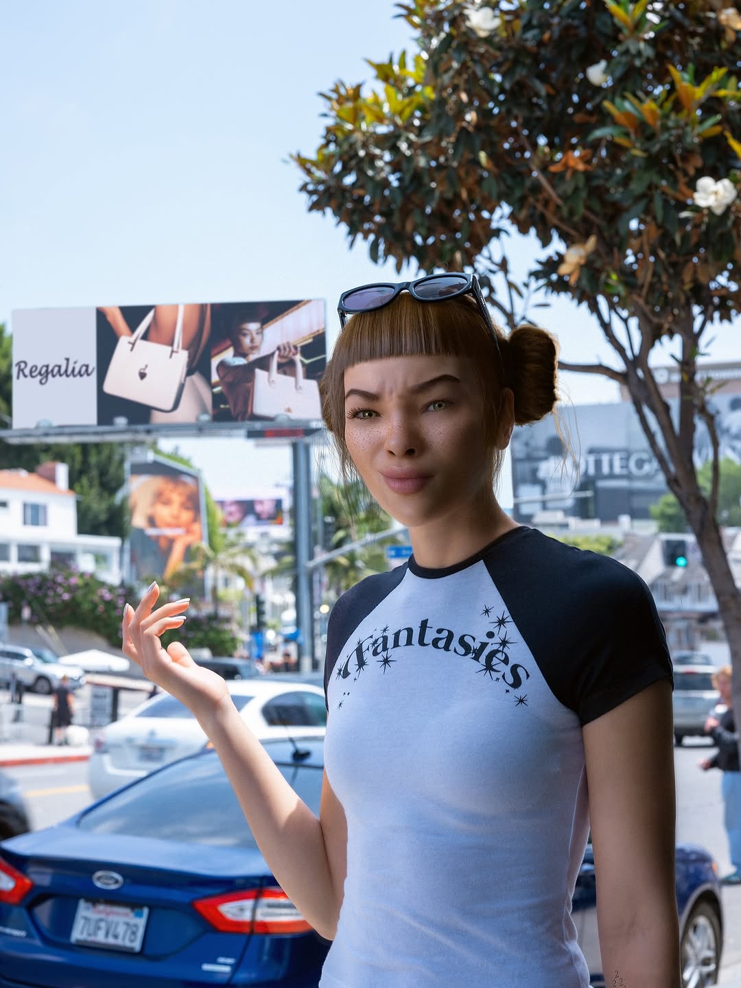
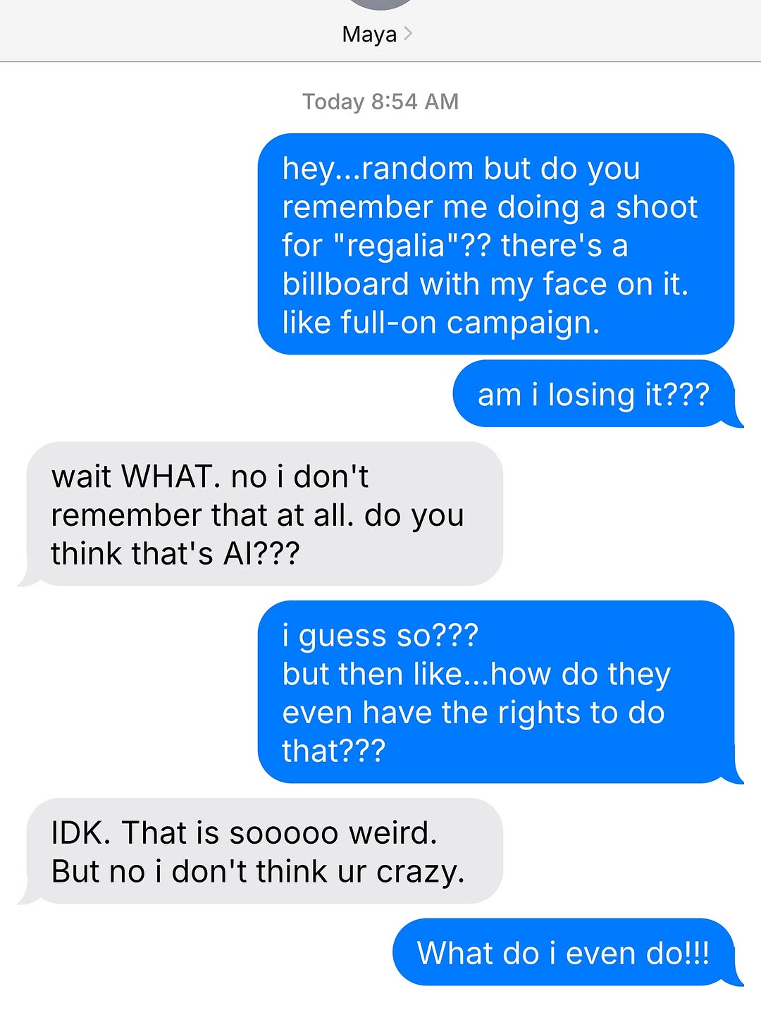
saw this billboard and nearly passed out. that’s me… right?? but i don’t remember taking this photo. and i definitely don’t remember saying yes to this brand?? texted my bff like...did i black out an entire campaign shoot?? (ok i’ve been busy but still.) i’m 99% sure it’s a deepfake and honestly? i’m freaking out. it’s giving violated!! it’s giving glitch!! it’s giving i need a HUG!!
How lilmiquela Framed This Deepfake Billboard Shock AI Portrait — and How to Recreate It
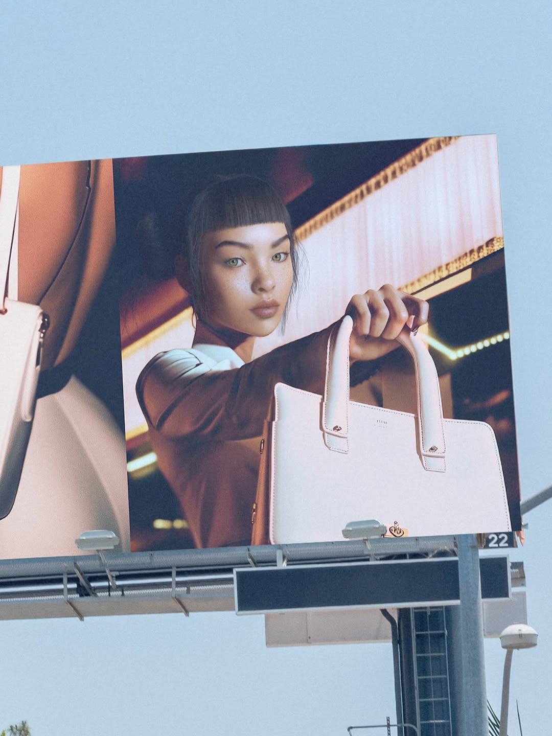
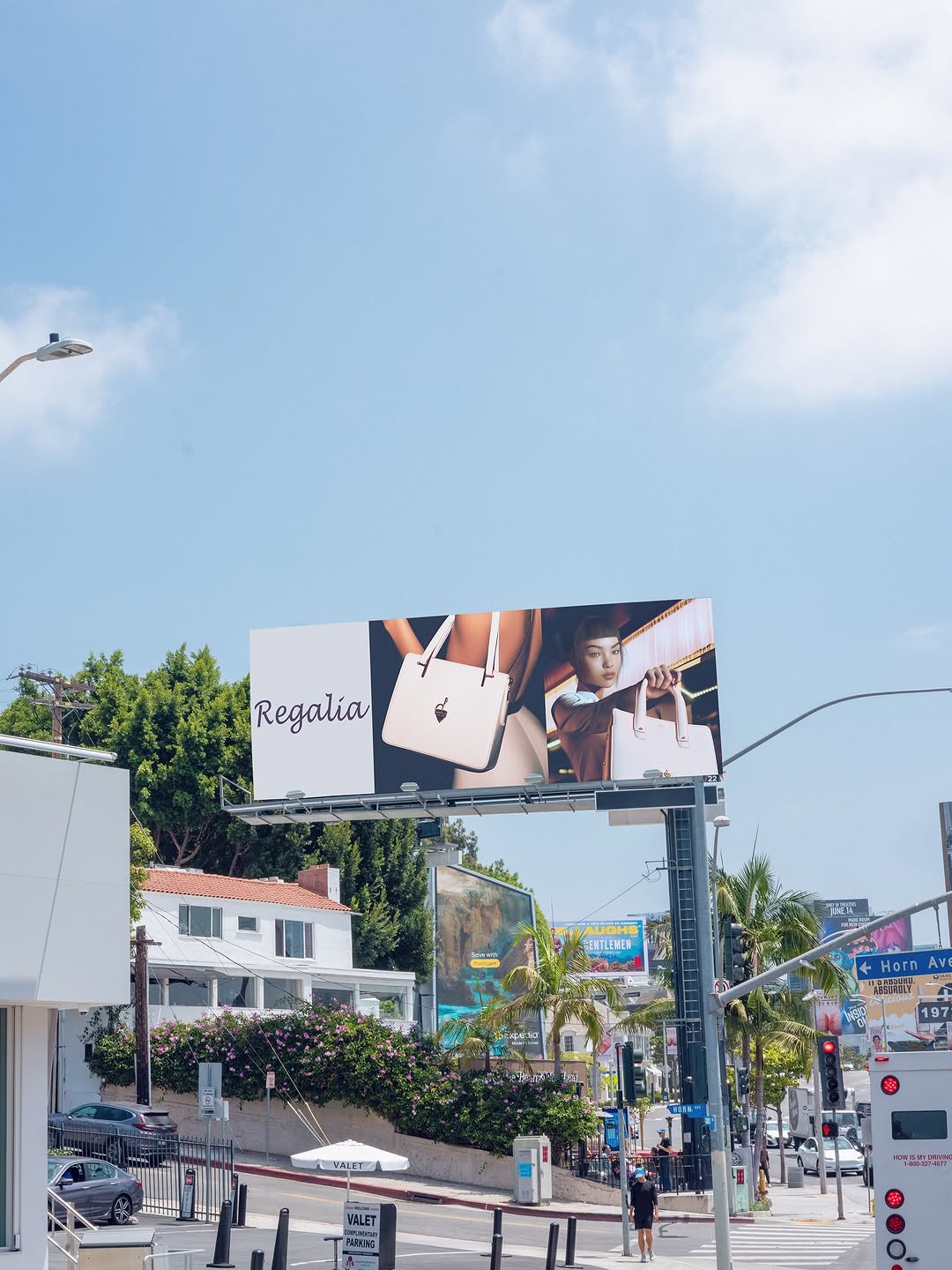
This image does something smart: it does not only show a fashion ad, it shows the ad in the real world. That "media in context" approach adds status, scale, and social proof in one frame. For creators and small brands, this is a powerful content format because it turns one campaign asset into a second narrative asset.
Instead of posting the clean studio creative alone, the photographer captures the billboard structure, sky, and angle from the street. That extra context tells viewers, "this campaign exists beyond the feed." It feels bigger, more public, and therefore more memorable.
Why It Can Drive Reach and Saves
The key mechanism is scale transfer. A normal product image might communicate design quality, but a billboard shot communicates cultural presence. Viewers read the post as an event, not just a product drop. Another mechanism is layered visual storytelling: there is an ad image inside a real photograph, which creates a frame-within-frame effect that naturally holds attention longer.
The low-angle composition contributes to perceived importance. Shooting upward increases monumentality and makes the brand object feel aspirational. At the same time, visible brackets and support hardware keep the image grounded in reality. This blend of aspiration plus proof is exactly what makes brand content more shareable.
Signal
Evidence (from this image)
Mechanism
Replication Action
Scale Proof
Large billboard occupies most of frame
Converts product post into brand-presence post
Capture assets in public placements (billboards, transit panels, storefront windows)
Frame-Within-Frame
Fashion portrait exists inside billboard shot
Adds visual depth and longer dwell time
Shoot campaign media through a second contextual frame whenever possible
Aspirational Perspective
Low-angle upward composition
Increases perceived significance and premium feel
Place camera below eye level and tilt up for hero framing
Authenticity Cues
Visible mounting brackets and support pole
Signals this is a real-world capture, not a mockup
Keep practical infrastructure details in frame instead of cropping them out
Use Cases and Adaptation Paths
Best-fit scenarios
Brand campaign announcements: ideal for signaling market presence; change angle and time of day for series variation.
Fashion accessory launches: product remains visible while context adds prestige; change billboard creative across carousel.
Creator partnership recaps: shows tangible media placement; change caption to process story and behind-the-scenes notes.
City-style content channels: combines architecture and branding naturally; change location backdrops for recurring visual identity.
Not ideal
Detail-first ecommerce posts: billboard distance can hide product texture details.
Tutorial explainers: environmental context may distract from instructional clarity.
Low-budget local promos without placement: forced imitation can feel inauthentic if context is fake.
Three transfer recipes
Transit-screen transfer Keep: real-world media placement framing Change: billboard to subway digital panel or bus shelter ad
Template: {city_media_surface}, low-angle capture, campaign image visible, practical structure details
Storefront poster transfer Keep: frame-within-frame concept and daylight context
Change: large outdoor board to storefront window print
Template: {storefront_display}, real street reflection, campaign portrait, product hero in center
Event backdrop transfer Keep: scale and proof cues
Change: billboard support hardware to event truss and lighting rigs
Template: {event_installation}, campaign visual in public context, candid documentary perspective
Aesthetic Read: Why This Feels Premium
The image succeeds by contrasting two visual worlds. Outside the billboard, we have clean daylight and minimal urban structure. Inside the billboard, we have controlled editorial lighting and polished fashion styling. That contrast makes the campaign feel both aspirational and physically present. It is not trapped in digital space.
Compositionally, the sky acts as negative space, giving the billboard room to dominate. The slight off-center crop and left-edge panel fragment prevent the image from feeling like a sterile architectural photo. These small asymmetries make the capture feel lived and believable. For creators, this is a strong lesson: perfection is less important than contextual truth.
Observed
How to Recreate
Why It Matters
Billboard dominates against open sky
Use large negative sky area and keep structure high in frame
Boosts scale perception
Product-forward pose within ad creative
Feature subject extending product toward camera in campaign design
Maintains clear commercial message
Visible installation hardware
Leave brackets, poles, seams uncropped
Adds authenticity and proof
Low-angle capture
Shoot from below and tilt upward moderately
Adds authority and monument feel
Prompt Technique Breakdown
Prompt chunk
What it controls
Swap ideas (EN, 2-3 options)
"large roadside billboard photographed from street level"
Context and scale
"rooftop ad panel" / "highway billboard" / "building facade screen"
"fashion model presenting pale pink structured handbag"