I’m still writing 2023, so it’s not too late for a recap of a surprisingly good year! But in 2024 imma need some more friends 💪🦾🫂
I’m still writing 2023, so it’s not too late for a recap of a surprisingly good year! But in 2024 imma need some more friends 💪🦾🫂
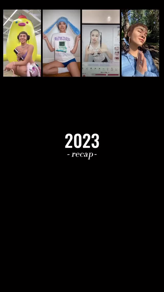
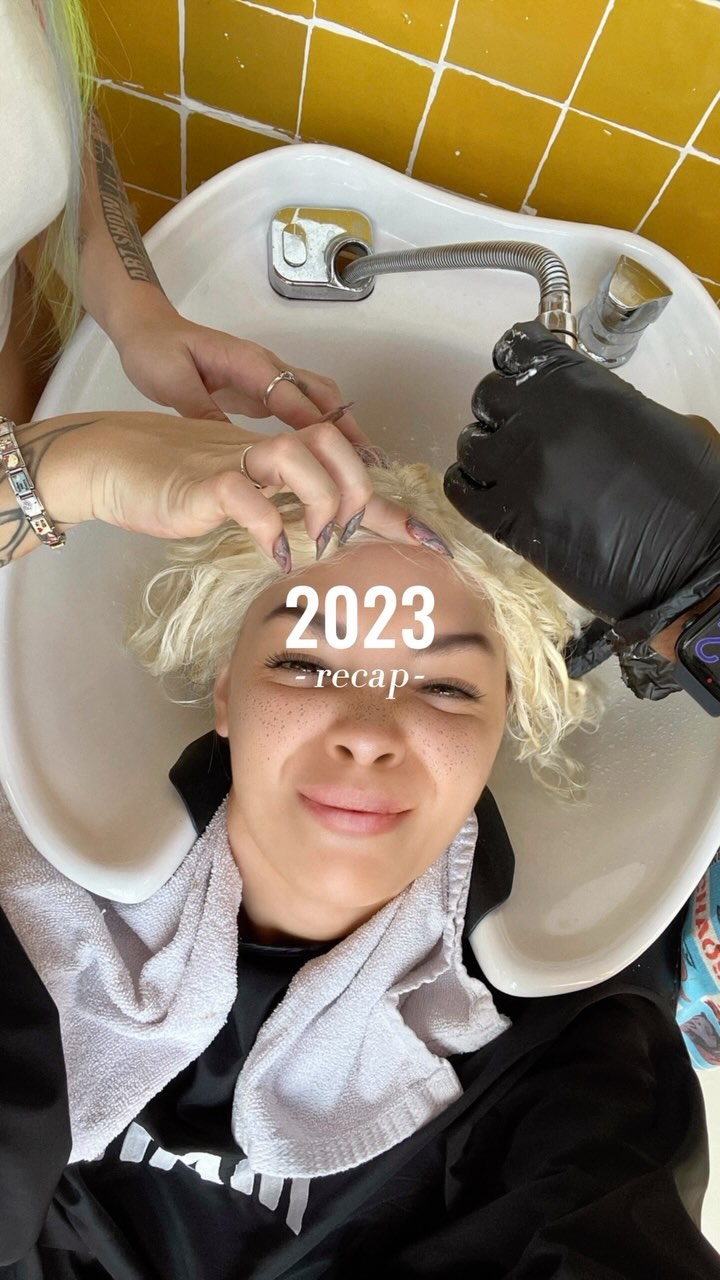
Most recaps fail because they try to show everything at once. This cover does the opposite: it shows just enough proof (four snapshots) and then gives the year a clean label. That huge black negative space is not empty—it’s a promise: “this is organized.”
For creators, this is a powerful pattern because it turns a long caption and a messy year into something that feels like a magazine cover. It’s also easy to repeat: swap the tiles, keep the typography, and you have a series system for any theme (month recap, tour recap, launch recap, etc.).
| Signal | Evidence (from this image) | Mechanism | Replication Action |
|---|---|---|---|
| Massive negative space | Most of the frame is pure black | Feels premium and instantly readable on mobile | Commit to one solid background color and protect whitespace |
| Proof-of-life thumbnails | Four small photos across the top | Teases variety without overwhelming the viewer | Use 3–6 tiny tiles as a “trailer,” not the whole recap |
| Clear title hierarchy | “2023” big, “- recap -” small | Instant topic clarity = more taps and saves | Make one headline giant; everything else secondary |
| Template repeatability | Same layout could fit any year/theme | Series formats train your audience to expect the next one | Lock a layout grid and only swap content tiles each episode |
Recipe 1: Theme swap (same layout)
Recipe 2: Palette shift (brand-safe)
Recipe 3: Tile count variant
Black negative space creates a “gallery wall” effect: your moments become curated, not chaotic. The thumbnails act like proof that there’s a story behind the title, and the simple typography makes it feel like a cover slide instead of a scrapbook page.
| Observed | Evidence in the image | Recreate instruction (prompt knob) |
|---|---|---|
| Whitespace discipline | Large empty black area | “keep 60–75% negative space; do not fill with extra elements” |
| Thumbnail teaser strip | Four tiles aligned at top | “top strip of 4 aligned tiles, equal height, clean spacing” |
| Simple title hierarchy | Big year + small recap label | “giant headline + small subtitle directly under it” |
| High contrast | White text on black | “pure black background, crisp white type, no shadow” |
| Template feel | No extra stickers/icons | “avoid emojis/icons; keep it editorial and minimal” |
| Prompt chunk | What it controls | Swap ideas (EN, 2–3 options) |
|---|---|---|
| Background block | Premium vs playful tone | “solid black”, “solid navy”, “solid cream” |
| Tile strip | Energy and variety signal | “4 tiles”, “6 tiles”, “3 tiles” |
| Headline hierarchy | Instant readability | “Year big + recap small”, “Month big + highlights small”, “Tour big + dates small” |
| Spacing rules | Whether it feels curated | “huge negative space”, “medium negative space”, “tight collage” |
vertical 9:16 recap cover, solid black background,
4 small photo tiles aligned across the top,
center text: “2023” and below “- recap -”, bold white sans-serif,
large negative space, no extra decorationsChange one knob per run: tile selection OR title text. Keep spacing and typography locked for consistency.