This image works because it uses a very familiar internet format: the emotional before-and-after comparison. Instead of relying on a complex campaign concept, it uses a simple visual joke that is immediately understandable and highly shareable.
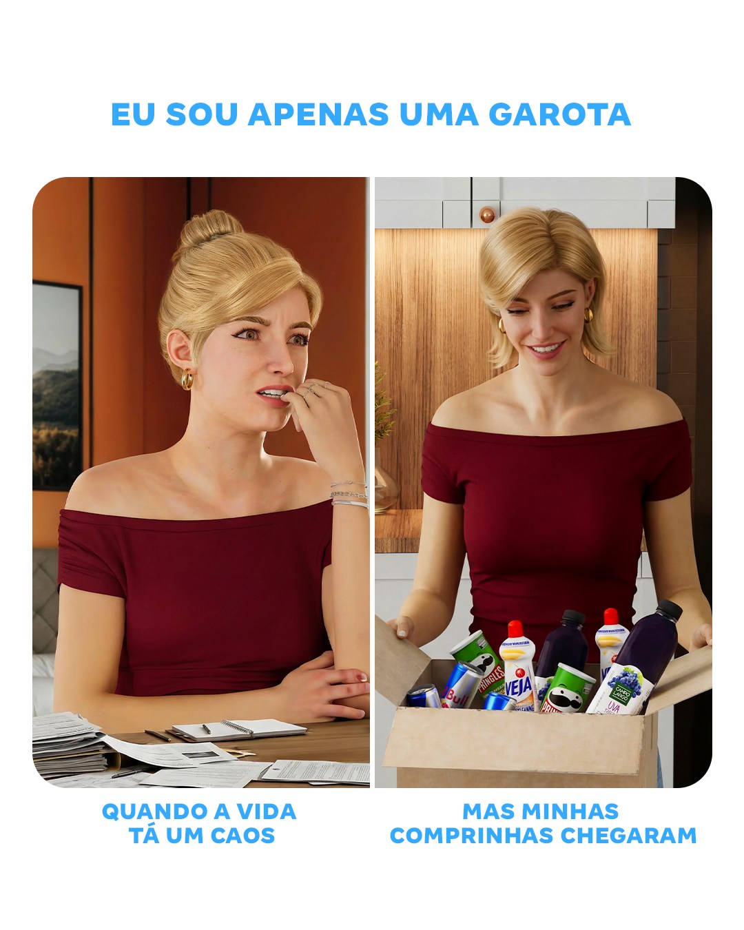
The strongest decision is the split-panel structure. By placing the same woman in two contrasting states, the message becomes readable in seconds. The left side communicates stress, confusion, and overload, while the right side communicates relief, pleasure, and reward.
The emotional shift is what carries the entire ad. On the left, the papers on the table act as visual shorthand for life admin, bills, tasks, and personal chaos. On the right, the cardboard box full of products becomes the emotional solution, even if only temporarily. That contrast is lighthearted, but very commercially effective.
Using the same outfit and same person in both frames is also important. It makes the transformation feel like a direct mood change rather than two unrelated scenes. That consistency gives the comparison its comedic clarity.
The products in the box are another key element. They are not luxury objects or abstract gifts. They are ordinary everyday purchases, which makes the joke feel relatable. The ad is saying that small practical buys can still feel exciting when they arrive.
The large blue text at the top helps frame the post as a social caption rather than a formal advertisement. It sounds conversational and meme-adjacent, which is exactly why the image feels native to contemporary retail social media.
The clean white layout with rounded panels is a smart design choice too. It keeps the image easy to scan and prevents the humor from getting buried in unnecessary background detail. The ad wants clarity more than atmosphere, and the layout supports that.
Another reason it works is that the right panel does not overplay the emotion. The smile is enough. That restraint keeps the scene believable while still letting the products feel like a genuine source of comfort or excitement.
From a prompt perspective, the key anchors are split-panel meme format, same blonde woman in red off-shoulder top, stressed desk scene with papers on the left, smiling unboxing moment with household products on the right, white background, blue Portuguese captions, and retail-social humor.
Overall, the image succeeds because it turns everyday shopping into a relatable emotional payoff. It is funny, direct, and instantly legible, which makes it ideal for social commerce communication.