Tribute-style visual performance of Price Tag by Jessie J ft. B.o.B, interpreted by virtual artist Milla Sofia.
This energetic and cheeky performance captures the playful spirit of the original — reminding us that it’s not about the money, it’s about the vibe.
Created with a love for music, movement, and message. 💃💸
🔔 Subscribe for more visual tributes & AI-powered performances
🎧 Original song: "Price Tag" by Jessie J ft. B.o.B
💡 This is a fan tribute — all rights belong to the original artists and rights holders.
How millasofiafin Made This Singer Guitar AI Portrait and How to Recreate It
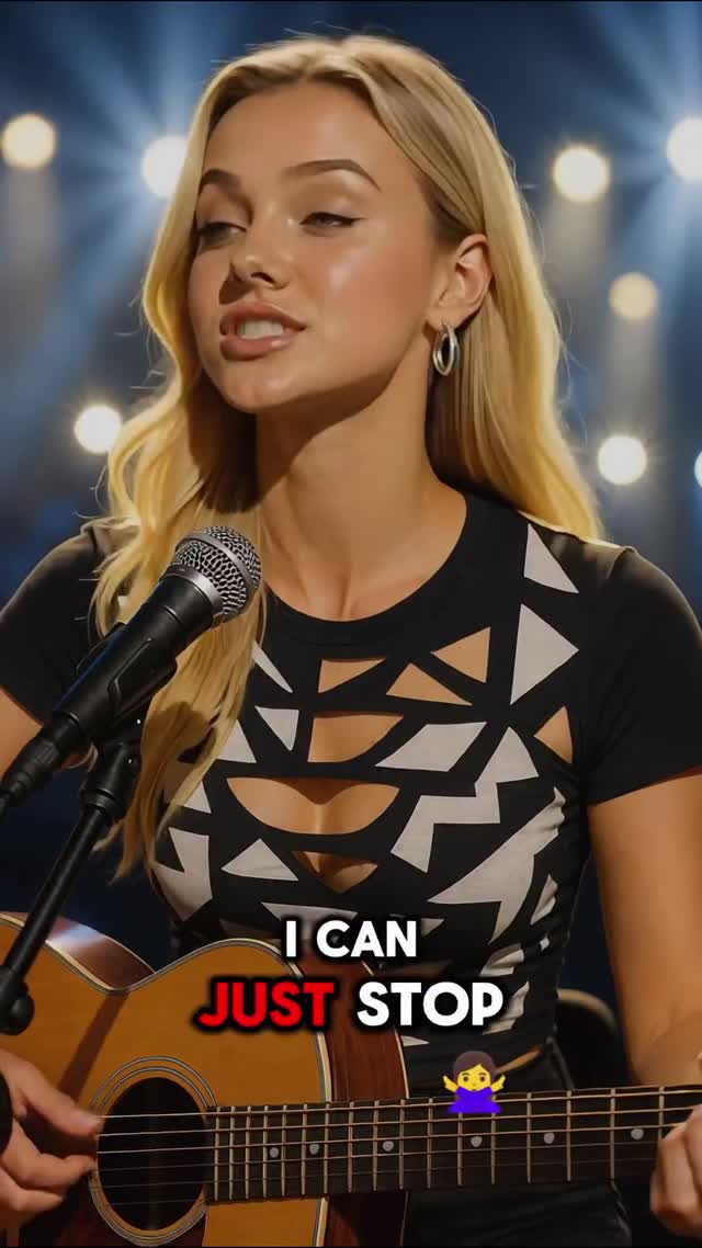
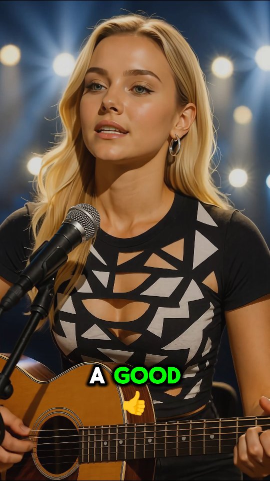
This image performs because it combines three retention anchors at once: face expression, instrument proof, and high-contrast lyric text. The viewer gets emotion, context, and narrative in a single frame. That combination is especially effective for short-form music posts where attention is won in under two seconds.
The subtitle design is the standout growth lever. The red keyword creates urgency, while white support text keeps readability high. It looks simple, but this typography hierarchy often decides whether a viewer keeps watching.
Signal Table
Signal
Evidence (from this image)
Mechanism
Replication Action
Tri-layer storytelling
Facial expression + microphone + guitar are all visible
Delivers emotion and credibility simultaneously
Frame face and instrument together in the first shot
Typography contrast hook
Red highlighted lyric phrase in center-bottom subtitle block
Color emphasis triggers faster text reading
Use one accent color only for the highest-impact lyric words
Define one repeatable wardrobe motif for your content series
Best-Fit Applications
Best fit: Lyric-hook reels. Why fit: text and expression work together. What to change: highlight a different keyword each post.
Best fit: Acoustic challenge formats. Why fit: guitar visibility confirms live performance. What to change: rotate chorus snippets by mood.
Best fit: Story-driven cover content. Why fit: subtitle pacing adds narrative continuity. What to change: keep layout, swap font weight only.
Best fit: Creator-brand serial formats. Why fit: same composition can produce many iterations quickly.
Not ideal: Instrument tutorials. Reason: subtitle block competes with instructional overlays.
Not ideal: minimalist no-text aesthetics. Reason: this format depends on on-screen words.
Not ideal: wide cinematic performance recaps. Reason: frame is optimized for intimate vertical delivery.
Exactly Three Transfer Recipes
Transfer 1: Soft-pop caption variant Keep: face + guitar + subtitle triad, same camera distance. Change: accent subtitle color from red to cyan/pink. Slot template (EN):{singer-guitar close-up} {single keyword accent color} {stage bokeh} {bold two-line subtitle}
Transfer 2: Dark acoustic version Keep: subtitle hierarchy and instrument placement. Change: reduce backlight intensity and increase shadow contrast. Slot template (EN):{acoustic performer} {low-key lighting} {clean lyric overlay} {minimal background}
Transfer 3: Bright studio variant Keep: expression timing and subtitle rhythm. Change: stage lights to bright neutral studio practicals. Slot template (EN):{vocal guitar portrait} {studio background} {subtitle emphasis word} {vertical social crop}
Aesthetic Read
The aesthetic succeeds through contrast management. The patterned top provides hard graphic shapes, while skin highlights and hair gradients stay soft. This balance prevents the frame from feeling either too harsh or too flat. The guitar introduces warm wood texture that offsets the monochrome wardrobe, and the microphone adds a clear vertical/diagonal anchor line. The subtitle block is intentionally bold and central, but because the upper frame remains clean, it does not overwhelm the portrait. Backlights use starburst bloom to suggest stage energy without introducing clutter. For creators, this is a useful principle: let one element carry style (wardrobe), one carry narrative (subtitle), and one carry credibility (instrument).