How myst_vault Made This Incredibles Lounge Duo — and How to Recreate It
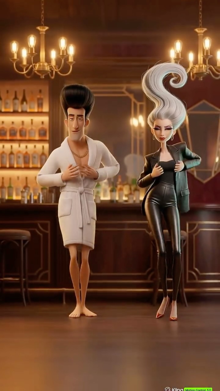
What makes this image work is that it never chooses between absurdity and polish. The characters are intentionally exaggerated, but the world around them is treated with real visual care. The warm bar lighting, chandelier glow, bottle shelves, and clean floor space all tell us that this is a premium nightlife setting. Because the environment is believable and elegant, the stylized figures become funnier and more fashionable at the same time.
The hairstyles do most of the storytelling
The first thing you read is not the wardrobe. It is the hair. The man’s vertical black pompadour and the woman’s silver spiral updo function like logos. They create immediate silhouette recognition and tell the viewer that these are not ordinary lounge guests. In stylized character posters, hair often carries more identity than facial detail, and this frame is a perfect example of that principle.
Once those silhouettes are established, the wardrobe sharpens the joke. A white bathrobe and bare feet are comedic in a luxury bar, while the glossy black catsuit and oversized blazer push the woman into high-fashion villain territory. The pairing turns the scene into a character concept poster rather than just a random comedic render.
Signal Table
| Signal | Evidence (from this image) | Mechanism | Replication Action |
|---|---|---|---|
| Instant character identity | Extreme pompadour and towering silver swirl hair | Large hairstyle silhouettes create recognizable personalities before details appear | Design one dominant silhouette cue for each character and make it impossible to miss |
| Luxury setting credibility | Amber chandeliers, bottle shelves, polished bar, warm wood tones | A believable upscale environment elevates parody into stylish satire | Use a refined lounge backdrop with controlled lighting and minimal clutter |
| Contrast-based comedy | Bathrobe and bare feet beside glossy catsuit and heels | Opposing wardrobe logic creates humor through visual mismatch | Pair one relaxed domestic outfit with one hyper-stylized nightlife outfit |
| Poster readability | Centered duo, open floor, soft background blur | Clear separation keeps both figures readable despite exaggerated design | Use symmetrical staging and leave breathing room around each character |
Observed style choices worth reusing
| Observed Style Choice | Why It Works | How to Recreate It |
|---|---|---|
| Warm amber bar lighting | Gives the scene cinematic comfort and expensive atmosphere | Prompt for chandeliers, bottle glow, brass accents, and amber interior falloff |
| Two sharply different wardrobes | Creates immediate role contrast without needing action | Use one minimalist robe look and one sculpted nightlife look in the same frame |
| Open floor foreground | Lets the duo feel staged like a theatrical entrance | Keep the lower frame clean instead of filling it with tables or props |
| Soft-focus bar background | Supports atmosphere without stealing attention from the characters | Blur or simplify the environment while preserving key luxury signals |
Prompt technique breakdown
| Prompt Layer | Purpose | Practical Writing Advice |
|---|---|---|
| Silhouette layer | Defines instant recognizability | Write hair shape and body proportions early so the model locks onto iconic outlines |
| Wardrobe layer | Controls tone and contrast | Specify robe, chain, bare feet, catsuit, blazer, and heels instead of generic clothing labels |
| Environment layer | Establishes class and mood | Use luxury bar elements with warm lighting rather than vague “nightclub” phrasing |
| Material layer | Improves visual richness | Call out plush fabric for the robe and glossy reflections for the catsuit |
| Composition layer | Makes the duo feel poster-ready | Ask for symmetrical spacing, full-body visibility, and clean foreground staging |
Iteration advice
The main failure mode for images like this is tonal collapse. If the render becomes too cheap, too dark, or too chaotic, the parody loses its elegance and turns into generic meme clutter. The solution is to over-specify the environment quality. Tell the model that the bar is upscale, polished, warmly lit, and compositionally clean.
A second common problem is losing character separation. Stylized duos can visually merge when the background is busy or the clothing values are too similar. Keep one character light and one character dark. Keep the hair silhouettes dramatically different. Those contrast choices do most of the compositional work.
At its best, this kind of image feels like a fake campaign poster for characters who should not logically be in the same room. That is precisely what makes it fun. It is not only a joke. It is a joke with production value.