How rioaigc Made This Street Fighter King of Fighters Crossover AI Art -- and How to Recreate It
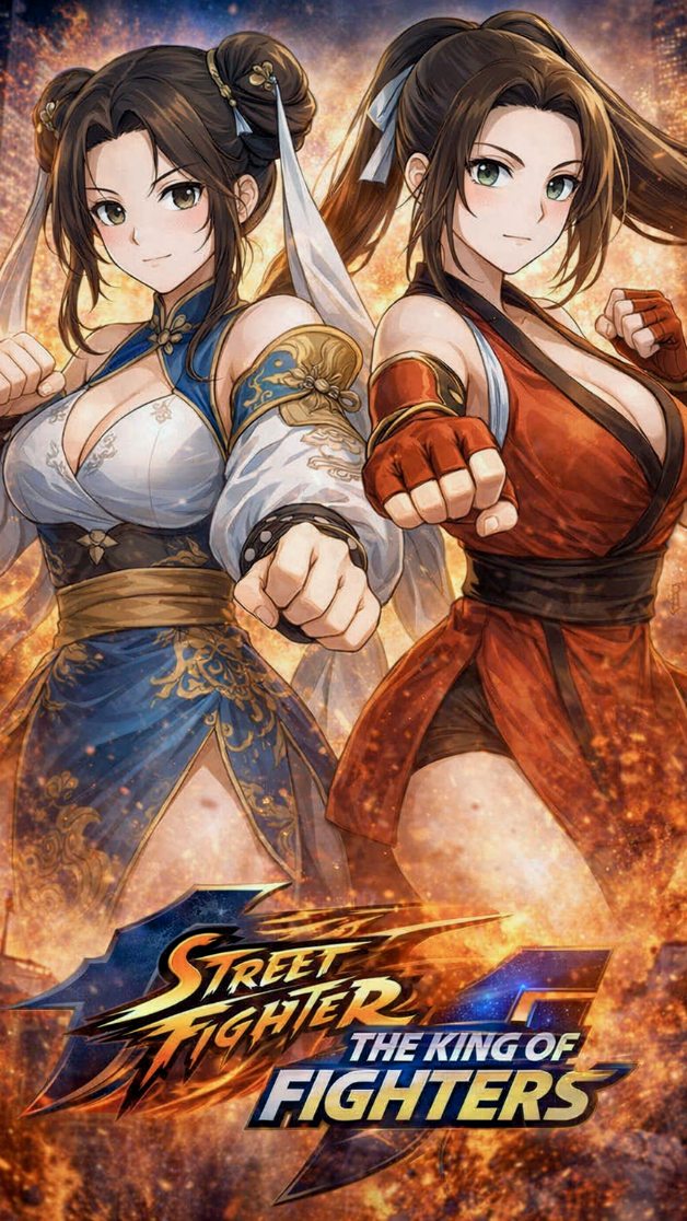
This image works because it understands the grammar of crossover fighting-game posters: equal weight, mirrored energy, and immediate character readability. Neither fighter is treated as background support. Both are framed as headline talent, which is exactly what a crossover key visual needs. The result feels less like fan collage and more like official promotional art for a major event release.
The strongest compositional move is the paired forward-fist pose. It creates instant momentum while also keeping the image symmetrical enough to feel like a versus poster. The hands drive the action, but the faces remain fully readable. That is important. If the fists dominated too much, the personalities would disappear. If the poses were too static, the poster would lose fighting-game urgency.
| Signal | Evidence in the image | Why it works | Replication action |
|---|---|---|---|
| Balanced star power | Both fighters occupy comparable space and receive equal visual emphasis | A crossover image only feels legitimate if each side is treated as a co-headliner | Keep character scale, facial clarity, and pose energy balanced in crossover posters |
| Immediate pose readability | Both fists are projected toward the viewer in a clean mirrored structure | The image communicates combat genre instantly without becoming messy | Use one clear action cue that both characters can share in different variations |
| Distinct costume coding | Blue-and-white elegance contrasts with red combat styling | Color and garment language make each fighter recognizable at a glance | Build strong costume contrast before adding background effects |
| Fire-and-embers backdrop | The background glows with orange sparks and heat | Abstract energy gives hype and scale without forcing a literal environment | Use elemental backdrops when you want promotional intensity more than narrative realism |
Another reason the poster succeeds is that it avoids unnecessary worldbuilding. It does not need a city, arena, or storyline to work. The crossover promise is already carried by the pair structure, the costume distinction, and the logo treatment. That is a useful lesson for prompt writers. In promotional art, too much setting can dilute the core selling point, which is the confrontation or alliance itself.
For prompt builders, the key is hierarchy. The real order here is: dual-hero composition first, signature costume silhouettes second, shared action pose third, energy backdrop last. If you start with generic “fiery background” effects, the image becomes loud but unfocused. If you anchor the two-character relationship first, the background becomes a supporting amplifier instead of the main event.
| Prompt chunk | What it controls | Swap ideas |
|---|---|---|
| two fighters with equal foreground weight | Defines the image as a true crossover rather than a solo character poster | Swap to rival duo, mentor-student pair, or tag-team alliance structure |
| mirrored forward-fist stance | Creates immediate combat energy while preserving graphic clarity | Try matching kicks, mirrored guard stance, crossed weapons, or back-to-back readiness |
| blue-vs-red costume contrast | Makes each side legible and visually memorable | Use white-vs-black, gold-vs-silver, or classic-vs-modern palette pairing |
| ember-filled promotional background | Adds hype and event-scale energy without narrative distraction | Replace with electric arcs, shattered glass, smoke clouds, or tournament neon |
If you want to recreate this type of visual, keep the formula tight: two equally important fighters, one shared action language, one strong color contrast, and one high-energy abstract backdrop. That structure is ideal for crossover posters, tournament-event graphics, versus cards, game-collab announcements, and any creator project that needs immediate franchise energy in a single frame.