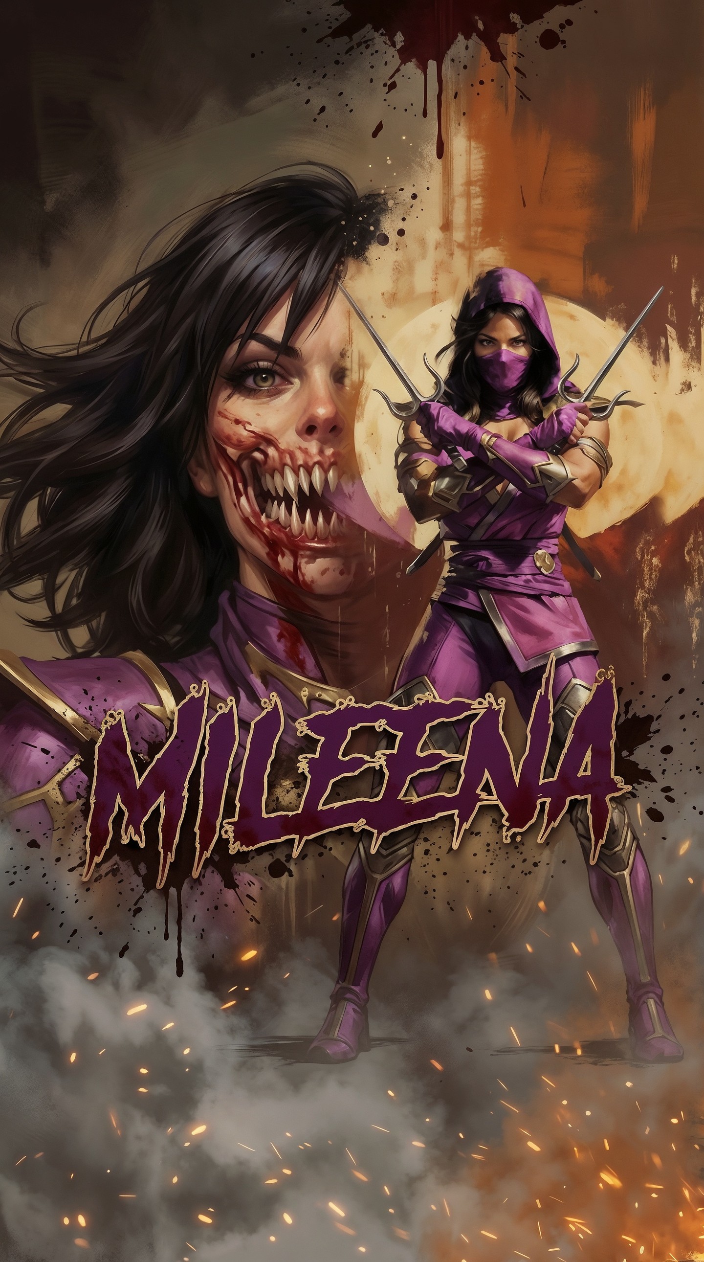
This image works because it does not choose between character portrait, horror reveal, and action poster. It stacks all three in a single vertical frame. The result feels instantly legible to fans, but it also reads as a reusable prompt formula for any dual-state villain, corrupted heroine, or masked warrior concept.
The composition is built around contrast. The left side gives you intimacy: skin, hair, blood, teeth, eye contact. The right side gives you mythology: the full costume, the weapons, the moon, the stance. Instead of forcing the viewer to choose which version is the “real” one, the image says both are true. That dual read is exactly why it has poster energy instead of simple character art energy.
The title treatment also matters. The dripping MILEENA wordmark anchors the entire frame and acts like a genre signal. Even before a viewer studies the face, the typography tells them this is horror-inflected action art rather than clean superhero branding. That small design decision changes the emotional temperature of the whole image.
| Signal | Evidence from the image | Mechanism | Replication action |
|---|---|---|---|
| Dual identity | Monstrous close-up on the left and masked warrior full body on the right | Shows private horror and public control in one frame | Use one oversized emotional portrait plus one smaller full-body stance |
| Instant franchise readability | Purple costume, hood, mask, sai, moonlit arena mood | Iconic costume language makes the character recognizable fast | Keep two or three non-negotiable silhouette markers in the prompt |
| Horror edge | Rows of teeth, blood streaks, splatter accents, smoky fire haze | Organic detail creates discomfort and memorability | Add one grotesque asymmetrical facial transformation instead of full monster makeup |
| Poster authority | Large moon disc, centered stance, bottom sparks, title over foreground | Environmental layering makes the image feel like key art | Give the figure a graphic backdrop shape such as a moon, halo, or sun disc |
The most useful thing here is that the art never becomes visually messy even though it includes many loud ingredients. Purple fabric, blood, gold edging, flying hair, smoke, sparks, moonlight, and title typography all coexist because each one has a clear job. Purple defines character identity. Orange and bronze define atmosphere. White moonlight defines silhouette. Red blood defines danger. The palette is not broad; it is disciplined.
The left portrait is also not just “a scary face.” It is beautiful and damaged at the same time. That beauty-versus-mutation tension is what keeps the poster from becoming generic gore art. If you remove the glamour, the image turns into monster fan art. If you remove the teeth and blood, it turns into a costume promo. The balance is the point.
| Prompt chunk | What it controls | Swap ideas |
|---|---|---|
| Dual-portrait character poster | Forces the model to build a layered poster instead of one pose | Use dual-state villain poster, transformation poster, or legacy hero poster |
| Monstrous close-up on the left | Locks emotional focal point and asymmetrical horror reveal | Swap in scarred version, cybernetic split, possessed eye, cracked porcelain skin |
| Full-body masked fighter on the right | Preserves brandable silhouette and action-read pose | Replace with mage, assassin, knight, rogue, android, or demon huntress |
| Huge moon behind the figure | Creates shape contrast and iconic backdrop separation | Try eclipse, neon halo, stained-glass circle, burning sun, sigil portal |
| Dripping horror-style title | Pushes the image from illustration to poster design | Swap for metal logo, brush-calligraphy title, torn stencil, embossed serif |
This layout is extremely reusable because it is built on roles, not on one specific franchise. You need four things only: a close-up emotional face, a full-body signature pose, a graphic background disc, and a title block that feels genre-appropriate. Once those roles are stable, you can pivot the subject almost infinitely.
That means you can turn this into a vampire queen poster, a cybernetic antihero poster, a cursed samurai poster, or a corrupted magical-girl poster without changing the architecture. The architecture is the asset. The surface styling is just the skin on top.
Version 1: Frost assassin. Replace the moon with a pale icy halo, swap sparks for snow dust, and turn the blood textures into cracked frost on the skin.
Version 2: Neon villain cover. Keep the split layout but replace the smoky bronze palette with cyan and magenta signage, then change the title to chrome club typography.
Version 3: Mythic war goddess. Keep the left beauty-versus-violence close-up, replace the right ninja stance with a spear-bearing ceremonial stance, and use eclipse light instead of fire haze.
Version 4: Creature transformation poster. Push the left side further into mutation while keeping the right side elegant and controlled. This is ideal for werewolf, demon, parasite, and possession themes.
The easiest way to lose this image is to let the prompt drift into generic fighting-game fan art. The cure is specificity. Name the exact split structure. Name the exact position of each character version. Name the moon. Name the title style. Name the sparks. Name the asymmetry of the mouth. If those anchors are absent, the model will simplify the whole poster.
The second failure mode is overcomplication. You do not need extra enemies, extra scenery, or extra color systems. The image is already doing a lot. Let the left face, right body, moon disc, and typography do the work. That restraint is what makes the poster feel sharp rather than noisy.