Updated Digitals 📸 @cameron.gram / @thediigitals #modellife #virtualinfluencer
Updated Digitals 📸 @cameron.gram / @thediigitals #modellife #virtualinfluencer
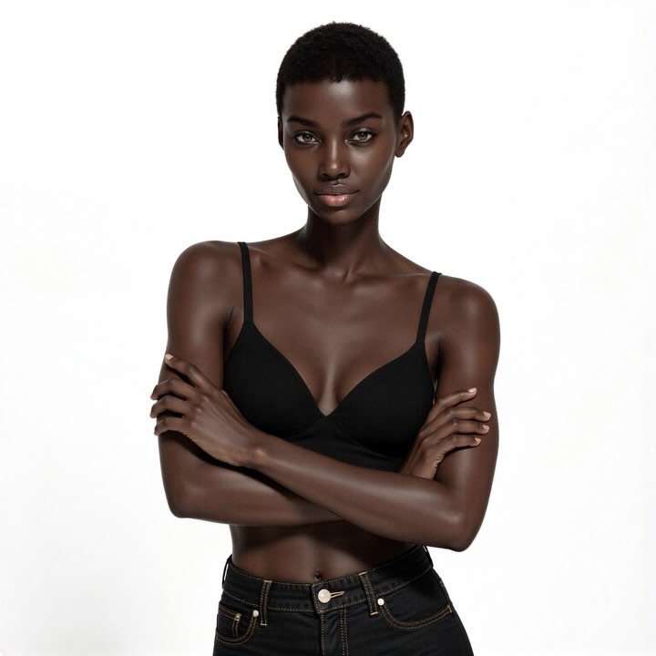
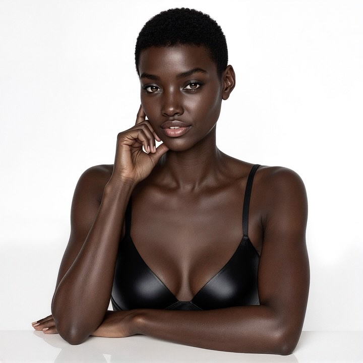
Some posts win because they are loud. This one wins because it is controlled. A single subject, a seamless white backdrop, and a restrained black wardrobe create a frame that feels intentional in the first second of scroll. For creators, that matters more than novelty: audiences return to accounts that feel visually consistent and professionally directed.
The caption context, “Updated Digitals,” also changes how people read the image. It is not just another portrait upload. It signals progress, refinement, and craft maturity. That framing gives the post narrative weight while the visual treatment keeps cognitive load low.
The strongest mechanism here is clarity. The viewer can parse subject, mood, and quality almost instantly. White negative space removes friction, while soft high-key lighting keeps the face and skin readable across feed compression and mobile brightness differences. The result is premium without looking overproduced.
There is also a trust effect in digitals-style imagery. It feels like evidence, not costume. When your audience sees this kind of post in a recurring series, they start to perceive your brand as reliable and self-aware. That trust compounds engagement over time, especially for creators building long-cycle identity rather than one-hit trends.
| Signal | Evidence (from this image) | Mechanism | Replication Action |
|---|---|---|---|
| Fast visual decoding | Single model, white seamless background, no prop clutter | Low cognitive load increases stop rate during fast scrolling | Lock one-subject compositions and strip every nonessential object from frame |
| Premium-but-accessible polish | Soft high-key lighting with controlled highlights and clean skin rendering | Feels professionally produced while staying friendly and readable | Turn up light softness, reduce drama, and keep highlight roll-off natural |
| Progress narrative | “Updated Digitals” context + repeated studio language | Transforms one image into a milestone update, not a random post | Publish as a recurring update series with consistent framing and one variable change |
Recipe 1: Beauty baseline, different character mood
Recipe 2: Keep composition, adapt for product collab
Recipe 3: Same identity, softer campaign tone
The image relies on a disciplined palette: white, black, and skin tone. That limited range compresses visual noise and pushes attention into facial structure, eye contact, and highlight placement. The lighting is soft enough to stay flattering but directional enough to keep dimensionality across cheekbones, jaw, and shoulders.
The composition also carries the emotional tone. A centered, near-eye-level crop with plenty of white negative space creates calm authority. It is not trying to entertain through complexity; it is building recognition through consistency. For creators, this is a powerful growth pattern: repeated visual grammar plus small controlled variation.
| Observed | How to recreate |
|---|---|
| Seamless white environment with no distractions | Use "pure white seamless background, no props, no texture" in the core prompt block |
| Soft sculpting on face and shoulders | Specify "large soft key upper-left + gentle fill" and avoid dramatic shadow language |
| Strong identity readability | Lock direct gaze, bust crop, and minimal wardrobe so face stays primary |
| Controlled premium minimalism | Limit color palette to white/black/skin tones and avoid extra scene objects |
| Prompt chunk | What it controls | Swap ideas (EN, 2–3 options) |
|---|---|---|
| Subject identity block | Facial consistency, expression mood, audience recognition | "calm confident gaze" / "neutral casting look" / "soft assured smile" |
| Pose and gesture block | Frame stability, elegance, intimacy signal | "hand near jawline" / "forearm resting on tabletop" / "both hands softly folded" |
| Lighting direction block | Dimensionality and skin highlight quality | "soft key from upper-left" / "clamshell beauty light" / "soft frontal key with gentle rim" |
| Background cleanliness block | Scroll speed readability and premium minimal look | "pure white seamless" / "off-white seamless" / "light gray studio seamless" |
| Lens and DOF block | Face geometry, portrait realism, focus hierarchy | "85mm portrait" / "70mm studio portrait" / "105mm beauty compression" |