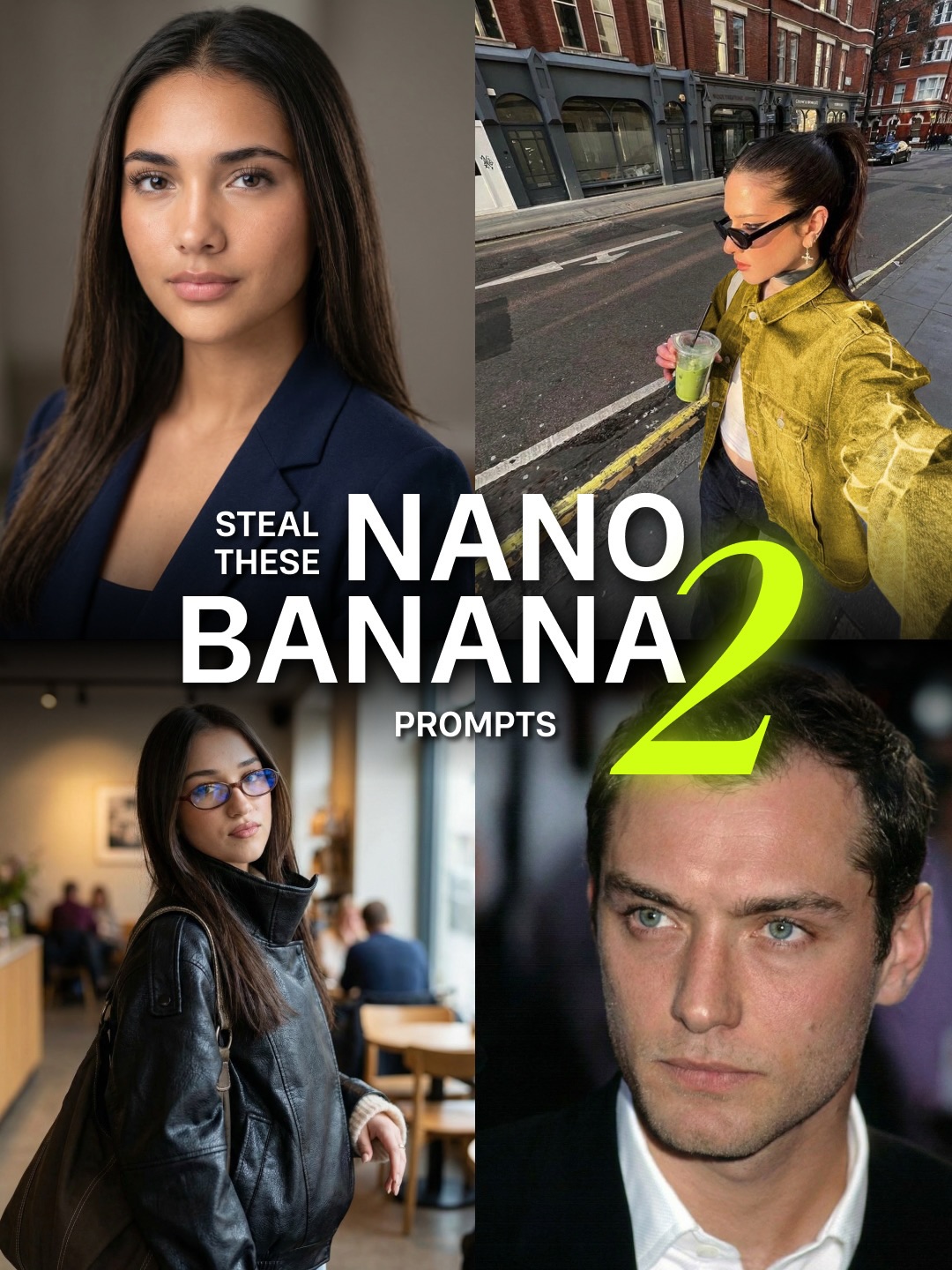
This image is not trying to prove one beautiful result. It is trying to prove versatility. That is why the collage works. By combining studio portraiture, street-style selfie energy, cafe lifestyle realism, and polished celebrity-adjacent portrait output, the cover signals that the prompt pack is broad, reusable, and commercially useful.
Single-image prompt posts sell one outcome. Multi-image covers sell possibility. Here, every quadrant suggests a different use case, so the viewer immediately reads the pack as more valuable. The large typography in the center acts like a command, while the four contrasting outputs function as proof.
| Element | Why It Works |
|---|---|
| Four distinct portrait scenarios | Shows that the prompt set is flexible rather than tied to one niche aesthetic. |
| Grid structure | Makes the cover feel organized, educational, and productized. |
| Bold center headline | Creates a fast hook and tells the viewer exactly what is being offered. |
| Neon numeral | Adds visual hierarchy and reinforces the idea of a versioned pack or upgraded release. |
| Mixed realism styles | The jump from studio to street to cafe to celebrity-style portrait implies broad prompt utility. |
The visual language belongs to creator-economy packaging. It borrows from tutorial thumbnails, prompt bundle ads, and digital product cover design. What makes it effective is contrast management. The images are different enough to imply variety, but similar enough in realism quality that they feel like outputs from the same system.
This kind of cover works especially well for AI education because people want proof of transferability. They do not just want “a good portrait prompt.” They want a prompt logic that can survive different lighting, styling, and subject categories.
| Prompt Move | Purpose |
|---|---|
| Show multiple output categories in one frame | Increases the perceived value of the prompt pack by signaling flexibility. |
| Keep all panels photoreal | Maintains brand consistency and prevents the collage from feeling random. |
| Use centralized tutorial text | Turns the collage into an instructional cover instead of a moodboard. |
| Mix studio and lifestyle contexts | Demonstrates that the prompt logic adapts across use cases. |
| Add one loud graphic anchor | The oversized numeral gives the composition a product-launch feel. |
This format is ideal for prompt bundles, preset drops, realism guides, model comparisons, and “one prompt many outcomes” educational posts. The layout can scale to fashion, food, interiors, travel, or character design. The secret is to make each panel different in scenario but consistent in quality.
Try replacing one quadrant with a night shot, a product ad, or a cinematic still to widen the promise even more. Another strong remix is to make all four panels the same subject across different environments, which shifts the message from range to consistency. You can also build a sequel-style version by changing only the color accent and the central claim.
When designing prompt-pack covers like this, think in terms of evidence architecture. Each image should defend a different benefit: professionalism, lifestyle realism, trend relevance, or aspirational polish. Once those roles are clear, the text only needs to frame the offer. The pictures do the selling.