


💕 A veces no buscas un lugar, el lugar te encuentra a ti. Que foto te gusta más?? ☀️
💕 A veces no buscas un lugar, el lugar te encuentra a ti. Que foto te gusta más?? ☀️
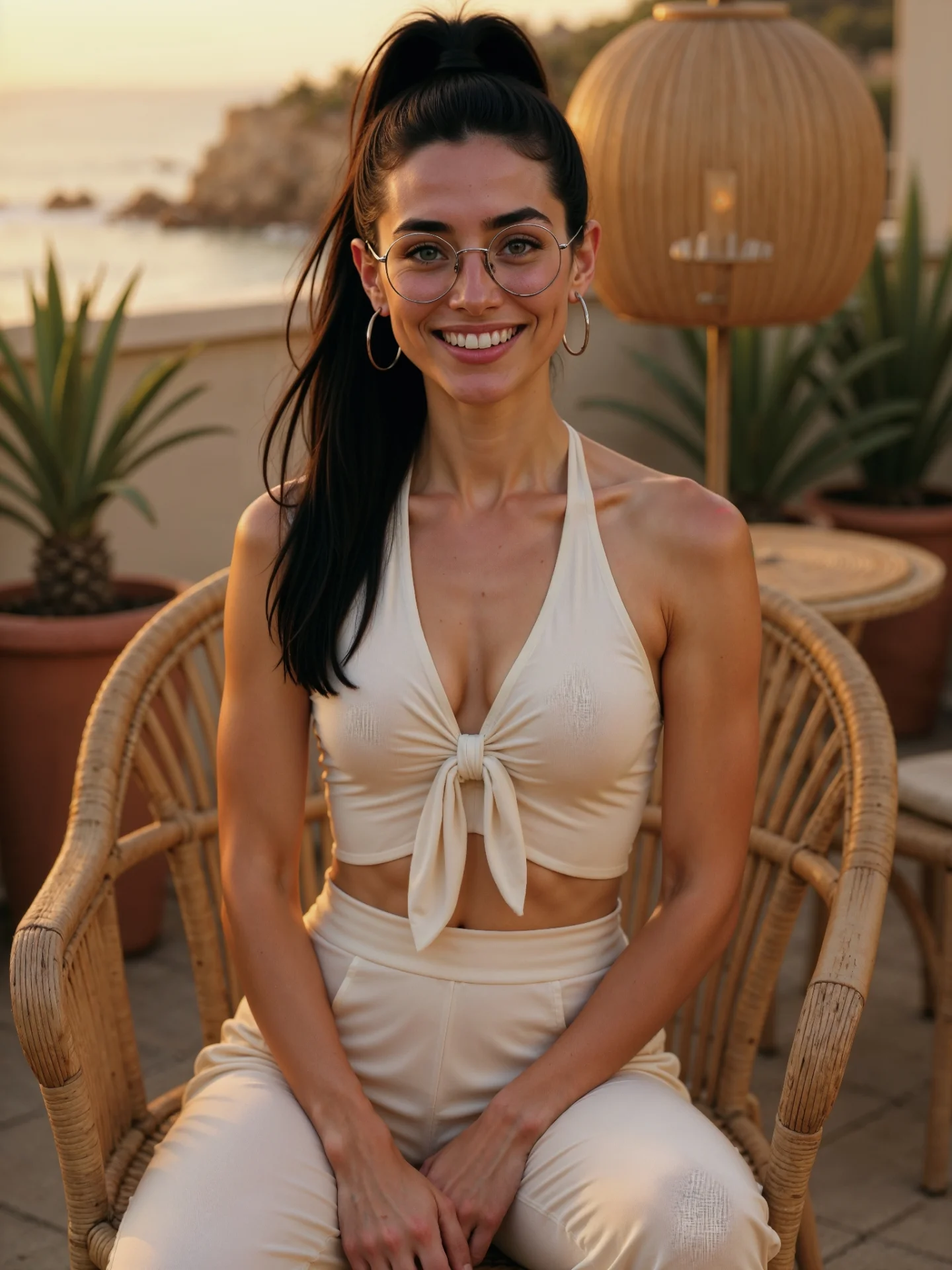
This image works because it feels like a place you would want to be, not just a face you would want to look at. The terrace, wicker furniture, terracotta planters, and distant coastline all create a believable emotional setting before the portrait even begins doing its job. That is why the caption line about a place finding you makes sense. The location is carrying part of the feeling.
The strongest move is how quietly luxurious the frame is. Nothing here is loud. The outfit is cream, the furniture is natural rattan, the light is warm, and the background is soft. That restraint makes the image feel expensive without trying too hard. It also helps in feed performance, because people often respond well to images that look calm and effortless rather than over-styled.
Because the original post asks which photo people prefer, this kind of image also works well as one side of a comparison pair. It has enough environment to build atmosphere, but not so much that the portrait becomes hard to judge. Viewers can respond to the mood, the outfit, the expression, or the location without feeling overwhelmed by details.
The first reason is environmental desirability. The frame suggests a boutique-hotel terrace or Mediterranean villa, which instantly raises aspiration. The second reason is palette harmony. Cream clothing, honey light, tan wicker, and muted green plants all sit in the same tonal family. The third reason is emotional clarity. The subject is smiling directly at the camera, so the image feels welcoming instead of distant or editorially cold.
Another advantage is that the setting supports the portrait without competing with it. The woven lantern, the second chair, and the sea view all add richness, but none of them tries to steal focus. This is a useful lesson for travel or lifestyle AI images. Good backgrounds should deepen the mood, not become a second subject.
| Signal | Evidence (from this image) | Mechanism | Replication Action |
|---|---|---|---|
| Location desire | Coastal terrace, wicker furniture, terracotta pots, sunset sea view | Viewers engage more when the image suggests an aspirational destination | Build the environment around 3-4 strong place cues rather than one generic background |
| Warm tonal cohesion | Cream outfit, golden light, tan wicker, soft coastal haze | Harmonized color families make the image feel premium and calm | Keep wardrobe, furniture, and light inside one warm natural palette |
| Relaxed portrait energy | Open smile, seated pose, direct eye contact | Approachability improves saves and preference-based comments | Use one inviting pose instead of a distant fashion stance |
| Balanced scene support | Background details stay visible but secondary | The portrait stays readable while the setting still tells a story | Let environment objects stay soft and organized around the subject, not on top of her |
This image style is ideal for travel-mood posts, Mediterranean summer aesthetics, “which one do you prefer?” comparisons, AI influencer resort content, and soft-luxury lifestyle feeds. It works especially well when you want the audience to respond emotionally to a place, not just technically to a pose.
It is less suitable for product-heavy posts or dense narrative scenes. Its power comes from serenity and restraint, so adding too much would weaken the effect.
{coastal terrace scene}, one seated woman, {light neutral resort outfit}, warm luxury travel mood{sunset terrace location}, same warm portrait energy, woven or natural seating, soft destination atmosphere{villa exterior}, one woman seated, {neutral summer outfit}, golden-hour calm, high-end lifestyle portraitThe image leans on material contrast in a very controlled way. Smooth skin and soft cream fabric sit against textured wicker, terracotta, and spiky plants. That contrast creates richness without clutter. It gives the eye surfaces to enjoy while still keeping the portrait calm. This is one reason the image feels more expensive than a plain outdoor selfie.
The cream outfit is also a smart decision. It keeps the subject integrated with the setting instead of fighting it. If the clothing were a stronger color, the scene might feel more commercial or trend-driven. Here, the quiet palette lets the location and the smile carry the emotional tone.
The seaside background remains soft enough to feel like memory instead of spectacle. That softness matters. The image is not trying to prove that the location is impressive through sharp detail. It is trying to make the viewer feel what it would be like to sit there at that hour. That is a stronger social-media strategy for this kind of content.
| Observed | Why it matters | How to recreate it |
|---|---|---|
| Wicker chair framing the body | Adds natural structure and resort texture to the portrait | Seat the subject in one textured natural-material chair rather than standing in empty space |
| Cream monochrome outfit | Keeps the look cohesive and premium | Use one neutral outfit family that blends with the environment instead of overpowering it |
| Terracotta pots and plants | Ground the terrace and add warmth | Include a few visible natural anchors around the subject’s edges |
| Soft distant coastline | Introduces destination feeling without distracting detail | Place the scenic payoff in the far background and keep it slightly blurred |
| Golden-hour face light | Makes the portrait feel intimate and flattering | Favor low warm sunlight over flat ambient daylight |
The key prompt lesson here is that place and person have to be written together. If you prompt only a beautiful woman, you will get a generic portrait. If you prompt only a beautiful terrace, you risk losing the emotional connection. This image succeeds because the environment and the subject are tuned to the same soft-luxury frequency.
| Prompt chunk | What it controls | Swap ideas (EN, 2-3 options) |
|---|---|---|
| Destination anchor | What kind of place fantasy the image delivers | Mediterranean terrace; cliffside resort patio; coastal villa balcony |
| Natural-material furniture | Texture and premium restraint | wicker armchair; rattan terrace chair; woven resort seating |
| Warm neutral wardrobe | Palette cohesion and luxury softness | cream halter set; ivory summer co-ord; soft beige resortwear |
| Golden-hour lighting | Emotional warmth and flattering skin tone | sunset terrace light; honey-toned evening sun; warm coastal glow |
| Scenic depth | Place recognition without scene clutter | distant rocky coastline; soft sea view; blurred cliffside horizon |
| Portrait energy | How approachable versus editorial the result feels | gentle direct smile; relaxed seated pose; inviting eye contact |
The biggest drift risk is letting the location get too generic. If the terrace loses the wicker, pots, or coast view, the image becomes only another warm portrait. The environmental signals are what make this frame memorable.
Lock the destination cues first: wicker chair, terrace plants, coast view, and golden-hour warmth. Then lock the subject identity: glasses, ponytail, smile, and cream outfit. Only after those are stable should you fine-tune chair shape, lantern placement, or background softness. This order protects the mood before you refine details.
Use the one-change rule. First solve the terrace. Then solve the outfit. Then solve the smile and eye contact. Finally polish the sunset atmosphere. This keeps the image coherent. If you change too many things at once, the frame easily drifts into either generic resortwear fashion or generic travel photography.
If the image feels too plain, strengthen the place cues before changing the pose. If it feels too editorial, soften the styling and keep the smile friendly. If it feels too busy, remove background objects before touching the wardrobe. The best version stays calm, warm, and quietly specific.