


☀️ Hoy empieza Agosto... Recuerda que no necesitas una razón para desconectar! Comenta "GUÍA" y te paso algo divertido para que pruebes con tus fotos 💕
☀️ Hoy empieza Agosto... Recuerda que no necesitas una razón para desconectar! Comenta "GUÍA" y te paso algo divertido para que pruebes con tus fotos 💕
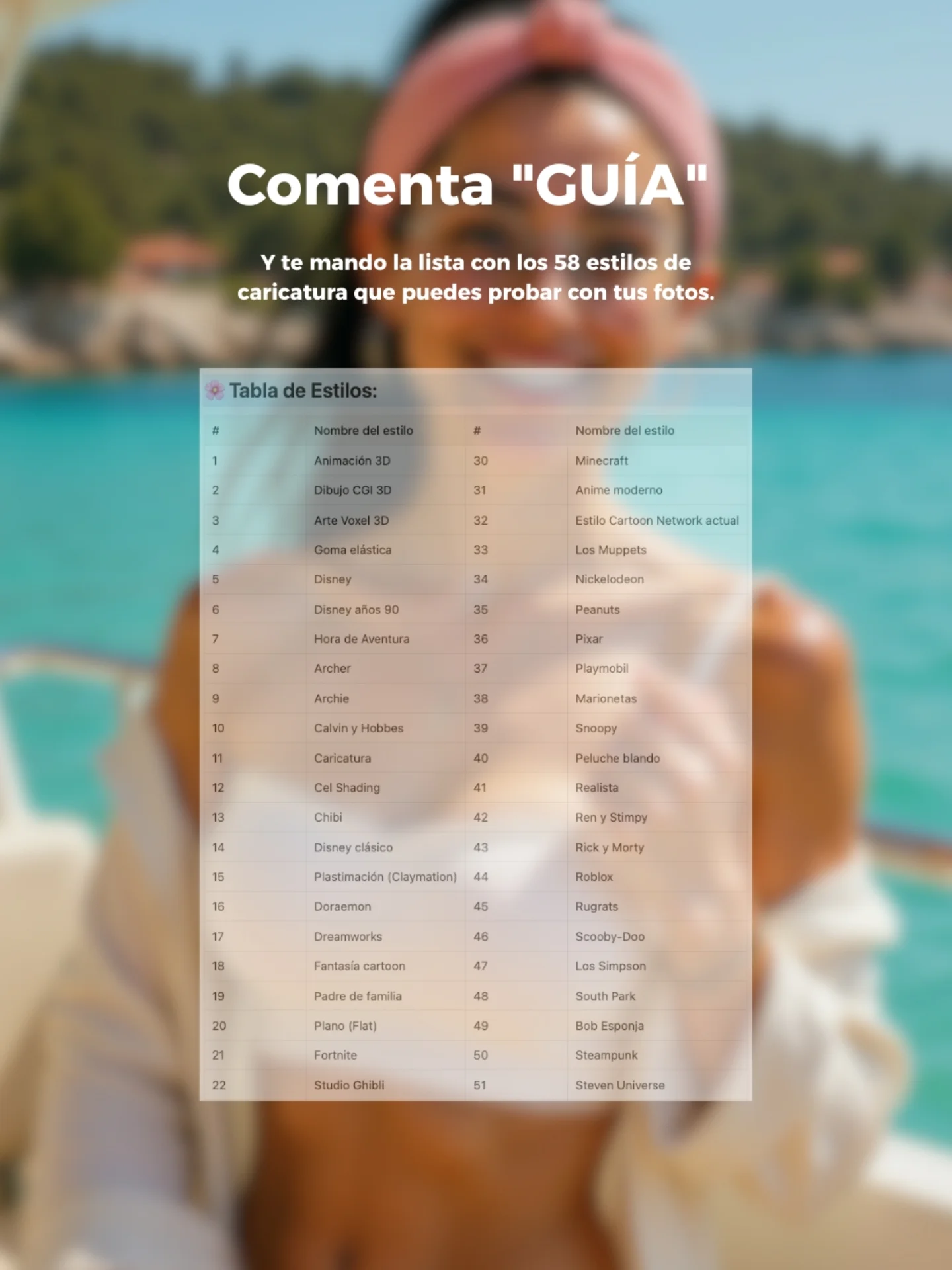
This image works because it combines aspiration and utility in one glance. The blurred summer boat portrait creates a desirable lifestyle frame, but the center overlay makes the offer concrete. Instead of promising something vague, the image shows a visible resource: a style list with many cartoon and caricature options. That immediately increases perceived value. Viewers do not just hear that there is a guide. They can see the guide.
The top call to action is also unusually direct. “Comenta GUÍA” is short, specific, and easy to follow. Then the subheadline explains the reward with enough detail to make the exchange feel worthwhile. This is good creator marketing. The design does not ask the user to decode the process. It tells them what to do, what they will get, and why it matters for their own photos.
| Signal | Evidence (from this image) | Mechanism | Replication Action |
|---|---|---|---|
| Visible proof of value | A centered screenshot of the style list is shown on the post itself | Seeing the resource increases trust and reduces skepticism about the offer | Show a preview of the free asset instead of relying only on copy |
| Low-friction CTA | The post asks for one simple comment keyword: “GUÍA” | A short comment action feels easier than clicking out or sending a complex DM | Use one single-word trigger whenever the goal is comment-based lead generation |
| Aspirational backdrop | Blurred summer boat scene with sea and coastline | The lifestyle background keeps the post visually attractive while the guide remains the main focus | Pair educational offers with a desirable but low-detail background image |
| Specific reward language | The copy mentions 58 caricature styles for users to try on their photos | Specific numbers and use cases make the promise feel more actionable | Name the quantity and use case of the resource inside the creative |
This structure is ideal for free guide promotions, prompt list giveaways, style-pack downloads, comment-to-receive campaigns, and onboarding assets for creators who teach AI image workflows. It works especially well when the downloadable resource is list-based or visual, because the preview can be shown directly in the post. It is less effective for luxury branding, purely aesthetic moodboards, or offers that require longer explanation before the audience understands the value.
Three strong transfer recipes come from this image. Keep the blurred aspirational backdrop, the top keyword CTA, and the center document preview; change the asset type for a preset pack: {lifestyle background} {comment keyword} {preview card} {clear freebie promise}. Keep the travel mood and the list-preview structure but swap the topic to prompt formulas or reel hooks: {soft branded backdrop} {single action word} {resource screenshot} {specific creator benefit}. Keep the giveaway logic and centered proof element while changing the background to studio, city, or desk scenes for different niches: {niche backdrop} {comment CTA} {resource preview} {plain-language reward}.
The key design move is blur discipline. The background is colorful and appealing, but it is intentionally softened so the eye goes straight to the white headline and the document overlay. That keeps the image from becoming a noisy summer collage. The palette also helps: aqua blue, cream, pink, and white create a fresh seasonal look without fighting the text.
The centered stack is another reason the image feels efficient. Headline first, explanation second, guide preview third. The eye does not need to hunt for the message. That is one of the clearest lessons from this post: a giveaway image behaves more like a mini landing page than a normal lifestyle photo.
| Prompt chunk | What it controls | Swap ideas (EN, 2-3 options) |
|---|---|---|
| blurred summer boat portrait background | Emotional backdrop and aspirational context | blurred rooftop portrait background; blurred desk setup with creator silhouette; blurred beach club scene |
| large white Spanish CTA headline | Main action prompt and stop-scroll clarity | Comenta “PROMPT”; Escribe “GUIA”; DM “LISTA” |
| centered style-guide screenshot overlay | Proof of value and educational focus | preset pack preview; prompt cheat sheet preview; style matrix card |
| specific subheadline with number-based promise | Offer credibility and usefulness | 30 prompt ideas; 12 avatar styles; 50 hook templates |
| clean mobile-first stacked layout | Readability and conversion path | top CTA with QR card; split-screen layout; centered card with bottom arrow |
Lock three things first: the CTA wording, the proof element, and the background blur level. Run one should establish the full headline plus the exact guide preview card. Run two changes only the background image while keeping the CTA and guide constant. Run three keeps the background but tests a different free resource, such as prompts instead of styles. Run four preserves the structure and experiments with one new accent or label treatment if readability still holds.
If the post starts feeling weak, the first fix is usually to strengthen the resource preview, not to decorate the background. A giveaway creative works when the audience can instantly understand the exchange. This one succeeds because it sells value visually before the caption even has a chance to do the work.