#花譜 × #CHiCOのコラボWリリース 2025年6月25日(水)配信 ───────────────── 花譜×CHiCO 「撃って」 作詞・作曲・編曲:#清竜人 CHiCO×花譜 「Story Tellers」 作詞:MOMIKEN(#SPYAIR)/CHiCO 作曲:UZ(SPYAIR) 編曲:tasuku ─────────────────
#花譜 × #CHiCOのコラボWリリース 2025年6月25日(水)配信 ───────────────── 花譜×CHiCO 「撃って」 作詞・作曲・編曲:#清竜人 CHiCO×花譜 「Story Tellers」 作詞:MOMIKEN(#SPYAIR)/CHiCO 作曲:UZ(SPYAIR) 編曲:tasuku ─────────────────
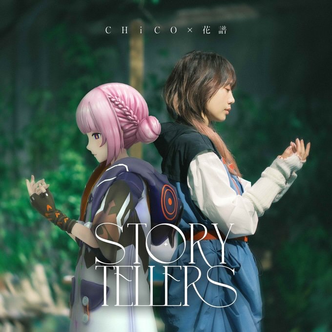
This cover works because it turns a collaboration into a visual metaphor. Two figures back-to-back, facing opposite directions, sharing the same light. One reads as illustrated/anime, the other reads photoreal—yet the scene holds together because the environment and depth-of-field are consistent. It feels like one world, not two layers pasted together.
If you want to recreate this kind of “two styles, one story” cover, the key is to treat the background as glue. A forest with heavy bokeh is perfect: it hides hard edges, gives you cinematic softness, and lets the typography sit cleanly on top.
Collaboration posts succeed when the visual makes the concept instantly obvious. Here, the pairing is readable even at thumbnail size: two characters, back-to-back, different worlds, same mood. That clarity makes it shareable—and it also creates a “double take” loop as viewers notice the mixed media and zoom in.
The typography choice matters too. A large serif title across the bottom signals “album cover” immediately. People don’t just see an image; they see a release. That context increases clicks, saves, and reposts.
| Signal | Evidence (from this image) | Mechanism | Replication Action |
|---|---|---|---|
| Collab clarity | Two subjects paired back-to-back | Instant “two artists / two sides” read | Use a symmetrical duo pose (back-to-back, mirrored profiles) |
| Mixed-media novelty | Anime character beside a photoreal subject | Creates a second-look moment | Lock lighting + DOF so the mix feels intentional, not pasted |
| Cinematic softness | Forest bokeh and shallow depth of field | Hides compositing seams and feels premium | Choose a bokeh-friendly background (forest, city lights, stage haze) |
| Album-cover framing | Large serif title + small artist line | Signals “official release” immediately | Use a two-tier type system: small top credit + big bottom title |
Recipe 1: Background glue
Recipe 2: Style inversion
Recipe 3: Gesture anchor
You don’t need the anime and photoreal parts to match perfectly. You need the camera story to match: same depth-of-field, same direction of light, same softness. The forest bokeh creates a unified “lens look,” and that’s what makes the cover feel coherent.
Keep your palette controlled too. Green background, one pink hair accent, one blue clothing accent, and white typography. That’s enough. Extra colors will make mixed media feel messy fast.
| Prompt chunk | What it controls | Swap ideas (EN) |
|---|---|---|
| “two subjects back-to-back, mirrored side profiles” | Collab readability and symmetry | “shoulder-to-shoulder”, “face-to-face”, “split frame” |
| “lush green forest bokeh, shallow depth of field” | Cinematic glue and softness | “night city bokeh”, “stage haze”, “sunset field” |
| “left anime character, right photoreal subject” | Mixed-media novelty | “both illustrated”, “both photoreal”, “3D + photo” |
| “consistent soft daylight lighting” | Prevents pasted look | “rim-lit sunset”, “overcast soft light”, “spotlight key” |
| “album cover typography: small top credit, large serif title” | Signals ‘official release’ | “minimal sans title”, “no type”, “centered title block” |
Cinematic square album cover in a lush green forest with heavy bokeh and shallow depth of field, soft natural daylight. Two subjects stand back-to-back centered in frame with mirrored side profiles: left is an anime-style girl with pastel pink hair in a low bun with braided wrap detail, wearing a dark navy/purple jacket with an orange circular emblem; right is a photoreal young woman with medium-length brown hair wearing a blue pinafore dress with white long sleeves. Both hold hands raised in front in a gentle mirrored gesture. Mixed-media composite with consistent lighting and DOF. White typography: small spaced artist line at top, large elegant serif title across bottom reading “STORY TELLERS”. High resolution, clean, album-cover layout.