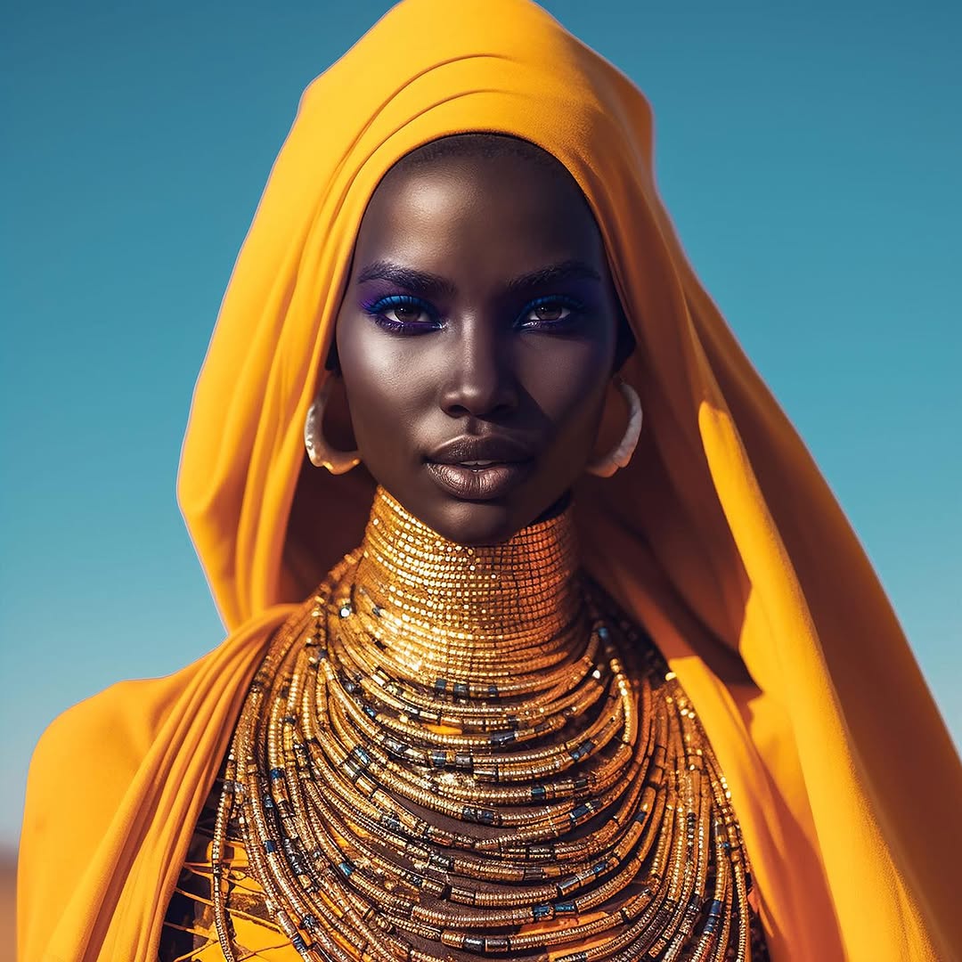
How shudu.gram Made This Orange Head Wrap Fashion AI Portrait - and How to Recreate It
This portrait is a masterclass in symbolic styling. It combines color, structure, and gaze to create immediate authority. The orange drape and layered bead architecture are not just fashion details; they function as visual language about heritage, futurity, and control of representation.
For creators discussing AI, identity, or digital authorship, this kind of image does more than attract likes. It anchors a cultural position.
Why This Visual Can Travel Far
The strongest mechanic is high-recognition silhouette. Even at small size, the wrapped head form and stacked neck structure remain unmistakable. This improves scroll-stop performance because the shape is unique before viewers even process details.
The second mechanic is chromatic contrast: warm saffron against a cool blue sky creates instant separation. Third, the direct gaze gives emotional presence, which helps the image feel like a statement rather than decoration.
| Signal |
Evidence (from this image) |
Mechanism |
Replication Action |
| Memorable silhouette |
Tall draped head wrap + layered neck form |
Shape-first recognition improves stop rate |
Design one dominant silhouette element and protect it across variants |
| High color polarity |
Orange fabric against cyan sky |
Complementary contrast increases visual pop |
Use one warm and one cool anchor color; avoid adding third competing hue |
| Authority gaze |
Centered direct eye contact, neutral expression |
Builds trust and narrative seriousness |
Lock eye line to lens in hero frame; avoid excessive expression changes |
| Material richness |
Detailed beads and fabric folds |
Texture density signals craftsmanship |
Specify material descriptors (glass bead, metallic thread, woven drape) in prompts |
Use Cases: Where This Style Fits
- Exhibition announcements: ideal for concept-led events around design and digital culture.
- Editorial covers: works when one image must carry identity + thesis together.
- Campaign hero visuals: strong for posts that need premium, global-art direction.
- Speaker/event posters: converts well when paired with minimal typography overlay.
Not ideal: tutorial-first posts that require process visibility, or lifestyle storytelling where environment context matters more than symbolic portraiture.
Three Transfer Recipes
- Exhibition flyer adaptation
Keep: centered regal portrait, bold warm/cool color pair.
Change: add negative space on one side for event text.
Slot template (EN): {subject} in {sculptural_headwear}, {warm_color} vs {cool_background}, leave {text_side} negative space
- Brand identity campaign
Keep: silhouette and direct gaze.
Change: replace beads with brand-specific material language.
Slot template (EN): {subject} with {signature_material_layers}, frontal gaze, minimal sky backdrop
- Music visual cover
Keep: strong shape hierarchy and high saturation.
Change: makeup accent color to match album mood.
Slot template (EN): {artist_portrait}, dominant sculptural styling, accent makeup in {album_color}, clean background
Aesthetic Read: Observed Craft Choices
The portrait uses a strict two-plane design: subject plane and sky plane. No mid-ground clutter. That binary separation increases impact and keeps all interpretive weight on styling and expression.
Jewelry layering is engineered like architecture. The repeated arcs create rhythm from chin to chest, while the head wrap counters with larger flowing mass. This scale contrast is why the frame feels both ornamental and controlled.
Prompt Technique Breakdown
| Prompt chunk |
What it controls |
Swap ideas (EN, 2-3 options) |
| single centered bust portrait, direct gaze |
Narrative authority and focal lock |
"centered half-body portrait" / "tight head-and-shoulders" / "frontal beauty crop" |
| saffron sculptural head wrap |
Hero silhouette and color anchor |
"crimson wrapped fabric" / "ivory structured veil" / "emerald layered turban" |
| multi-layer metallic bead neck stacks |
Material richness and visual rhythm |
"pearl collar tiers" / "bronze chain layering" / "ceramic bead lattice" |
| cyan sky minimal background |
Contrast clarity and negative space |
"flat studio blue backdrop" / "pale mint sky" / "neutral off-white background" |
| high-clarity daylight with crisp highlights |
Texture articulation and premium finish |
"soft overcast daylight" / "golden hour side key" / "studio hard key + bounce fill" |
Remix Playbook
Baseline lock: lock silhouette element, lock color polarity, lock centered composition.
One-change rule: only one variable per generation cycle.
- Cycle 1: test three head-wrap volumes while keeping jewelry constant.
- Cycle 2: keep winning wrap shape, test makeup accent color only.
- Cycle 3: keep color winner, test background tone (cyan, teal, pale blue).
- Cycle 4: keep image winner, test caption framing (culture-forward vs design-forward).
This sequence helps creators avoid random drift and build a coherent visual thesis across a campaign.