本日配信リリース🎧 #組曲2 第七弾 #花譜 × #MoriCalliope 「光」 作詞:#たなか 作曲:たなか/椎乃味醂 編曲:#椎乃味醂
本日配信リリース🎧 #組曲2 第七弾 #花譜 × #MoriCalliope 「光」 作詞:#たなか 作曲:たなか/椎乃味醂 編曲:#椎乃味醂
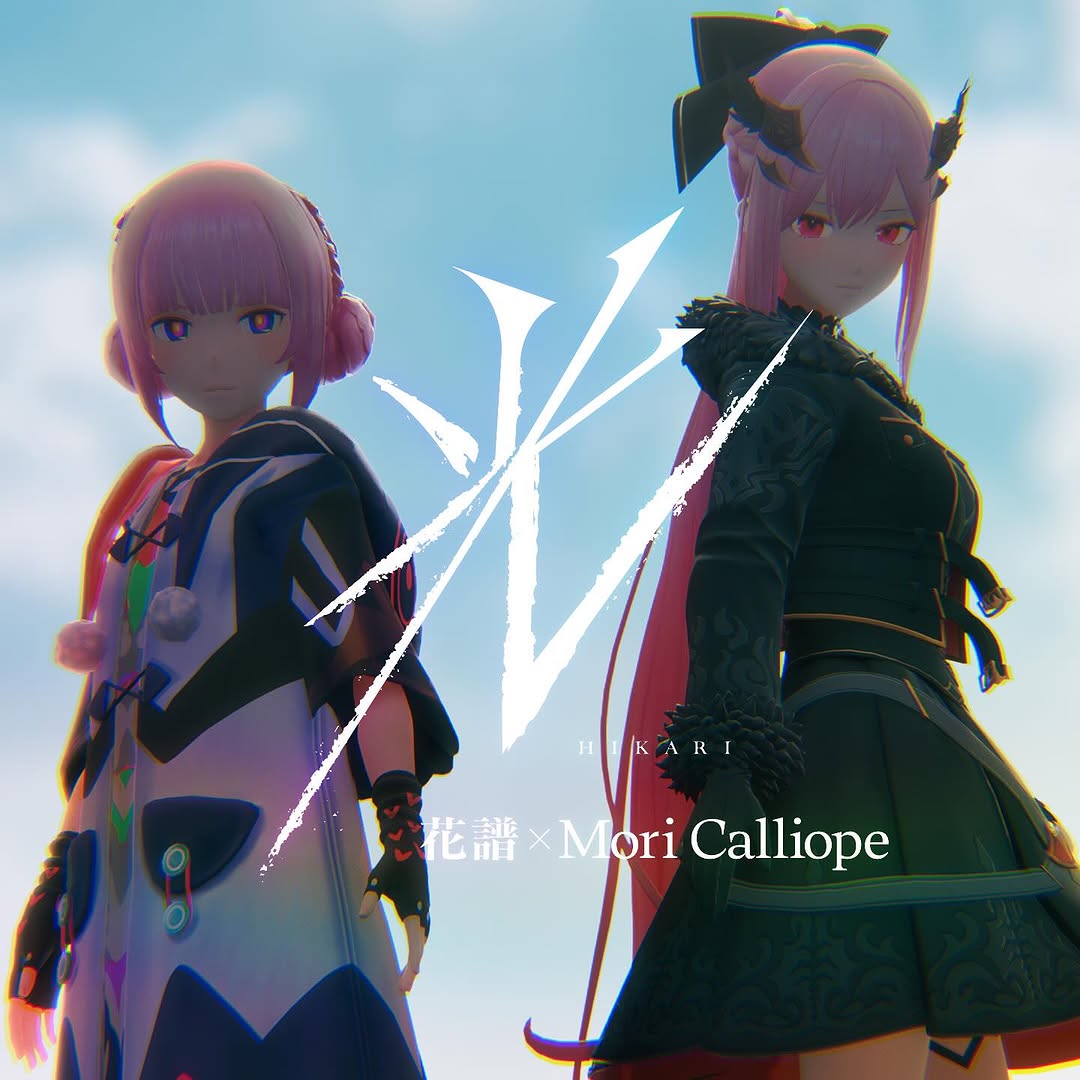
This artwork is a clean collaboration template: two distinct personas, one shared title symbol, one unified atmosphere. That is exactly what good collab covers need. If one character dominates too hard, the collaboration feels fake. If both are too similar, the visual loses tension. This image solves both by using contrast with balance.
For creator teams, virtual artists, and music collabs, this format is extremely practical because it communicates identity, partnership, and release mood in a single square frame.
The visual has a built-in comparison hook. Audiences naturally read left vs right, then ask how the two personas connect. That curiosity increases comments and shares. The central white emblem acts as a symbolic bridge, turning two separate character brands into one campaign statement.
| Signal | Evidence (from this image) | Mechanism | Replication Action |
|---|---|---|---|
| Dual-identity tension | Contrasting character designs side-by-side | Encourages audience comparison and discussion | Pair collaborators with clearly distinct visual archetypes |
| Unity anchor | Large central emblem/title mark | Makes the collaboration feel intentional, not random | Use one shared symbol or title lockup between artists |
| Hero framing | Low-angle pose against open sky | Adds scale and release-event importance | Use low-angle composition for collab lead visuals |
| Readable metadata | Artist names and title integrated near lower center | Supports reposts where captions may be lost | Embed essential collab text directly into key art |
{artist A} × {artist B} low-angle hero cover, central symbol, sky backdrop{character 1} and {character 2} promotional key art with shared emblem{creator persona} + {brand persona}, central campaign mark, clean cover typographyThe success here comes from controlled contrast. Left character uses brighter futuristic design, right character uses darker gothic styling. This "light vs dark" polarity creates dramatic tension while pink hair continuity keeps the pairing coherent. The sky background keeps the palette open and avoids visual claustrophobia.
| Observed | Recreate evidence |
|---|---|
| Two-character mirror balance | Place one subject on each side with clear center gap |
| Shared color thread | Use one repeating color cue across both characters |
| Central symbolic mark | Insert a bold emblem/title graphic between subjects |
| Low-angle hero perspective | Shoot/render from below eye line for scale |
| Soft bloom finish | Add gentle glow/chromatic fringe for promo-art polish |
| Prompt chunk | What it controls | Swap ideas (EN, 2-3 options) |
|---|---|---|
| Character contrast block | Role differentiation | "futuristic vs gothic" / "light vs dark" / "tech vs fantasy" |
| Shared motif block | Collab cohesion | "matching hair tone" / "shared accessory color" / "same emblem accent" |
| Center mark block | Campaign identity | "calligraphic symbol" / "geometric logo glyph" / "single-letter crest" |
| Text lockup block | Metadata readability | "title + artist names" / "episode name + duo credits" / "event + collab line" |
| Atmosphere block | Mood scale | "bright sky haze" / "dusk gradient" / "clouded dramatic sky" |
Baseline lock: lock two-character side placement, center emblem, and low-angle composition.
This process keeps collaboration art consistent across all distribution surfaces.