How shudu.gram Made This ATE OpenArt MVA AI Art
This visual works because it is pure signal and almost no noise. One word, one style system, one emotional direction. In social feeds overloaded with complex visuals, a highly controlled text-first poster can stop attention faster than scene-heavy content.
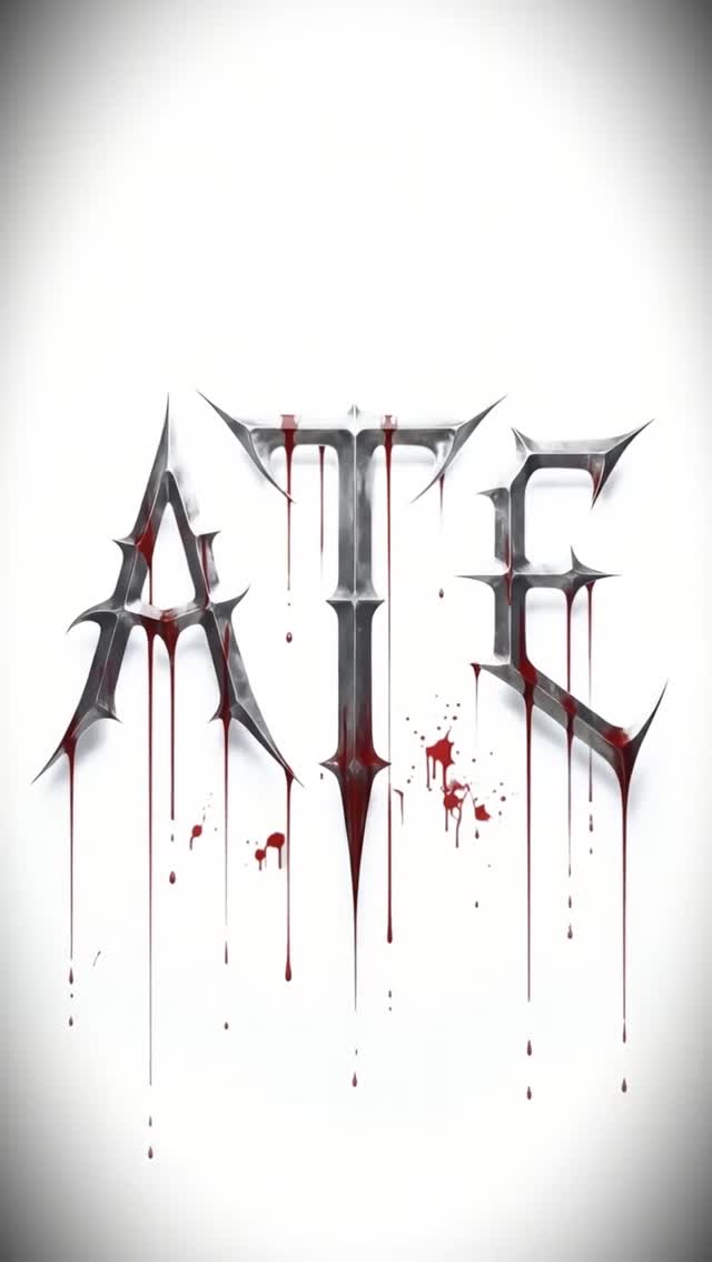
The chrome gothic letterforms communicate genre attitude immediately, while the red drip treatment adds kinetic tension and memorability. Even without a face or setting, the frame still carries personality. That is the strength of disciplined typographic storytelling.
For creators promoting music, challenges, or awards, this is a useful reminder: a strong title treatment can function as a standalone hero asset when the styling language is coherent and distinctive.
Signal Table
| Signal | Evidence (from this image) | Mechanism | Replication Action |
|---|
| Single-word dominance | Only “ATE” appears as focal content | Reduces cognitive load and increases instant recall | Use one hero word for campaign hooks, not full sentences |
| Genre-coded lettering | Sharp chrome gothic forms | Conveys tone before users read context | Match letterform style to music genre identity |
| Controlled accent color | Red drips over silver text | Adds emotional intensity without clutter | Limit accent palette to one high-impact color |
| Negative-space leverage | Large white empty field around text | Makes central mark feel premium and deliberate | Leave generous whitespace for text-centric posts |
Use Cases and Transfer
- Music release title cards: ideal for bold pre-roll visual hooks.
- Award or challenge promo posters: works for high-contrast campaign identity.
- Artist era branding: strong for defining a visual chapter with one keyword.
- Merch concept graphics: typography can translate directly to apparel prints.
- Not ideal for explanatory posts requiring multiple information points.
- Not ideal for soft lifestyle audiences expecting warm human imagery.
- Not ideal for product demos where object realism is required.
Three Transfer Recipes
- Keep: one-word center composition. Change: genre typography. Template:
{hero_word} in {genre_font_style}, minimal background, one accent effect - Keep: silver + red palette logic. Change: texture treatment. Template:
chrome title + {effect_layer} drips/sparks, white poster field - Keep: negative-space dominance. Change: campaign keyword. Template:
{campaign_word}, centered high-detail render, aggressive minimal aesthetic
Aesthetic Read
The visual tension comes from contrast between precision and decay. Chrome letters are clean, geometric, and polished; red drips are irregular and organic. That push-pull creates emotional depth in a very minimal composition. The white field amplifies every detail of edge, bevel, and drip trajectory. Because no extra objects compete for attention, the viewer spends more time reading micro-details in the letterforms.
| Observed | Creative Effect | Recreate Decision |
|---|
| Chrome beveled gothic forms | High-impact genre tone | Use sharp serif geometry and metallic shading |
| Red downward drips | Motion and tension cue | Add gravity-consistent streaks with varied thickness |
| Centered word with whitespace | Premium poster readability | Preserve large negative margins around the title |
| Monochrome + one accent | Strong visual focus | Restrict palette to silver, red, and white/gray background |
Prompt Technique Breakdown
| Prompt chunk | What it controls | Swap ideas (EN, 2-3 options) |
|---|
| Keyword block | Campaign core message | "ATE" / "RISE" / "VOID" |
| Font DNA | Genre identity | "gothic chrome" / "blackletter steel" / "spike serif metal" |
| Accent effect | Emotional intensity | "red drips" / "ink bleed" / "liquid chrome splash" |
| Background rule | Focus control | "white field" / "light gray paper" / "subtle vignette backdrop" |
| Render sharpness | Professional finish | "print-quality edges" / "high-res bevel detail" / "clean anti-aliased contours" |
| Mood direction | Brand personality | "dark pop" / "industrial elegance" / "aggressive minimal" |
Remix Steps
- Baseline lock: lock centered one-word layout, chrome material, and red-drip effect.
- Step 1: test alternate keywords with same style system.
- Step 2: vary serif sharpness while preserving composition.
- Step 3: adjust drip density to balance readability and aggression.
- Step 4: export multiple contrast versions for feed vs story formats.
Use one-variable iteration loops. Typography branding scales best when style constants remain stable.