本日配信リリース🎧 #組曲2 第八弾 #花譜 × #ネクライトーキー 「ユーフォーを見にいこう」 作詞・作曲:朝日(ネクライトーキー)
本日配信リリース🎧 #組曲2 第八弾 #花譜 × #ネクライトーキー 「ユーフォーを見にいこう」 作詞・作曲:朝日(ネクライトーキー)
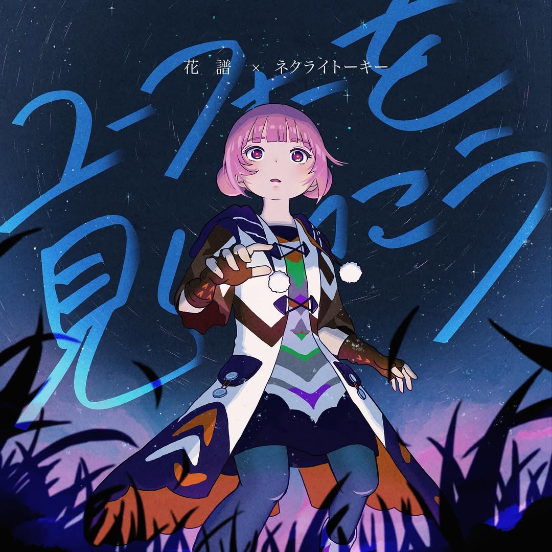
This image functions as both artwork and announcement. It delivers character emotion, song atmosphere, and title branding in one glance. That is why it works for music-release posts: fans get a collectible visual while new viewers still understand that something new dropped today.
For creators releasing tracks, this type of key art is useful because it supports both fandom depth and feed readability.
The character pose creates narrative tension. She is not static; she appears to be stepping toward something unknown. That motion cue pairs well with the nighttime setting and gives viewers a reason to linger.
The giant handwritten title strokes are another strong mechanism. Instead of placing text in a separate label box, the typography becomes part of the scene. This increases memorability and makes the song title feel emotionally integrated.
| Signal | Evidence (from this image) | Mechanism | Replication Action |
|---|---|---|---|
| Character-led curiosity | Forward-reaching pose and wide-eyed expression | Creates implied story moment | Use one gesture that suggests movement or discovery |
| Integrated title branding | Large cyan brush-script across sky | Song title becomes visual identity, not just metadata | Design title lettering as a scene layer, not a footer caption |
| Mood-consistent palette | Deep blue night tones with cyan highlights and pink hair | Emotional cohesion reinforces track atmosphere | Pick one dominant mood family and one accent color pair |
| Foreground framing | Dark grass silhouettes at bottom | Adds depth and cinematic perspective | Include subtle foreground silhouettes to avoid flat composition |
Not ideal: technical tutorial posts, documentary updates, or cases where text density must be very high and utilitarian.
{character_pose} under {night_sky_style}, giant brush title {song_title}, foreground {silhouette_element}{artistA} x {artistB} credit on top, {hero_character} center, mood palette {color_set}chapter {n}, same cover grid, new {expression}/{stroke_color}, consistent foreground silhouetteThe design avoids the common trap of separating illustration and typography. Here, letters flow through the same space as the character, so the whole frame feels authored as one object. That integration is what gives the post a “real cover art” quality.
The value contrast is also well controlled: dark foreground and sky allow the character face and cyan title strokes to pop without visual chaos.
| Prompt chunk | What it controls | Swap ideas (EN, 2-3 options) |
|---|---|---|
| single pink-bob anime heroine, dynamic gesture | Character identity and emotional hook | "running pose" / "looking upward pose" / "reaching-forward pose" |
| large cyan handwritten Japanese title strokes | Brand memory and title prominence | "white brush script" / "magenta graffiti script" / "electric-blue calligraphy" |
| starry deep-blue night background | Mood and atmosphere | "sunset twilight" / "rainy neon night" / "moonlit cloudscape" |
| dark grass silhouettes foreground | Depth and cinematic framing | "flower silhouettes" / "city fence silhouettes" / "branch silhouettes" |
| high-saturation anime cover rendering | Commercial poster finish | "soft watercolor anime" / "clean cel-shaded anime" / "ink-heavy manga style" |
Baseline lock: lock character placement, lock title integration style, lock night palette.
One-change rule: test one axis per variant.
This keeps branding stable while giving enough flexibility for multi-platform launch assets.