How invideo.io Built This Red Dead Redemption 2 AI Art
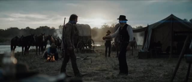
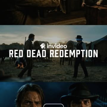
This frame performs because it behaves like a mini trailer before the video even starts. Three horizontal strips compress narrative scope, character conflict, and emotional intensity into one square image. The viewer reads it as “cinema,” not “random screenshot,” which instantly raises perceived production value.
The central title placement is the strongest conversion element. “RED DEAD REDEMPTION” is large, high-contrast, and positioned over the most dynamic strip. The brand marker above it (“invideo”) anchors attribution without stealing attention. This hierarchy is exactly what short-form promo covers need: story first, brand second, both legible.
Color grading also drives retention. Cool shadow dominance with warm fire accents creates a gritty western mood that matches audience expectations for this genre. When visual tone matches content promise, click-through improves because there is no mismatch between thumbnail and payoff.
Signal Table
| Signal | Evidence (from this image) | Mechanism | Replication Action |
|---|
| Multi-moment compression | Top/middle/bottom strips each show different scene intensity. | Suggests story breadth in a single glance. | Use 2–3 narrative strips to imply sequence without full trailer playback. |
| Title-first readability | Large white centered headline over mid strip. | Instantly communicates content theme and genre. | Keep title short, bold, and placed on highest-contrast region. |
| Genre-consistent grading | Dark blue shadows and warm fire accents. | Mood coherence increases trust and click intent. | Lock one genre grade profile across thumbnail and video opening shots. |
| Conflict framing | Two figures facing off in center strip. | Visual tension creates curiosity before motion begins. | Choose one confrontation or decision moment as central strip hero. |
Best-Fit Scenarios and Transfers
- Best fit: AI trailer showcases. Why fit: strip montage communicates cinematic range fast. What to change: swap central title by project name.
- Best fit: Before/after storytelling promos. Why fit: multiple strips map naturally to narrative stages. What to change: assign one strip per stage.
- Best fit: Genre demo ads for video tools. Why fit: visual mood immediately indicates capability. What to change: keep same layout, rotate genre palette.
- Best fit: Reel cover for cinematic edits. Why fit: clear title and dramatic frame improve click-through. What to change: keep logo subtle and headline dominant.
- Not ideal: Minimalist educational explainers. Reason: heavy cinematic mood can overpower informational tone.
- Not ideal: Product macro campaigns. Reason: collage format diffuses focus away from a single object.
- Not ideal: Bright family-vlog content. Reason: gritty grade may conflict with expected emotional tone.
- Transfer Recipe 1: Sci-Fi Variant
Keep: three-strip montage, centered headline, brand-above-title structure.
Change: western imagery to neon city and spacecraft conflict scenes.
Slot template (EN): {three_strip_collage} {genre_scenes} {center_title} {brand_tag} {cohesive_grade} - Transfer Recipe 2: Crime Thriller Variant
Keep: middle-strip confrontation and low-key palette.
Change: horses/fire to alleyway chase and interrogation closeup.
Slot template (EN): {dark_thriller_montage} {conflict_center_strip} {bold_white_title} {no_clutter} - Transfer Recipe 3: Fantasy Epic Variant
Keep: narrative compression across strips and headline readability.
Change: western setting to castle-battle-portrait sequence.
Slot template (EN): {epic_three_panel_story} {hero_vs_rival_center} {cinematic_color_profile}
Aesthetic Read
The aesthetic strength is editorial hierarchy, not raw detail. The image knows exactly where the eye should go: center title, then conflict strip, then supporting strips. This makes it resilient on mobile where attention is limited and compression is aggressive.
Another key point is tonal continuity across panels. Even though each strip shows a different shot type, the shared color grading makes the collage feel like one project. This is essential for creator brands producing serialized video promos.
| Observed | Recreate | Why it matters |
|---|
| Three horizontal cinematic strips | Design with top/mid/bottom narrative moments | Increases perceived story scale |
| Centered white title block | Place short bold headline on middle strip | Boosts immediate comprehension |
| Dark cool grade + warm accents | Use blue-shadow profile with selective fire highlights | Aligns mood with genre promise |
| Confrontation scene in middle | Select highest-tension frame as center hero | Improves curiosity and click behavior |
Prompt Technique Breakdown
| Prompt chunk | What it controls | Swap ideas (EN, 2–3 options) |
|---|
| three-strip montage layout | Narrative density and pacing feel | “two-panel split”; “four-frame grid”; “single hero still” |
| center confrontation shot | Tension and viewer hook | “chase moment”; “close-up stare-down”; “dramatic reveal” |
| bold centered title typography | Message clarity and branding | “small top title”; “outlined title”; “subtitle + title stack” |
| dark western film grade | Genre signaling | “noir blue grade”; “warm sepia western”; “high-contrast desaturated” |
| subtle brand mark above title | Attribution without clutter | “corner logo only”; “end-card logo”; “no logo clean cut” |
Remix Steps
Baseline Lock: lock strip geometry, lock center title hierarchy, lock unified grade.
- Step 1: Build baseline with western center conflict and headline.
- Step 2: Change one knob only: genre scene set (western to sci-fi/crime).
- Step 3: Change one knob only: title typographic style while preserving size.
- Step 4: Change one knob only: grade temperature (cool-heavy vs warm-heavy).
Test legibility at thumbnail size. If title cannot be read instantly, reduce background complexity behind the text before changing fonts.