Ali Abdaal Thumbnail Playbook: 7 Stop-the-Scroll Patterns (2026)

Seven Ali Abdaal thumbnail patterns distilled into a fast, repeatable 2026 workflow.
|
12 min
Key Takeaways
Ali's 2023 guide highlights four core elements: expressive face, high-res subject, strong contrast, and a story cue.
Use a single focal subject and remove visual noise.
Show a clear transformation (before/after, then/now, problem/solution).
Combine expressive faces with high contrast so it reads on mobile.
Make the title and thumbnail promise the same outcome.
Keep text short, label the change, and test quickly.
Quick Answer: Ali Abdaal's YouTube guide points to four essentials: an expressive face, a high-res subject, strong contrast, and a story cue. The stop-the-scroll versions also show a clear change and match the title promise. Keep one subject, one outcome, and a fast-read cue that still works at mobile size.
💡 Quick Start: Thumbnail Expert Pro helps you generate multiple on-brand thumbnail variants in minutes. Create Click-Worthy Thumbnails →
The Ali Abdaal Thumbnail Model (4 Elements)
Ali's YouTube guide highlights a simple model that keeps thumbnails readable and clickable (source):
Expressive face: A single, clear emotion that matches the video promise.
High-res subject: Sharp images signal quality and trust.
High-contrast color: The subject stands out at small sizes.
Story cue: A single frame that hints at the full story.
Think of these as building blocks. The seven patterns below are different ways to combine them.
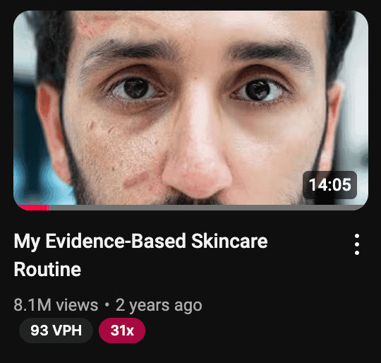
A Quick Case Breakdown: Ali's Transformation Thumbnail
In Jamie Whiffen's breakdown of an Ali Abdaal thumbnail, the example is built around a skincare transformation (source). The image shows two versions of the same face: the left side with visible skin issues, the right side clean and confident. The title signals credibility and a specific promise. The thumbnail then does the heavy lifting by showing the outcome directly.
Why this matters: it is simple, readable at a glance, and works even if the viewer never reads the full title. You can translate the same logic to almost any topic by showing a clear before/after that matches the title promise (messy to clean, confused to confident, or empty to full). The key is the visual promise, not the niche.
Our Evaluation Methodology
Because we do not have access to YouTube's internal CTR data, this is a pattern evaluation (not a claim of verified CTR uplift). Each pattern is assessed against a 5-dimension framework focused on clarity and repeatability for small creators.
Dimension | Weight | What We Look For |
|---|---|---|
Instant Clarity | 25% | Can the viewer understand the premise in under 1 second? |
Transformation Signal | 25% | Is the before/after or problem/result visible? |
Mobile Readability | 20% | Does it remain clear at small size? |
Curiosity Cue | 15% | Does it create a clear question without hiding the answer? |
Replicability | 15% | Can a small creator execute without a big budget? |
Review Environment:
- Sources: Ali Abdaal's YouTube guide (thumbnail section) + a public Ali thumbnail breakdown
- Review period: 2023-2026
- Team: alici.ai Content Team
- Note: This is a pattern guide, not a controlled experiment
Pattern Snapshot Table (Fast Scan)
Pattern | Primary Effect | Best For | Difficulty |
|---|---|---|---|
1. Transformation Split | Clear result promise | Tutorials, results-based videos | Medium |
2. Expressive Face Anchor | Immediate attention | Personal brands, teaching | Low |
3. High-Contrast Color Pop | Mobile readability | Any niche | Low |
4. Story Snapshot | One-frame narrative | Essays, explainers | Medium |
5. Curiosity Question | Click intent | Problem/solution topics | Medium |
6. Time-Progression Cue | Outcome certainty | Skill or habit change | Medium |
7. Strategic Labels | Fast understanding | Dense topics | Low |
1) Transformation Split (Before/After That Reads Left-to-Right)
This is the clearest Ali-style pattern: show the viewer the result they want in the same frame as the problem. A classic Ali example uses a left-to-right face transformation, so the viewer instantly understands the promise without reading the title.
Why it works: A before/after frame is a complete story in a single image. It answers "what changes?" and makes the outcome concrete.
Layout recipe:
- Split the frame vertically or diagonally.
- Use the same subject on both sides so the comparison is fair.
- Keep lighting consistent and let the change carry the story.
- Add a simple label only if the change is subtle.
Title pairings that fit:
- "I Fixed This in 30 Days"
- "From X to Y in One Week"
- "The Before vs After That Surprised Me"
What to test:
- Version A: full split with labels
- Version B: split without labels
- Version C: single subject with a strong "before" prop
Common pitfalls:
- Two different subjects (the viewer cannot compare)
- Over-editing that makes the change look fake
- Too many props that distract from the change
Why small creators can win with this: You do not need expensive design. You only need two clear states of the same subject. A phone photo, a clean crop, and a simple split can outperform a fancy graphic if the change is obvious.
Mini layout example:
- Left: "Messy desk" with clutter and poor lighting
- Right: "Clean desk" with one laptop and warm light
- Label: "Before" and "After" in small, bold text
Quick checklist:
- Is the change obvious without reading the title?
- Is the same subject shown on both sides?
- Is there only one main change, not five?
- Does the split follow left to right reading?
- Is the background simple enough to highlight the change?
2) Expressive Face Anchor (One Face, One Emotion)
Ali's thumbnails frequently place a single expressive face front and center. The expression is not random; it matches the title's promise (surprise, relief, confidence, or focus).
Why it works: A face is the fastest visual hook. The viewer reads emotion in a fraction of a second. If the emotion matches the promise, the click feels safe.
Layout recipe:
- Face fills 40-60% of the frame.
- Eyes look toward the key object or text.
- Background stays simple and low-detail.
- Keep skin tones natural; avoid extreme filters.

Title pairings that fit:
- "The Mistake I Finally Fixed"
- "The One Tip That Changed Everything"
- "I Tried This So You Don't Have To"
What to test:
- Open mouth vs closed mouth
- Direct eye contact vs looking at the object
- Neutral background vs branded color background
Common pitfalls:
- Exaggerated expressions that look forced
- Multiple faces competing for attention
- Busy backgrounds that reduce clarity
Why small creators can win with this: You already have the main asset: your face. A well-lit, close-up photo taken with a phone can beat a complex design if the emotion is clear and the crop is tight.
Mini layout example:
- Face on the left, 50% of the frame
- One object on the right that represents the topic (book, laptop, chart)
- One accent color background
Quick checklist:
- Does the emotion match the title promise?
- Is the face the biggest element on screen?
- Are the eyes visible and not shadowed?
- Is the background simple enough to keep focus?
3) High-Contrast Color Pop (Make It Read on Mobile)
Ali's guide stresses the importance of bright, high-contrast color. The reason is practical: small thumbnails on mobile need strong contrast to read instantly.
Why it works: Contrast creates immediate visual hierarchy. A bright subject against a darker background is more visible than a flat image. High contrast also helps the viewer identify the main subject without reading the title.
Layout recipe:
- Choose one dominant background color and one accent color.
- Keep the subject brighter than the background.
- Use a thin outline or glow to separate the subject.
- Avoid noisy textures that reduce legibility.
Title pairings that fit:
- "The Simple Upgrade I Wish I Did Sooner"
- "The Fastest Way to Improve X"
- "This Tiny Change Made a Big Difference"
What to test:
- Warm background vs cool background
- One accent color vs two
- Outline thickness (thin vs thick)
Common pitfalls:
- Too many colors that fight each other
- Over-saturation that makes the image harsh
- Low-contrast text that blends into the background
Why small creators can win with this: You do not need a designer to create contrast. A single bright background and a clean cutout of the subject is enough to make the thumbnail stand out.
Mini layout example:
- Solid dark background
- Subject cutout with a light outline
- One bright accent element (arrow, icon, or highlight box)
Quick checklist:
- Can you read the thumbnail at phone size?
- Is there one dominant color and one accent color?
- Does the subject stand out from the background?
Pro Tip: Use alici.ai Thumbnail Expert Pro to generate 3-5 color variations from the same layout. Create Click-Worthy Thumbnails →
4) Story Snapshot (One Frame That Implies the Plot)
A good Ali-style thumbnail shows a moment that implies the rest of the story. It is not the full answer; it is a teaser of the most interesting beat.
Why it works: If the viewer can guess the story, they want to see how it plays out. This pattern is powerful for educational channels because it turns a lesson into a mini narrative.
Layout recipe:
- Pick a single moment that feels incomplete.
- Show the key object and the person's reaction in the same frame.
- Remove anything that does not serve the story cue.
- Make sure the action is readable without the title.
Title pairings that fit:
- "I Didn't Expect This Result"
- "What Happened When I Tried X"
- "The Decision That Changed My Workflow"
What to test:
- Reaction face vs no face
- Close-up on object vs wide shot
- With label vs without label
Common pitfalls:
- Too much context needed to understand the frame
- Using a random image that has no story signal
- Overly staged scenes that feel inauthentic
5) Curiosity Question (Plant the Click Intent)
Ali's guide highlights that the best thumbnails create a question in the viewer's mind. This can be done with a visual contrast, a partial reveal, or a single word that hints at the outcome.
Why it works: The viewer sees a gap between "what I see" and "what I need to know." Clicking is the fastest way to close that gap. The key is to show enough for relevance while leaving one piece unanswered.
Layout recipe:
- Use a visual contrast (old/new, small/large, messy/clean).
- Add a short question or a 1-3 word label.
- Let the title complete the question rather than repeat it.
- Keep the unanswered part visible but unresolved.
Title pairings that fit:
- "Why This Worked When Nothing Else Did"
- "The Real Reason I Stopped Doing X"
- "Is This Actually Worth It?"
What to test:
- Question text vs no text
- Partial reveal vs full reveal
- Curiosity label at top vs bottom
Common pitfalls:
- Hiding too much so the viewer cannot guess the topic
- Asking a question the video never answers
- Repeating the same text in the title and thumbnail
6) Time-Progression Cue (Day 1 to Day 7)
Time cues create confidence that the result is achievable. A simple timeline or progression in the thumbnail makes the change feel specific and believable.
Why it works: A timeline compresses the viewer's journey and gives the promise a concrete frame. It turns a vague outcome into a measurable process.
Layout recipe:
- Use two to four stages (e.g., Day 1, Day 7, Day 30).
- Keep the subject consistent; only the outcome changes.
- Use minimal text to avoid clutter.
- Keep the progression left to right to match reading flow.
Title pairings that fit:
- "I Tried This for 7 Days"
- "My Results After 30 Days"
- "From Week 1 to Week 4"
What to test:
- Two stages vs three stages
- Labels vs simple arrows
- Numbers vs dates
Common pitfalls:
- Too many stages that make the image unreadable
- Tiny labels that do not read on mobile
- Inconsistent lighting or angles between stages
Why small creators can win with this: A timeline makes results feel reachable. You do not need perfect lighting; you need consistent framing so the change is obvious.
Mini layout example:
- Three panels of the same subject
- Labels: "Day 1", "Day 7", "Day 30"
- One accent arrow showing direction
Quick checklist:
- Are the stages readable at phone size?
- Is the change visible without zooming in?
- Does the timeline match the title promise?
7) Strategic Labels (Short Text That Clarifies the Promise)
Ali's example thumbnails use small, clear text to reinforce the promise: what is changing, what the result is, or why it matters. The text is not the story; it is the label that makes the story obvious.
Why it works: A good label reduces thinking time. It tells the viewer exactly what to expect without forcing them to guess.
Layout recipe:
- Keep text under 4 words whenever possible.
- Use bold, high-contrast type with clean spacing.
- Place labels near the thing they describe (not floating randomly).
- Use words that describe outcomes, not processes.
Title pairings that fit:
- "The 1-Step Fix"
- "This Changed Everything"
- "The Fastest Result I've Seen"
What to test:
- Outcome labels vs process labels
- 1 word vs 3 words
- Label near object vs near face
Common pitfalls:
- Long text blocks that do not read at small size
- Labels that describe the process instead of the result
- Text that overlaps the subject's face
Why small creators can win with this: Labels are the fastest clarity tool you have. A two-word label can explain a complex idea better than a busy graphic.
Mini layout example:
- Face on one side
- Outcome label near the object (e.g., "3x Faster")
- Simple background color
Quick checklist:
- Is the label under four words?
- Can you read it at phone size?
- Does the label describe the result, not the steps?
Title + Thumbnail Promise (The Ali Rule)
Ali's guide makes one point clear: the title and thumbnail together form a single promise. If they conflict, the viewer is confused. If they match, the click feels justified.
Three alignment rules:
1. One outcome, two angles: the title names the result, the thumbnail shows it.
2. No mismatched stakes: do not promise a big result in the title and show a small one in the image.
3. No false clickbait: if the video cannot deliver the promise, the click does not help you long-term.
Pairing templates you can reuse:
- Title: "How I Got X" + Thumbnail: clear visual of X
- Title: "I Tried Y for 30 Days" + Thumbnail: timeline cue
- Title: "The Simple Fix" + Thumbnail: before/after split
- Title: "What Happened When..." + Thumbnail: story snapshot
A good workflow is to create the title first, then build a thumbnail that visually proves the title's promise.
Comparison Table: Which Pattern Fits Which Video?
Pattern | Core Positioning | Best For | Speed to Apply | Risk |
|---|---|---|---|---|
Transformation Split | Best for clear before/after results | Results-driven topics | Medium | Low |
Expressive Face Anchor | Best for personal credibility | Talking-head and advice | Low | Low |
High-Contrast Color Pop | Best for mobile readability | Any niche | Low | Low |
Story Snapshot | Best for narrative curiosity | Essays, explainers | Medium | Medium |
Curiosity Question | Best for problem/solution hooks | Fixes, tips, hacks | Medium | Medium |
Time-Progression Cue | Best for measurable change | Habits, skills | Medium | Low |
Strategic Labels | Best for clarity at a glance | Dense topics | Low | Low |
How to Choose the Right Pattern (Decision Tree)
If your video promises a visible result, start with Transformation Split.
If your video relies on your credibility, use Expressive Face Anchor.
If your thumbnail looks messy at small size, use High-Contrast Color Pop.
If your video is story-driven, use Story Snapshot.
If your idea is a fix or tip, use Curiosity Question.
If you can show a timeline, use Time-Progression Cue.
If the topic is complex, add Strategic Labels.
A Low-Cost Ali-Style Workflow (Using Alici.ai)
You do not need a design team to build this playbook. Use a simple, repeatable workflow:
Start with the title promise (what the viewer gets).
Pick one pattern from the seven above.
Generate 3-5 variants with alici.ai Thumbnail Expert Pro.
Keep the best headline + image pairing.
Iterate if CTR stalls within the first week.
Alici.ai features that map directly to Ali's method:
- AI Quick Generation: generate multiple layout variations fast.
- Script → Thumbnail: extract the strongest promise from your script.
- URL Reference: match the visual style of a reference video.
- One-Face: keep your face consistent across a series.
A One-Page Thumbnail Brief Template
Use this short template before you design any thumbnail:
Video promise: What does the viewer get?
Primary pattern: Which of the 7 patterns fits best?
Subject: Face, object, or both?
Outcome cue: What change or result will be visible?
Label text: 1-4 words max, if needed
Color plan: 1 background color + 1 accent color
Title alignment: Does the title finish the promise?
If you can answer all seven quickly, you are ready to design.
Related Guides (Internal)
For size and format rules, see the official YouTube thumbnail dimensions guide.
For broader crafting advice, see 10 thumbnail best practices.
If you want tool recommendations, compare the best AI thumbnail makers.
First-Week Testing Sprint (Small Creator Version)
You do not need dozens of tests to learn what works. Use a lightweight sprint:
Day 0: Create 3 variants from the same title promise.
Day 1: Publish with your strongest version.
Day 3: If CTR stalls, swap to version B.
Day 5: If needed, swap to version C.
Day 7: Lock the winner and move on.
Keep title changes separate from thumbnail changes so you know what caused the result.
Common Mistakes to Avoid
Two stories in one image: pick one promise, not two.
Over-texting: too much text kills scan speed.
Low-resolution photos: poor image quality signals low production value.
Title mismatch: if the title promises A and the thumbnail shows B, the click will drop.
Too many props: extra objects reduce clarity at small size.
Copying without adapting: the pattern matters more than the exact design.
FAQ
Do I need a face in every thumbnail?
Not always, but for personal brands it is the fastest way to create recognition. If you skip the face, make sure the object or scene clearly communicates the promise.
How much text should I put on a thumbnail?
Aim for 1-4 words. If the text is longer, it will not read at mobile size.
Is high contrast always better?
Yes for readability, but you can keep it tasteful. Contrast does not mean neon; it means clear separation between subject and background.
Should the title repeat the thumbnail text?
No. Use the thumbnail to show the promise and the title to complete it.
How many variants should I test?
Start with 3-5. If one wins early, lock it in and save time for the next video.
Can I copy Ali Abdaal's exact style?
You can copy the pattern logic, but keep your own brand and niche signals. The goal is clarity, not imitation.
What if my video is not a transformation?
Use Story Snapshot or Curiosity Question. You can still promise a result even if the change is not visual.
What tool should I use to create Ali-style thumbnails faster?
If you want fast iteration, use alici.ai Thumbnail Expert Pro to generate multiple variants from one idea. It is built for creator workflows and helps keep faces, colors, and layout consistent. Create Click-Worthy Thumbnails →
Do I need special tools to make these?
No, but tools speed up iteration. A template-based generator reduces design time and keeps style consistent.
🎁
Limited-Time Creator Gift
Start Creating Your First Viral Video
Join 10,000+ creators who've discovered the secret to viral videos