10 Best MrBeast Thumbnails for YouTube in 2026: Patterns That Drive Clicks

From Placement to Expression: A One‑Page Mobile‑Readable Workflow
|
13 min
Key Takeaways
A public analysis of ~3,000 MrBeast thumbnails highlights repeatable visual patterns you can test.
Face‑first composition, high contrast, and clear emotion drive instant readability on mobile.
Primary color accents (red/green/yellow) signal stakes faster than complex palettes.
The fastest wins come from a short testing sprint, not endless redesigns.
You don’t need a big budget - just consistent, controlled experimentation.
TL;DR: Use face‑first composition, high contrast, and specific numbers, then test 3–5 variants in a 7‑day sprint.
Quick Answer
A LinkedIn analysis reported reviewing roughly 3,000 MrBeast thumbnails across 125 videos (2020–2025) and found consistent visual patterns: dominant faces, natural expressions, action‑forward poses, high contrast, and specific numbers. These patterns are not official A/B results, but they are practical, repeatable signals. Small creators can copy the approach by generating 3–5 variants and testing them quickly. (Source: Josiah Hritsko, LinkedIn)
💡 Quick Start: Thumbnail Expert Pro helps you generate multiple on‑brand thumbnail variations in minutes. Try it free →
Why MrBeast Thumbnails Matter (Even If You’re a Small Creator)
Most creators redesign thumbnails blindly - then hope click rate improves. MrBeast’s approach flips that: test one variable, learn fast, and keep what wins. That’s the real advantage. You can apply the same method at a smaller scale without copying the budget.
If you want the foundational basics, read How to Make YouTube Thumbnails That Get Clicks (2026). If you need the exact sizes, see YouTube Thumbnail Dimensions 2026. This article focuses on the patterns that keep showing up in high‑performing MrBeast thumbnails. If you want the official platform guidance, YouTube’s help docs recommend a 1280×720 (16:9) thumbnail size (see YouTube Help).
What This Guide Is (and Isn’t)
Is: A practical pattern playbook based on public observations and creator analysis.
Is not: Official YouTube A/B data or a guaranteed click-rate uplift formula.
Use these patterns as hypotheses to test on your own channel.
Our Evaluation Methodology
Because we don’t have access to MrBeast’s internal A/B results, we use a pattern‑evaluation rubric rather than a controlled experiment. Each pattern is assessed on five dimensions based on public examples and creator heuristics.
Dimension | Weight | What We Look For |
|---|---|---|
Story Clarity | 30% | Can the viewer understand the premise in <1 second? |
Emotional Signal | 25% | Does the thumbnail show clear emotion or tension? |
Contrast & Legibility | 20% | Is the subject readable at mobile size? |
Curiosity Gap | 15% | Is there a visual “question” the video answers? |
Replicability | 10% | Can small creators test this without huge budgets? |
Review Environment:
- Source set: public MrBeast thumbnails (2020–2025) + creator analysis summaries
- Review period: 2025–2026
- Team: alici.ai Content Team
- Note: This is a pattern guide, not a claim of verified click-rate uplift.
Pattern Snapshot Table (Fast Scan)
Pattern | Primary Effect | Best For | Difficulty |
|---|---|---|---|
1. Face‑First Composition | Instant attention | Any niche | Low |
2. Natural Expressions | Trust + authenticity | Vlogs, challenges | Low |
3. Action Poses | Energy + motion | Challenge videos | Medium |
4. Blurred Backgrounds | Focus + clarity | Busy scenes | Medium |
5. Dark BG + Bright FG | High contrast | Dramatic hooks | Medium |
6. Primary Color Pops | Readability | Money/stakes | Low |
7. Zoomed‑In Scale | Mobile readability | Object‑centric | Low |
8. Directional Cues | Eye guidance | Complex scenes | Medium |
9. Specific Numbers | Concrete stakes | Money/score | Low |
10. Refresh & Cleanup | Quality signal | Evergreen videos | Medium |
Pattern Scorecard (Impact vs Effort)
Pattern | Impact | Effort | Best Starting Point |
|---|---|---|---|
Face‑First Composition | High | Low | Yes |
Natural Expressions | Medium‑High | Low | Yes |
Action Poses | Medium | Medium | Maybe |
Blurred Backgrounds | Medium | Medium | Maybe |
Dark BG + Bright FG | Medium‑High | Medium | Yes |
Primary Color Pops | Medium | Low | Yes |
Zoomed‑In Scale | High | Low | Yes |
Directional Cues | Low‑Medium | Medium | No |
Specific Numbers | Medium‑High | Low | Yes |
Refresh & Cleanup | Medium | Medium | Maybe |
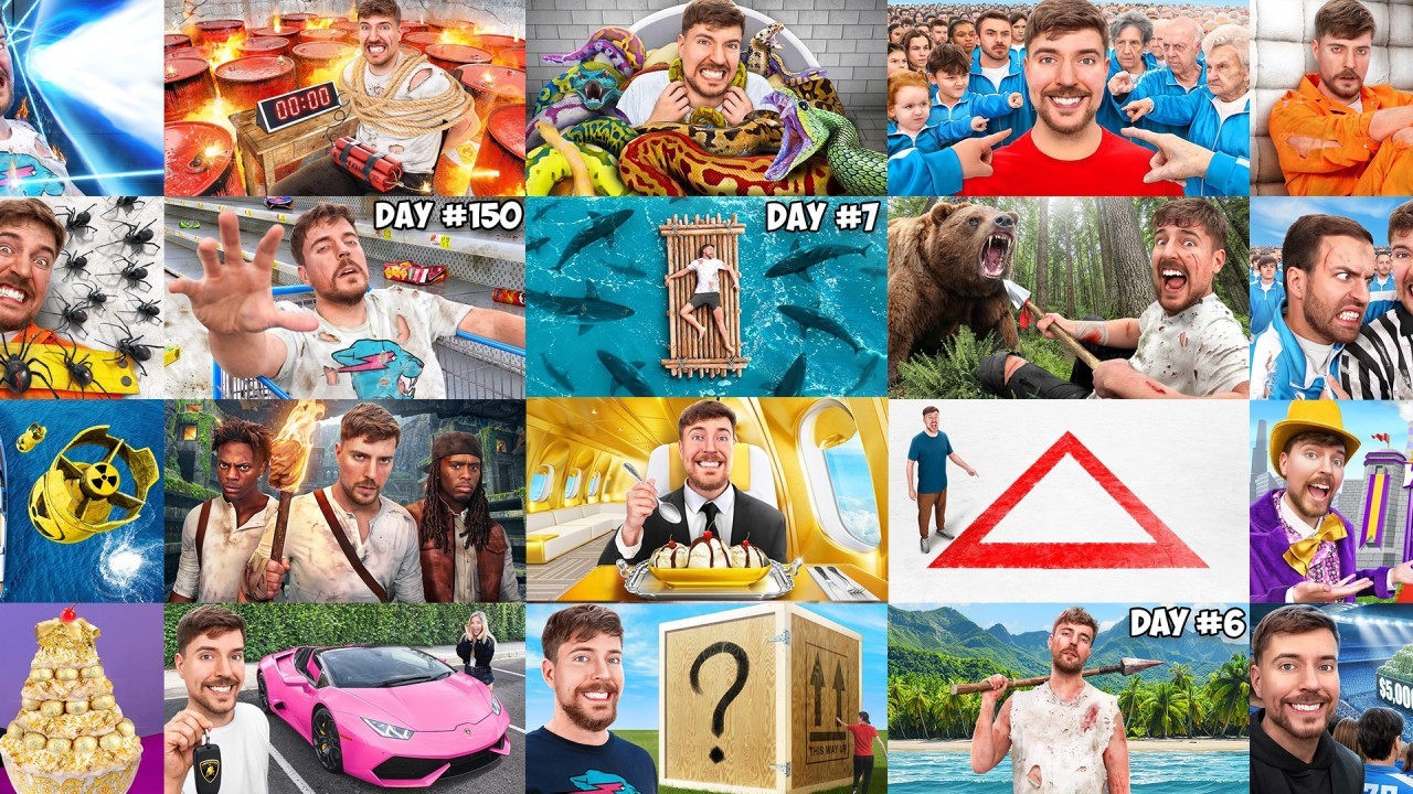
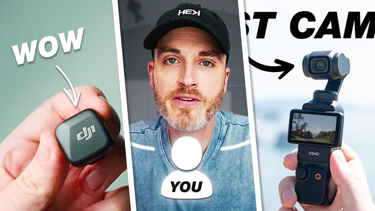
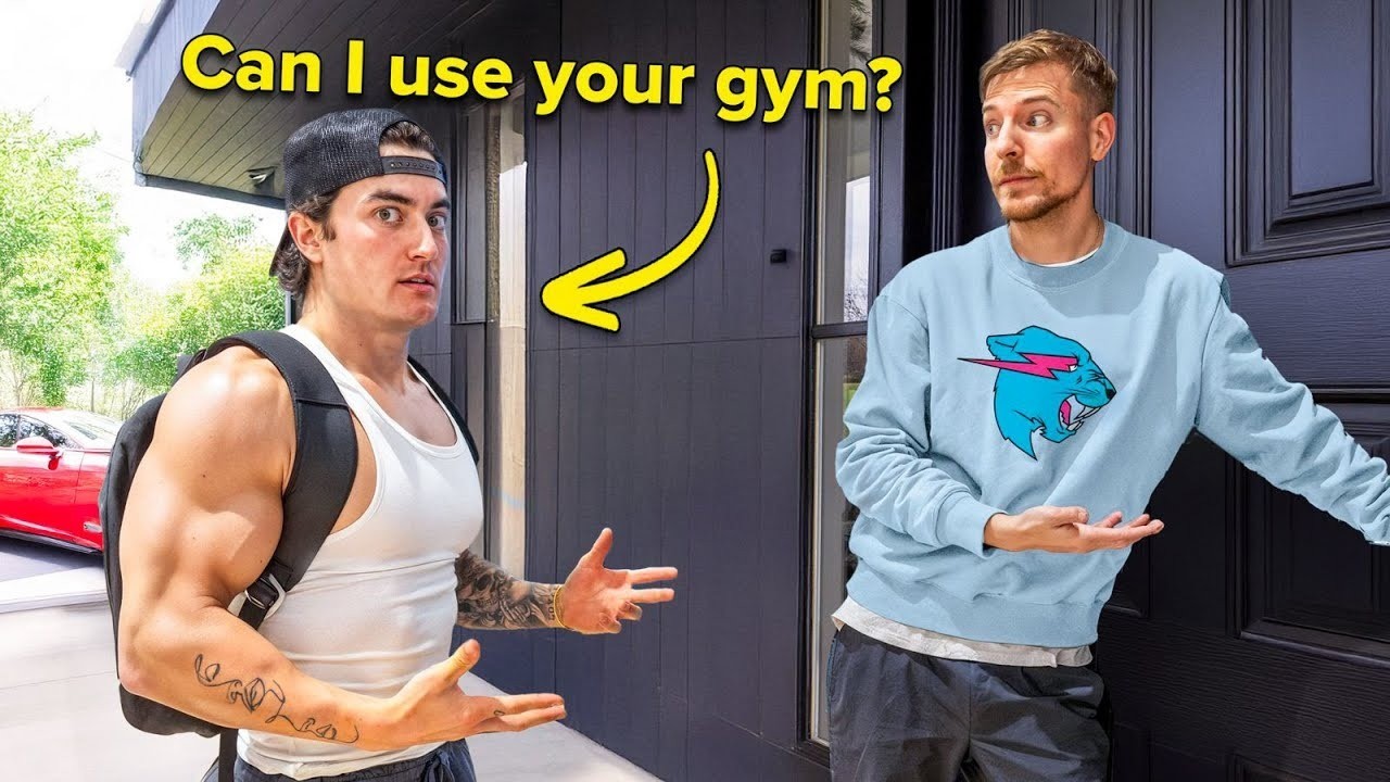
1) Face‑First Composition (Make the Face the Subject)
MrBeast’s face is nearly always present. A dominant face gives viewers a human anchor and emotional context. If you can only change one thing, make the face the largest, clearest element in the frame.
Why it works: Humans are wired to read faces instantly. It’s the fastest way to signal tone - fear, surprise, triumph - before the title even loads.
How to test:
- Version A: face takes 40–60% of the frame
- Version B: face at 20–30% with more scene detail
Avoid: tiny faces, multiple faces fighting for attention.
2) Natural Expressions Beat Exaggerated Ones
In reported tests, closed‑mouth or natural, mid‑action expressions often outperformed exaggerated open‑mouth poses. The takeaway: real beats theatrical more often than creators expect.
Why it works: Over‑exaggerated thumbnails can feel like clickbait; a natural expression reads as honest and confident.
How to test:
- Version A: open‑mouth “shock”
- Version B: closed‑mouth, focused, or subtle smirk
3) Action Poses Win Over Static Poses
Thumbnails with jumping, running, or reacting subjects tend to outperform static, posed shots.
Why it works: Action implies a story in motion - viewers sense a moment they want to see completed.
Small‑creator shortcut: Use burst mode or short clips and grab the most dynamic frame.
4) Blurred Backgrounds = Instant Focus
A sharp foreground with a blurred background consistently helps readability. It also separates subject from clutter.
Why it works: Blur mimics depth of field and instantly tells the viewer what to look at.
How to use:
- Add a background blur in an editor
- Increase subject sharpness and edge contrast
5) Dark Background + Bright Foreground
High‑contrast thumbnails stand out in the YouTube feed. Dark backgrounds with bright subjects pop even on low‑brightness mobile screens.
Why it works: Contrast creates immediate visual hierarchy; the eye snaps to bright areas first.
Pro Tip: Use alici.ai Thumbnail Expert Pro to generate 3–5 contrast‑optimized variants quickly. Create Click‑Worthy Thumbnails →
6) Primary Color Pops (Red / Green / Yellow)
Winning thumbnails often include clear primary color accents. Red signals danger, green signals money, yellow signals urgency or excitement.
Why it works: Primary colors are the most legible at small sizes and activate quick emotional cues.
How to test:
- Version A: neutral palette
- Version B: one dominant primary color accent
7) Zoomed‑In Scale (Make the Subject Larger Than Life)
Zoomed‑in subjects - faces, money, key objects - perform better than wide shots. The rule: if it matters, zoom it.
Why it works: Small thumbnails compress details; zooming preserves clarity and message.
Quick fix: Crop tighter and remove secondary objects that distract.
8) Directional Cues (Arrows & Circles, Used Sparingly)
Arrows and circles were common in early years, guiding eyes toward money, boxes, or hidden details. They still work when the scene is complex, but can feel dated if overused.
Why it works: They shorten the viewer’s scan path - important on mobile.
Best practice: Use at most one arrow or circle, and keep it clean.
9) Specific Numbers Create Instant Stakes
Large numbers (especially money amounts) clarify the challenge instantly. Specificity beats vagueness: “$100,000” is stronger than “big prize.”
Why it works: Numbers give the viewer a concrete promise and increase perceived stakes.
Test idea:
- Version A: vague text (“huge prize”)
- Version B: clear numeric value (e.g., “$10,000”)
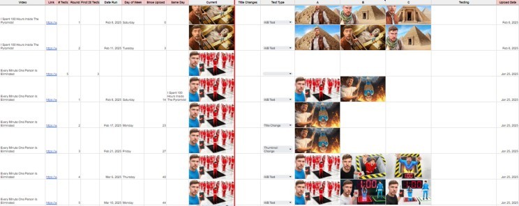
10) Refresh & Cleanup Your Back Catalog
MrBeast reportedly updated older thumbnails after major pattern discoveries. A simple quality refresh - better lighting, cleaner composition, updated face - can lift old videos.
Why it works: YouTube recommends evergreen videos; cleaner thumbnails signal freshness and quality.
Small‑creator play: Pick your top 5 evergreen videos and refresh thumbnails quarterly.
A 7‑Day Thumbnail Testing Sprint (Small‑Creator Version)
You don’t need 600 tests to learn what works. Use a simple, repeatable sprint:
Day 1–2: Create 3–5 variants of your next video thumbnail
Day 3: Publish with the strongest version
Day 4–5: Swap to version B (if click rate stalls)
Day 6–7: Swap to version C or revert to best performer
Week 2: Apply the winner to a similar video
Tip: Keep title changes separate from thumbnail changes so you know what caused the result.
Which Pattern Should You Test First?
If you’re unsure where to start, use this quick decision guide:
Low clicks + low watch time → Start with Face‑First + High Contrast
Clicks but poor retention → Test Natural Expressions + Action Poses
Cluttered thumbnails → Apply Blurred Backgrounds + Zoomed‑In Scale
Cash/prize videos → Use Specific Numbers + Primary Color Pops
Common Mistakes to Avoid
Too many focal points: one face + one object is enough.
Low contrast: if it doesn’t pop on your phone, it won’t pop in feeds.
Over‑editing: heavy filters reduce clarity and trust.
Copying without context: a MrBeast pattern might fail in a calm, educational niche.
How Alici.ai Helps You Apply These Patterns Faster
The hardest part of thumbnail testing is creating multiple high‑quality variants quickly. Alici.ai’s Thumbnail Expert Pro is built for that workflow:
Generate multiple variations from one concept
Keep a consistent face or character across iterations
Adjust colors, contrast, and composition without redoing the whole design
If you want a tool‑focused comparison, see Best AI YouTube Thumbnail Makers in 2025.
Sources & Attribution
Josiah Hritsko, “I Studied 3,000 MrBeast Thumbnails. Here’s What I Learned...” (LinkedIn, 2025)
YouTube Help: "Add video thumbnails on YouTube" (official guidance, accessed 2026)
Final Takeaway
MrBeast thumbnails aren’t magic; they are systematic experiments. If you combine clear emotions, high contrast, and fast iteration, you can capture the same advantages at a smaller scale. Ready to apply these patterns?
Create Click‑Worthy Thumbnails → Thumbnail Expert Pro
Try It Yourself
Ready to build thumbnails that earn more clicks?
Generate 3–5 variants fast, test them in a sprint, and keep the winner.
FAQ: MrBeast Thumbnails
Do MrBeast thumbnails always include his face?
Not always, but in many reported examples his face is present because it anchors emotion and instantly signals the video’s tone.
Is open‑mouth “shock” still the best approach?
Not necessarily. Observational testing suggests more natural, closed‑mouth expressions can outperform exaggerated poses.
How many thumbnail variants should I test?
Start with 3–5 variations. That’s enough to identify winning patterns without overwhelming your workflow.
Should I change thumbnails on old videos?
Yes - especially on evergreen videos. Refreshing with clearer, higher‑contrast thumbnails can revive older content.
Do arrows and circles still work?
They can, but use them sparingly. If the scene is simple, they add clutter; if it’s complex, they can guide attention.
What’s the best tool to create multiple thumbnail variants quickly?
For fast experimentation, Thumbnail Expert Pro is built for creators who want consistent, on‑brand variants without heavy design work.
How fast can I generate variations?
With tools like Thumbnail Expert Pro, you can generate multiple on‑brand variants in minutes and test quickly.
🎁
Limited-Time Creator Gift
Start Creating Your First Viral Video
Join 10,000+ creators who've discovered the secret to viral videos