Nano Banana Pro Is Here: Full Review + Practical Guide

Text-in-image, consistency, control - plus Pro vs Nano Banana and ready-to-use workflows
|
5 min
TL;DR
If your image needs readable text, series consistency, or strict layout/structure (posters, ads, infographics, product visuals, UI mocks), start with Nano Banana Pro. If you’re still exploring directions and want to iterate quickly, start with Nano Banana - then switch to Pro for
Key Takeaways
Nano Banana Pro is now available in Alici AI Image Studio - best for deliverable assets like posters, ads, infographics, product visuals, and UI mocks (especially when text/layout must be usable).
The biggest upgrades cluster around 4 things: readable text inside images, stronger identity/style consistency, better “structured” visuals, and more controllability (closer to describing a shot, not just a vibe).
Pro vs Nano Banana isn’t about being “cooler” - it’s about fewer re-dos. When you need stable series outputs or precise typography/layout, Pro’s advantage is more obvious.
A practical spec-level difference (as described by the comparison source): Pro supports higher output resolution (e.g., 2K/4K) and more reference images (e.g., up to 14) for consistency. (Source: InVideo)
The easiest workflow: use Nano Banana to explore directions fast (composition/style/character) → switch to Pro for final delivery (add text, layout rules, and consistency constraints).
If your image needs readable text, series consistency, or strict layout/structure (posters, ads, infographics, product visuals, UI mocks), start with Nano Banana Pro. If you’re still exploring directions and want to iterate quickly, start with Nano Banana - then switch to Pro for the final deliverable.
What’s actually new? (Explained through 4 everyday pain points)
Note: The capability points below come from the two reference articles. We translate them into practical, non-hype outcomes you can validate in your own workflow.
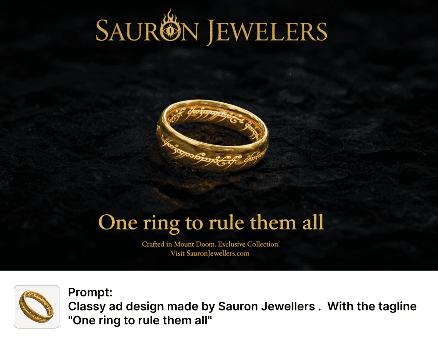
1) Text inside images: from “sometimes readable” to “closer to usable”
The most obvious change is typography: short headlines, labels, UI copy, and packaging text are more likely to come out legible and stable.
That matters because “poster/ads/infographics” often fail at the last mile: you get a great visual, then the text is warped - and you’re back to manual fixes.
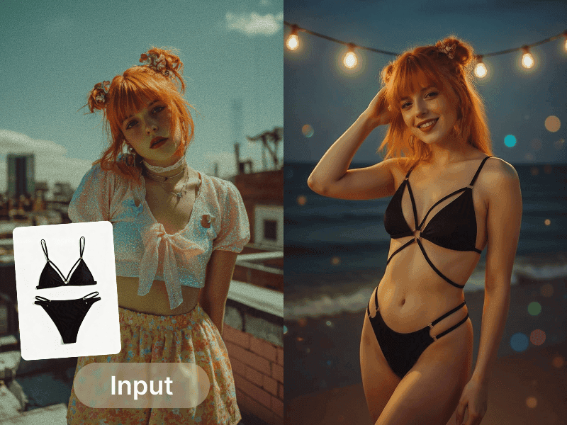
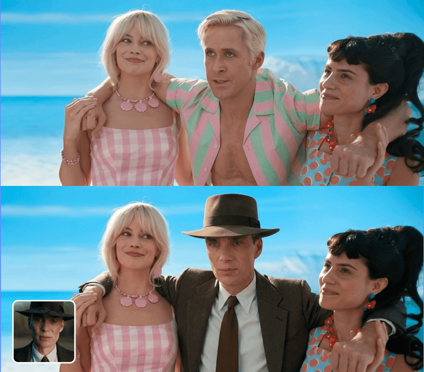
2) Consistency: more reliable for series assets
The references emphasize stronger stability for faces/identity and overall style/composition - helpful for:
- a campaign set of posters with one consistent look
- the same character across multiple scenes
- branded creatives where color/layout/subject must stay coherent
3) Structured visuals: diagrams, step cards, and infographic-style layouts “make more sense”
The sources describe improved handling of structure/quantity/logic. In practice, that means better odds that arrows, counts, and layout relationships stay coherent when you generate:
- step-by-step cards
- simple process diagrams
- infographic-style compositions with numbers and labels
Important: this does not mean “facts are guaranteed correct.” It means the model is more suitable for visualizing information you already know is correct - with fewer layout breakages.
4) Control: closer to describing a shot (lighting, camera, focus, grade)
When you start specifying lighting, camera angle, depth of field, focal point, color grade - and rules like text placement/spacing - Pro tends to pay attention more consistently. The clearer your constraints, the fewer “mystery iterations” you need.
How to use reference images more reliably (so Pro behaves the way you expect)
Many “model is stronger but results still drift” issues are actually reference usage problems. A simple fix is to separate references into two buckets:
Identity / subject references: face, hairstyle, outfit, product shape - the goal is “same person/product.”
Style / layout references: palette, typography vibe, whitespace ratio, grid/layout - the goal is “same design system.”
In your prompt, label what must stay consistent vs what is only inspiration. Add one “hard no” rule (e.g., no script fonts, no low-contrast text, no cramped layout). This tends to work better than simply adding more references.
30-second decision: which one should you use right now?
Answer three questions:
1) Do you need readable text inside the image? (headline, labels, UI copy)
→ Yes: use Pro
2) Are you producing a consistent series? (same character/brand/layout across multiple images)
→ Yes: use Pro
3) Are you exploring direction or delivering final assets?
→ Exploring: Nano Banana first. Delivering: Pro.
Nano Banana Pro vs Nano Banana: a practical comparison table
This table follows the comparison framework from the reference and is rewritten for AI image workflows. For claims like “2K/4K”, “up to 14 references”, or underlying model naming, we keep the phrasing as “the source describes.”
Dimension | Nano Banana Pro | Nano Banana |
|---|---|---|
Positioning | Final deliverables / higher fidelity | Fast drafts / exploration |
Text inside images | Stronger: better for headlines, labels, UI copy (source highlights) | Weaker: more likely to warp or become unreadable (source highlights) |
Consistency (identity/style/layout) | More stable for series assets | More drift; better for early exploration |
Structured visuals (steps/diagrams/infographics) | More suitable for structure + relationships | More “a nice image,” less structure reliability |
Controls (lighting/camera/focus/grade) | More controllable with explicit constraints | More trial-and-error |
Output quality / resolution | Source notes higher output (e.g., 2K/4K) | More lightweight, fast iteration |
Multi-reference context | Source notes more references (e.g., up to 14) for consistency | More like “reference inspiration” than hard constraints |
Best use cases | Posters/ads, infographics, product visuals, UI mocks, series creatives | Moodboards, concept drafts, style exploration |
2 workflows that save the most time
Workflow A: fast → precise (explore directions, then deliver)
1) Use Nano Banana to generate 3–6 direction drafts (composition, palette, character, vibe). Avoid text at this stage.
2) Pick one direction and switch to Nano Banana Pro: add your short copy + layout rules + constraints, and generate the deliverable version.
3) Iterate only on small variables (copy, icon, CTA), not the whole concept.
Workflow B: series production (one template, many outputs)
1) Use Pro to create a “master layout”: title area / hero area / info area, plus typography vibe and palette.
2) Keep layout rules fixed; swap variables (headline, short benefit, hero visual, date/price if needed).
3) Produce 6–12 images that look like one coherent campaign.
Prompts to Try (copy-paste)
Tip: for text, keep copy short, and specify placement, contrast, whitespace, and hierarchy - not just “modern” or “premium.”
1) Poster with readable typography (better with Pro)
2) 4-step infographic card (better with Pro)
3) Direction exploration (better with Nano Banana)
Mini FAQ
I keep getting warped text in posters/ads. Is this update worth trying?
Yes. The references treat text-in-image usability as a core upgrade. A practical approach is: explore without text, then use Pro for the final layout + typography.
Does Pro make infographic facts more accurate?
Think “more coherent structure” rather than “guaranteed truth.” Use it to visualize information you already verified, and still do a quick human proofread.
Should I take “2K/4K and 14 reference images” literally?
Treat it as an upper-bound direction (as described by the source), not a promise for every prompt. The best proof is a quick A/B on one of your real use cases, focusing only on text readability and consistency.
Where do I try it in Alici?
Open Alici AI Image Studio and pick the model:
Try Alici AI Image Studio →
🎁
Limited-Time Creator Gift
Start Creating Your First Viral Video
Join 10,000+ creators who've discovered the secret to viral videos