Why Your YouTube Thumbnails Don't Get Clicks—And 4 Formulas to Fix It (2026)

|
8 min
TL;DR
We analyzed 50+ Veritasium thumbnails and reverse-engineered 4 formulas that consistently drive 10M+ views: 1) Use the Clickbait Map to balance curiosity and honesty. 2) Build a reusable expression library. 3) A/B test 2-3 versions with single-variable changes. 4) Apply the 4-Hook Matrix (Emotion, Result, Knowledge, Comparison). The key insight: thumbnails are questions, not posters.
Key Takeaways
Thumbnails are "click motivation", not video summaries: Make unfamiliar viewers ask a specific question (why/how/what is the truth).
Information gap can be large, but misleading should be low: The closer to "attractive but honest", the more clicks and long-term stability.
Facial expressions are assets, not inspiration: Build an expression library once, reuse forever.
Test 2-3 versions, then iterate with data: Change only one variable at a time, record like an experiment.
Mobile readability beats aesthetics: Single focus + high contrast + fewer words.
How we researched this: We analyzed 50+ Veritasium thumbnails across 3 years of uploads, studied his public commentary on thumbnail strategy (including the viral "Clickbait is Unreasonably Effective" video), and reverse-engineered the patterns that consistently drove 10M+ views. The 4 formulas below are what we found.
If you want high-CTR thumbnails like Veritasium, focus on two things:
1) Compress your video's core value into a question viewers care about (not a topic name).
2) Create curiosity without crossing into misleading; then test 2-3 versions and iterate based on data.
Data hook: If a video gets 100,000 impressions, increasing CTR by 1% = 1,000 more views. Same content, better packaging.
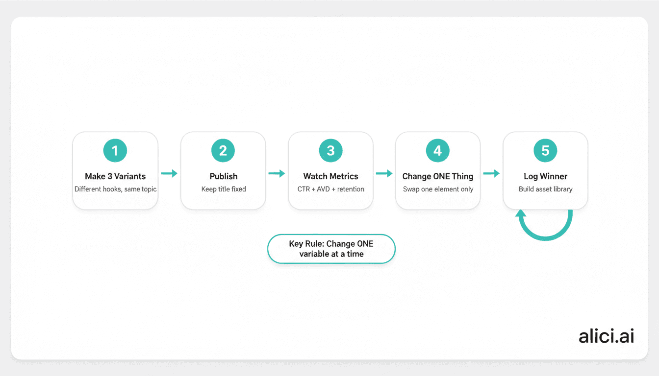
How to Make 3 Thumbnail Variants in 15 Minutes
Skip the theory for now. Here's the minimum process to create 3 testable versions:
Step 1: Write your "Cover Sentence" (30 seconds)
Viewers think it's A, but it's actually B; I'll prove it in the video.
Step 2: Write 3 title angles (2 minutes)
Result angle: What happened when I changed X
Cause angle: Why X actually works
Method angle: How to do X step by step
Step 3: Make 3 covers (10 minutes)
Only change one variable per version:
Version A: Stronger expression (emotion hook)
Version B: Clearer subject (result hook)
Version C: Shorter text (information gap hook)
Step 4: Iterate after publishing
Swap versions every 24-48 hours. Track CTR trends. Keep what works.
Why "Reasonable Clickbait" Works for Educational Content
Many creators feel "clickbait" is beneath serious content. But Veritasium reframes it: If viewers don't click, they'll never see your content at all.
The key distinction:
Click trap: Promise something the video doesn't deliver. Viewers feel cheated.
Reasonable clickbait: Create curiosity that your content actually satisfies.
For educational channels, high-CTR thumbnails aren't moral compromises—they're translation work. You're translating expert content into questions normal people immediately understand.
(Disclaimer: This article analyzes Veritasium's public video content for educational purposes. Alici.ai has no commercial relationship with Veritasium.)
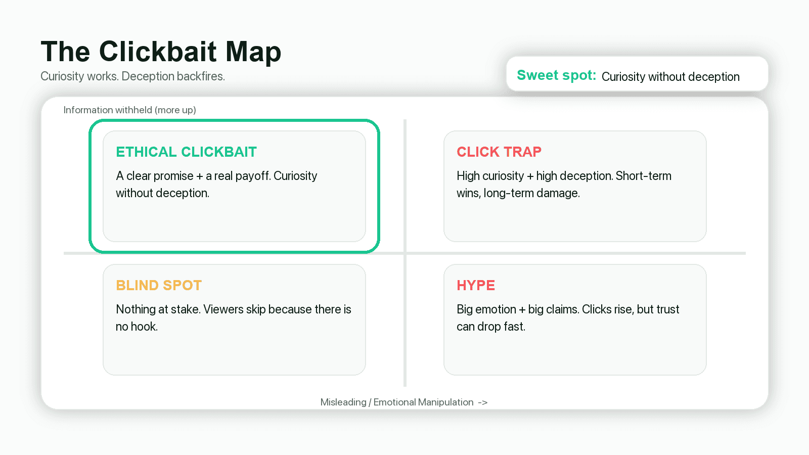
How to Balance Curiosity and Honesty: The Clickbait Map
Veritasium uses a two-dimensional framework to evaluate thumbnails:
X-axis: Misleading level (higher = more deceptive)
Y-axis: Information withheld (higher = more curiosity)
The sweet spot: High information gap + Low misleading. Brady Haran calls this "reasonable clickbait"—tempting but honest.
3 self-test questions before publishing:
1) What question will viewers have after seeing this thumbnail?
2) What information am I withholding to create that curiosity?
3) Will viewers feel cheated after watching the first 60 seconds?
3 types of curiosity gaps that work:
Missing reason: They see the result, want to know why ("Why does X happen?")
Missing consequence: They see an action, want to know what happens ("What if I try X?")
Missing variable: They think A matters, but it's actually B ("The real reason is...")
3 Before/After Examples: From Low CTR to High CTR
Case 1: Magnus Effect → Basketball from Dam
Original title: "Strange Uses of the Magnus Effect" (academic, no imagery)
New title: "Basketball Thrown from a Dam" (specific object + action)
Lesson: Replace conceptual nouns with specific objects + specific actions.
Case 2: Asteroid Video Turnaround
Original: Generic asteroid title (changed several times, no improvement)
New: "These asteroids hitting Earth are what we should really worry about"
Lesson: Find the angle that's closer to audience concerns, not more exaggerated.
Case 3: Clarity Over Suspense
For some old videos, simply making titles clearer (not more dramatic) increased views.
Lesson: Clarity first, suspense second. If they don't understand, they won't click.
How to Build a Reusable Expression Library for Thumbnails
Veritasium's team shoots dedicated expression photos for thumbnails—not afterthoughts from video footage.
Key insight: Expressions are inventory, not inspiration.
10-minute setup:
Fixed camera position (phone + tripod, slightly above eye level)
Fixed lighting (window light or one fill light)
Clean background (solid color wall)
Leave space for cropping (forehead and chin room)
Shoot 30-50 photos covering: shock, confusion, doubt, excitement, fear, enlightenment. Organize by emotion folder.
Alternative: Use One-Face (Alici.ai) to maintain face consistency across all thumbnails automatically.
How to A/B Test YouTube Thumbnails Without Premium Tools
Even MrBeast can't predict the winning thumbnail on the first try. The solution: treat thumbnails as experiments.
Low-cost testing workflow:
1) Prepare 2-3 covers before publishing (change only one variable each)
2) Swap versions every 24-48 hours
3) Track: impressions, CTR, 30-second retention
Key rule: Don't change hourly. You need enough data to see trends.
Day | Version | Variable Changed | CTR Trend | Next Action |
|---|---|---|---|---|
1 | A | Stronger expression | ↑ or ↓ | Keep or try B |
2 | B | Larger subject | ↑ or ↓ | Keep or try C |
3 | C | Shorter text | ↑ or ↓ | Keep winner |
What Are the 4 Types of Thumbnail Hooks?
When testing variants, be clear about which hook you're testing:
1) Emotion Hook
Visual: Face + expression + minimal background
Text: 1-3 words ("WAIT...", "NO WAY", "WHY?")
Risk: Strong emotion but unclear question = looks like acting
2) Result Hook
Visual: Before/after, success/failure, comparison
Text: Emphasize outcome, not process
Risk: If result isn't visual, forced "result shots" look fake
3) Knowledge Hook
Visual: Key object emphasized (circles, arrows, blur)
Text: "NOT THIS", "THE REAL REASON"
Risk: Implying conclusions not in the video = click trap
4) Comparison Hook
Visual: A vs B layout
Text: Question format, don't spoil the winner
Risk: Comparing things in different dimensions = confusion
What Makes a Thumbnail Click-Worthy? 4 Must-Have Elements
1) Clear subject (who/what viewers will see)
One protagonist only: your face, a key object, or a result screen. Two competing subjects = split attention.
2) Clear conflict/contrast (why it's worth clicking)
You thought A, but it's B. You're worried about X, but Y is the real issue. Seems impossible, but it happened.
3) Mobile-readable text (or no text)
Text gives a "reason to click", not a summary. If it's not readable at phone size, delete it.
4) Deliverable payoff (so viewers don't feel cheated)
Think of it as a contract: thumbnail raises question → first 60 seconds confirms you'll answer → video delivers.
How to Match Your Title and Thumbnail for Maximum CTR
Common mistake: Title says A, thumbnail shows B. They fight each other.
Better approach: Decide the question first, then split the work:
Title: Make the question clearer (viewers know they won't waste time)
Thumbnail: Visualize the emotion/conflict (viewers feel "I have to click")
Question You Want | Title (clarify) | Thumbnail (visualize) |
|---|---|---|
Why did this happen? | "The real reason X happened" | "WHY?" + result screen + expression |
What happens if...? | "I did X, and Y happened" | "I DID THIS..." + before/after |
Is it A or B? | "Everyone thinks A, but it's B" | "NOT A" + A vs B visual |
How to Generate 6 Thumbnail Variants with AI
Strategy is easy. Production at scale is the bottleneck. Here's how to speed it up:
Using Alici.ai YouTube Thumbnail Expert:
1) Choose input method:
- Script → Thumbnail (aligns with content promise)
- URL Reference (match competitor style)
- One-Face (consistent face across all thumbnails)
2) Write input as Problem + Conflict + Subject:
3) Select 2-3 from 6 variants based on: Which is most like a question? Which can your content actually deliver?
Is Your Thumbnail Mobile-Readable? 3 Quick Tests
Most thumbnails look great in Photoshop but fail in the feed. Test yours:
1) One-second test: Shrink to phone size. Can you tell who's the subject and what question it raises?
2) Squint test: Squint or step back. Is the subject still the brightest, largest element?
3) Grayscale test: Convert to black and white. Does your subject still stand out?
If you fail these tests, you probably have too many elements. Delete until one thing dominates.
Why Your Thumbnail Isn't Getting Clicks: 3 Common Mistakes
Mistake 1: No clear subject
Problem: Face, props, and background are all similar size. Viewers don't know where to look.
Fix: Make the subject uncomfortably large. Blur/darken everything else.
Mistake 2: Text explains instead of questions
Problem: "This video explains..." is accurate but has zero click motivation.
Fix: Change to "Why does X happen?" or imply a question.
Mistake 3: No conflict/contrast
Problem: Looks like a normal photo. No tension, no curiosity.
Fix: Find the "you think A, but it's B" moment in your script. Put that on the thumbnail.
Summary: Thumbnails Are Questions, Not Posters
Veritasium's core insight: thumbnails aren't art—they're communication mechanisms. Your job is to make viewers form a clear question in 1 second and trust you'll deliver the answer.
The system: Make 2-3 variants → test with single variables → track trends → build your own "what works" library over time.
CTA Card
Want to turn this into consistent production?
"Script → Thumbnail" aligns covers with content promises
"URL Reference" quickly generates competitor-style variants
"One-Face" solves face consistency automatically
FAQ
Will clickbait get punished by YouTube?
Click traps (high clicks, quick exits) hurt performance. "Reasonable clickbait" (curiosity that content delivers) does not.
Does the thumbnail need a face?
Not required, but faces with clear emotions are proven attention-grabbers. The real rule: have ONE clear focal point.
How many words should be on a thumbnail?
Less is better. Start with 2-4 words. If it's not readable on a phone, delete it.
How often should I change thumbnails?
24-48 hour windows minimum. Hourly changes don't give enough data to see trends.
What's the right thumbnail size?
1280x720 pixels, 16:9 ratio, under 2MB. For detailed specs including Shorts, see: YouTube Thumbnail Size Guide
I have no design skills. Where do I start?
Start with "question + contrast": write the curiosity in short text, match with one clear subject. Use AI tools to generate variants, then pick the one your content can deliver.
🎁
Limited-Time Creator Gift
Start Creating Your First Viral Video
Join 10,000+ creators who've discovered the secret to viral videos