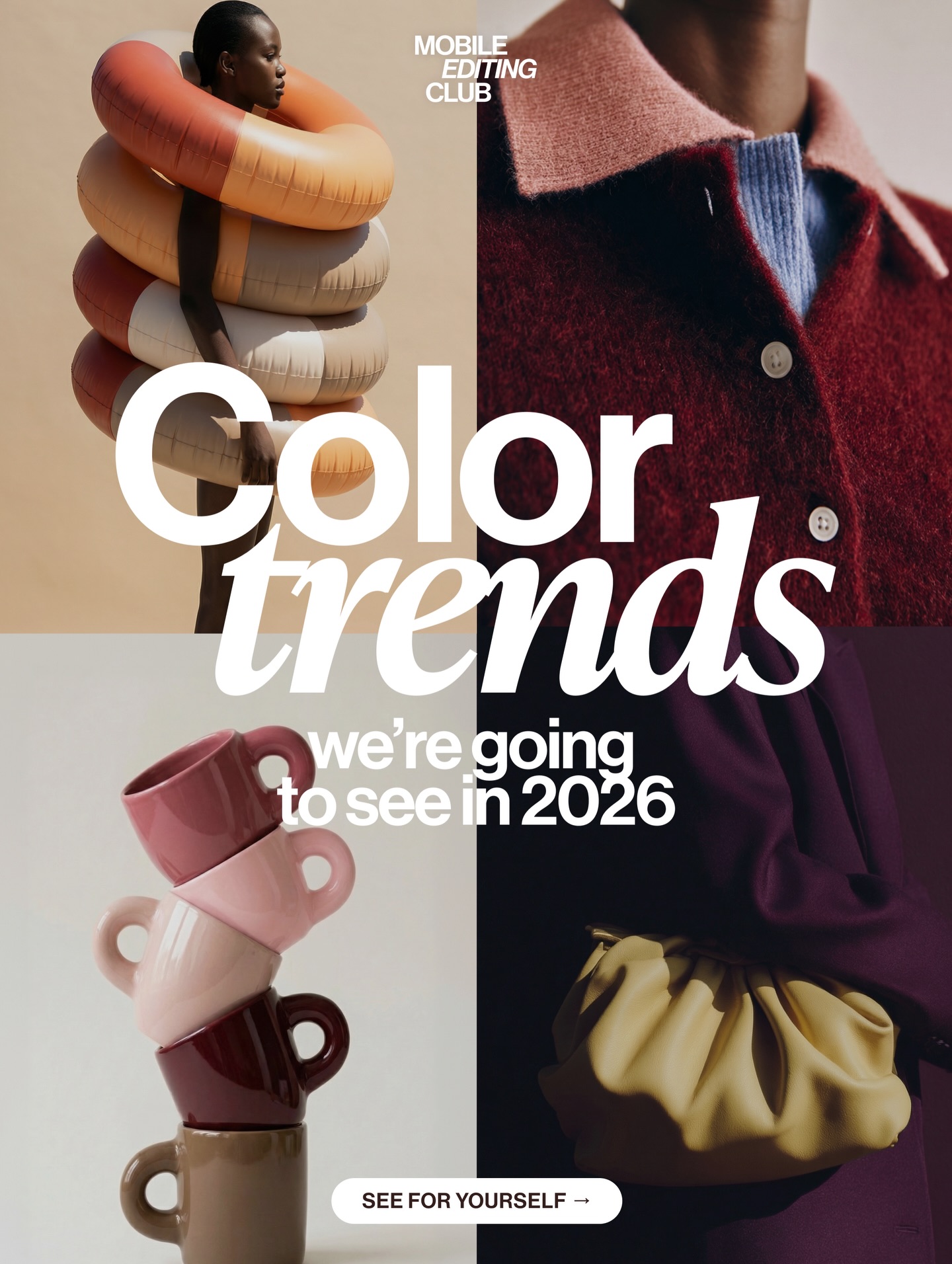
This image works because it does not merely list colors. It stages them. Each quadrant translates the palette into form, material, and use case. That makes the cover feel like a real trend forecast instead of a random collection of pretty swatches.
The typography gives the image its message, but the panels give it credibility. Viewers can immediately see that the palette is being tested across fashion, ceramics, sculptural accessories, and soft material close-ups. That multi-surface application is what makes the trend claim feel plausible and current.
| Element | Why It Works |
|---|---|
| Four curated panels | Show that the palette can operate across different creative categories. |
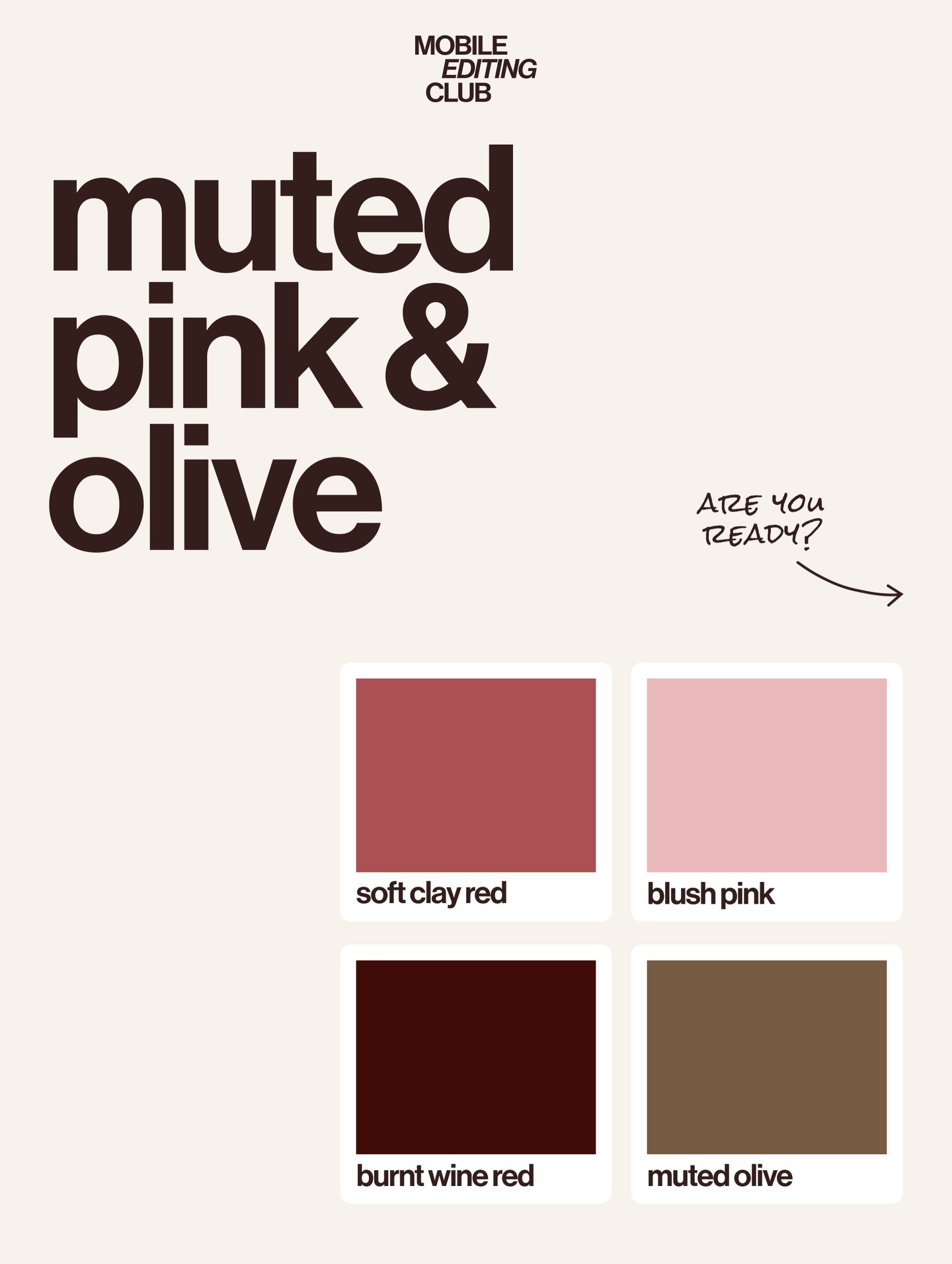
| Muted earth-and-plum tones | Make the forecast feel premium and wearable rather than loud or disposable. |
| Material diversity | Ceramic, fabric, and object forms prove the palette beyond flat color theory. |
| Oversized central headline | Turns the collage into a clear editorial cover instead of a loose inspiration board. |
| Minimal call-to-action button | Adds contemporary creator-brand polish without overwhelming the design. |
This cover sits between design forecasting, product branding, and fashion editorial culture. Its strength lies in controlled variation. Each panel is different in subject, but all share the same tonal family. That repetition through difference is the visual signature of a good trend board.
The palette itself leans warm, dusty, and tactile. Instead of relying on bright novelty, it builds value through texture: matte ceramics, soft knit fabric, air-filled forms, and sculptural accessories. That material emphasis makes the color story feel grown-up and commercially relevant.
| Prompt Move | Purpose |
|---|---|
| Use multiple object categories in one collage | Shows that the palette can travel across design systems and product types. |
| Describe materials, not just colors | Makes the trend feel tangible and real rather than abstract. |
| Keep the palette warm and tightly controlled | Creates coherence across separate panels. |
| Use editorial cover hierarchy | Turns the board into a shareable social-media or magazine-style asset. |
| Block clutter and unrelated accents | Protects the authority and calm of the forecast aesthetic. |
This format is ideal for trend reports, seasonal product launches, design newsletters, fashion palette forecasts, and creator-brand content. The structure is simple and repeatable: choose a tonal family, apply it across multiple materials, and package the result as an editorial statement.
Try a cooler metallic palette for a tech-focused forecast, a spring pastel set for homeware design, or a monochrome version where texture carries the variation instead of hue. Another strong remix is to replace one quadrant with packaging or typography samples so the forecast feels even more system-oriented.
When prompting color-trend covers, start with the palette philosophy before you name the objects. Then choose objects from different categories that can all hold the same tones. If you begin with disconnected product ideas, the collage will feel random. This image works because every panel answers the same color question in a different language.