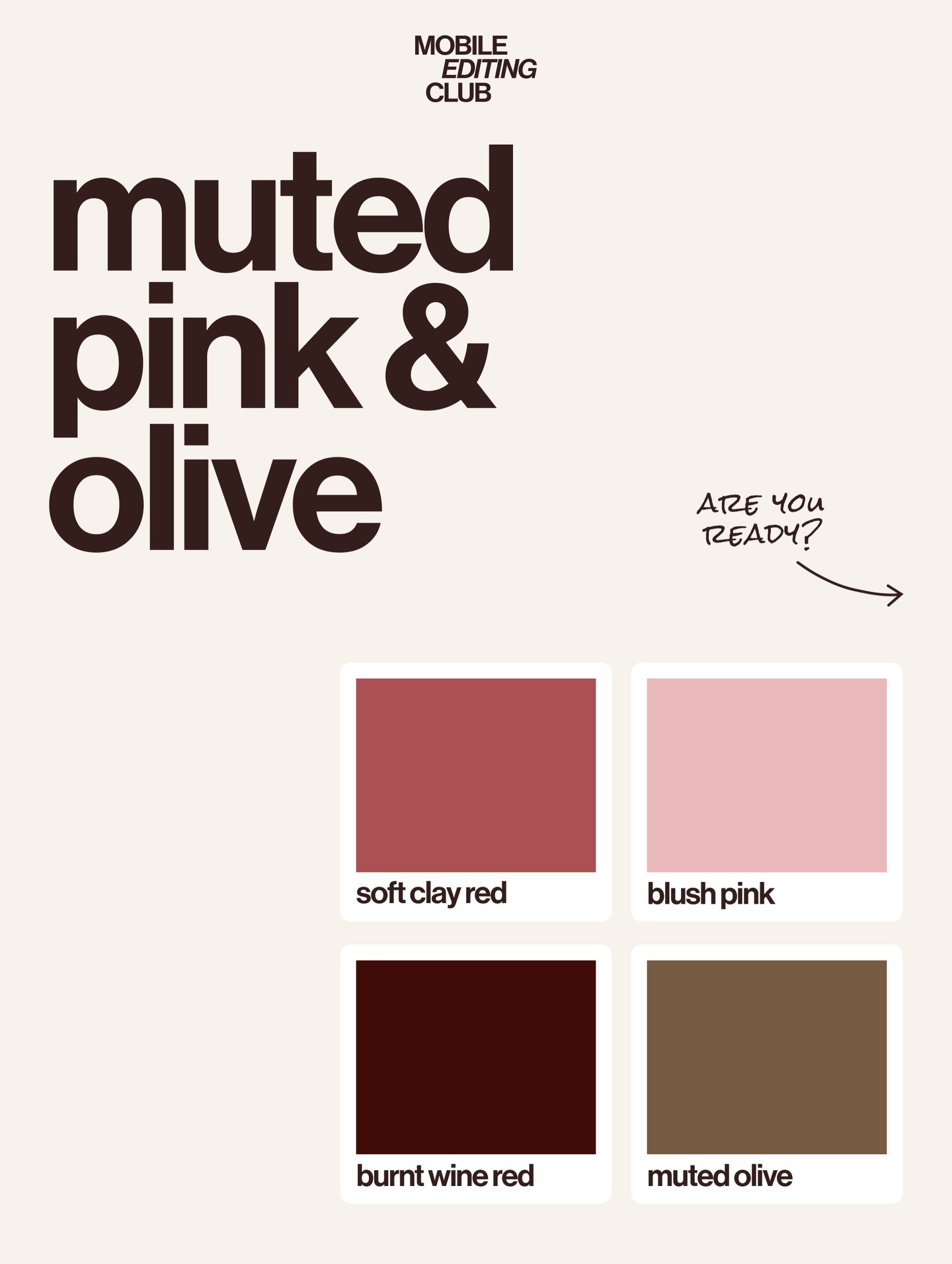
This image works because it strips the idea of “trend forecasting” down to its most useful form. Instead of wrapping the palette inside products, fashion objects, or moodboard clutter, it presents the colors directly. That makes the post easier to save, easier to remember, and easier to reuse.
The strength of this cover is speed. The viewer can understand the theme in one second: muted pink and olive. The headline names the trend, the swatches visualize it, and the labels make it practical. There is no confusion about what is being offered or how to use it.
| Element | Why It Works |
|---|---|
| Oversized headline | Creates immediate clarity and frames the entire graphic as a trend statement. |
| Four labeled swatches | Turn the design into a usable palette reference rather than a vague aesthetic post. |
| Warm cream background | Keeps the layout soft, premium, and easy on the eyes. |
| Handwritten note detail | Adds personality and prevents the poster from feeling too corporate. |
| Minimal empty space | Gives the palette room to breathe and strengthens the perception of taste. |
This cover belongs to the language of modern editorial design systems: soft neutrals, bold typography, clean spacing, and utility-first composition. What makes it effective is that it does not overperform. It trusts the palette to be interesting enough on its own.
The color selection also matters. The set moves from dusty clay to blush to wine to olive, which creates a mature warm-earth progression rather than a playful pastel spread. That is why the image feels trend-forward instead of generic.
| Prompt Move | Purpose |
|---|---|
| Use named swatches rather than abstract blocks | Makes the palette directly useful for creators, designers, and stylists. |
| Keep the layout typographic and clean | Supports fast reading and gives the post an editorial authority. |
| Work with a narrow tonal family | Creates sophistication through restraint rather than variety. |
| Add one informal handwritten accent | Introduces warmth and keeps the design from feeling sterile. |
| Block photos and decorative clutter | Protects the utilitarian, saveable quality of the post. |
This format is highly reusable for trend boards, branding kits, seasonal palettes, fashion-color forecasts, and creator education posts. It is especially strong when the goal is utility. People can screenshot it, reference it, and adapt it without needing to interpret a complex moodboard first.
Try a cool-toned version built around stone blue and steel grey, a saturated summer version with citrus and cobalt, or a luxury-neutral palette using cream, espresso, and blackened gold. Another strong variation is to replace the handwritten note with a miniature styling tip or typography sample.
When prompting palette posters, define hierarchy before aesthetics. Name the palette, choose the swatches, decide the grid, and only then add stylistic flavor. The image works because the information structure is strong. Design clarity is doing more work than decoration.