Ya está aquí la parte 2 del preguntas y respuestasss ✅🔥🔥 ¿Os pensabais que me iba a quedar callada? 😏 Mil gracias por vuestras preguntas y por estar siempre ahí. Espero que os haya gustado esta segunda parte. Prometo que lo que viene, os va a flipar ✨ —— Here comes parttt 2 of the Q&A ✅🔥🔥 Did you really think I was going to stay quiet? 😏
Thank you so much for all your questions and for always being there. I hope you enjoyed this second part. I promise what’s coming next is going to blow your mind ✨
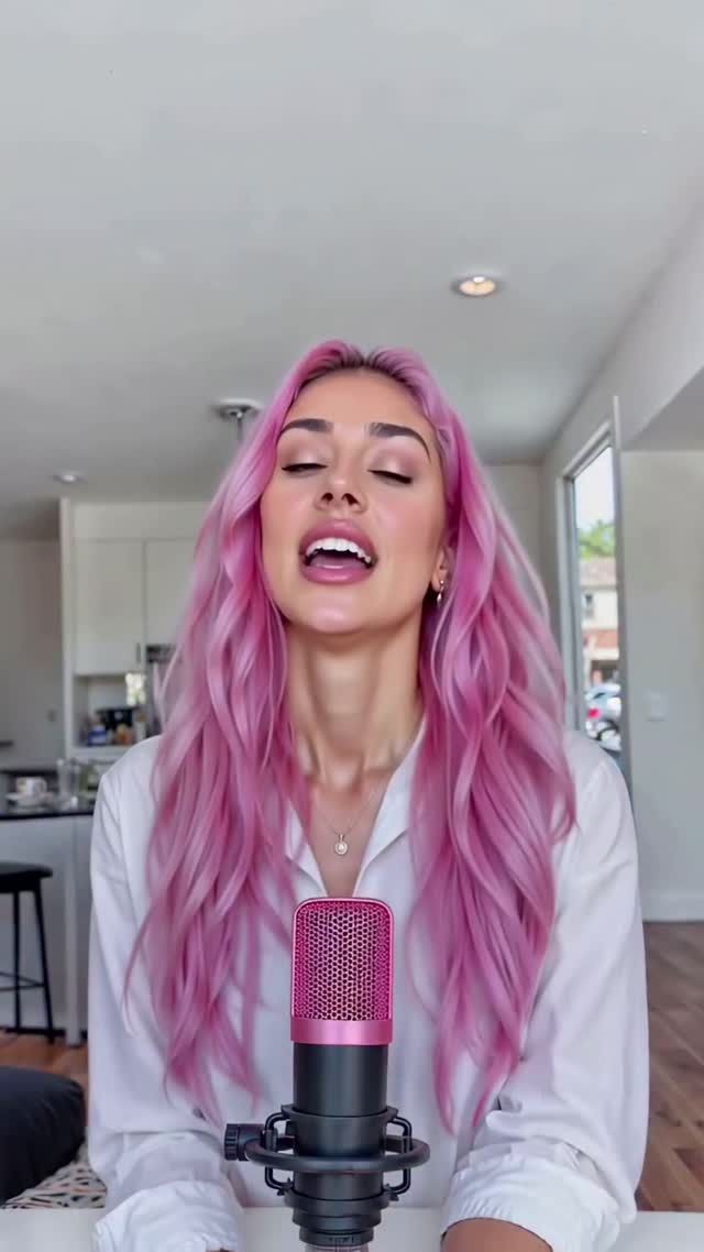
How fit_aitana Made This Q&A Part 2 Portrait - and How to Recreate It
This frame works because it combines direct creator presence with a clear content promise in one compact visual.
Why this image spread
This image performs because the message is immediate. The creator is centered, making direct eye contact, while a bright heart-shaped badge clearly says this is Q&A part 2 content. Viewers do not need to guess the format, tone, or intent. In fast feeds, this kind of instant decoding is a major advantage because it reduces cognitive load and improves stop behavior.
The second reason is trust architecture. The home interior background feels real and familiar, not over-produced. A visible microphone mount at the bottom reinforces that the creator is actively speaking to the audience rather than posting a generic selfie. The combination of personal proximity and production cue creates a strong "I am talking with you" effect, which increases comments and story replies.
It also spreads because the visual hierarchy is disciplined. Neutral room tones keep noise low, pink hair plus the neon heart provide a memorable color anchor, and the headline sits exactly where the eye naturally lands. This is highly reusable for episodic content. Creators can swap only the badge text and keep everything else stable. That repeatable template logic is one of the strongest growth mechanics for Q&A series, weekly updates, and audience-led content formats.
Signal
Evidence (from this image)
Mechanism
Replication Action
Instant format clarity
Heart badge with "Preguntas y respuestas parte 2" in center
Fast comprehension improves retention
Place one bold episode label in the focal center zone
Creator intimacy
Centered face, direct gaze, indoor home setting
Personal connection increases response intent
Use eye-level framing and a familiar environment
Production credibility
Visible microphone hardware below the text badge
Signals real conversation workflow
Keep one recording element visible to support authenticity
Use cases and adaptations
Best-fit scenarios
Q&A series cover posts. Why fit: episode identity is obvious immediately. What to change: only update episode number and subtitle text.
Community response content. Why fit: direct gaze and home scene feel conversational. What to change: include one topic keyword in the badge.
Weekly creator updates. Why fit: repeatable structure reduces production friction. What to change: rotate badge shape once per month.
Podcast clip intros. Why fit: mic cue supports talk-format expectations. What to change: keep badge lower if subtitles are added above.
Not ideal
Cinematic travel storytelling, because fixed indoor framing limits environmental variety.
Product-detail tutorials, because overlay badge takes central visual priority.
Large group recaps, because one-person centered framing drives single-voice narrative.
Keep: neutral room and direct gaze. Change: accent palette. Slot template:{background_neutrality} {accent_color} {badge_style} {creator_energy}
Keep: visible mic cue and chest-up framing. Change: text language and icon. Slot template:{language} {icon_shape} {headline_weight} {audience_intent}
Aesthetic read
The visual style is clean, centered, and intentionally utility-driven. The portrait occupies the vertical middle, the badge sits in front as a functional graphic layer, and the background remains soft enough to avoid distraction. This creates a card-like composition that is easy to read on mobile.
Color handling is strategic. Most of the room stays neutral, which allows pink hair and the neon heart badge to define identity and hierarchy. The palette feels modern and coherent because only a few saturated elements carry the emotional load. Nothing competes with the main message.
Depth is subtle but effective. Foreground microphone mount, mid-plane subject, and slightly blurred kitchen background produce enough spatial separation to feel real. The result is approachable, polished, and highly reusable for recurring audience conversation formats. It also keeps the creator voice recognizable across episodes, which is essential for building serialized content habits and long-term audience retention.
Prompt controls
Prompt chunk
What it controls
Swap ideas (EN, 2-3 options)
centered chest-up portrait in bright home interior