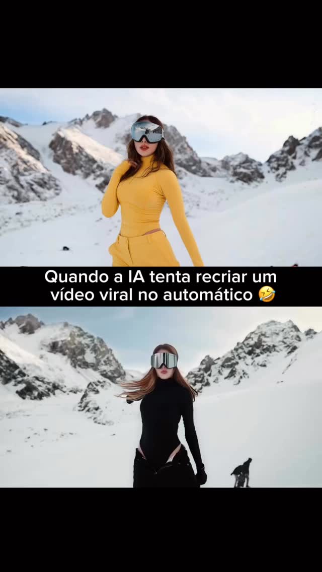
This image works because it behaves like a social meme before it behaves like a polished render. The creator is not simply showing a winter fashion portrait. The frame is built as a comparison joke: one version reads like the source look, and the second reads like the AI remake. That narrative structure is what makes the visual instantly legible in a feed.
The strongest decision is the stacked split-screen layout. Both panels reuse the same snowy mountain environment, the same mirrored visor styling, and a very similar subject position. That repetition tells the viewer these images belong to the same template. Then the wardrobe shift from saturated yellow to matte black becomes the punchline. The composition does the storytelling before the caption is even read.
| Signal | Evidence | Why it works | Replication action |
|---|---|---|---|
| Comparison meme structure | Two vertically stacked frames with a central text strip | Creates immediate "original vs remake" logic | Design the post as a deliberate paired layout instead of a single hero frame |
| Location continuity | Both scenes share the same snow valley and mountain wall | Keeps the joke coherent and reinforces recreation intent | Reuse one environment anchor across all comparison panels |
| Color contrast | Bright yellow outfit above, black outfit below | Makes the change readable at a glance | Change one dominant styling variable between versions |
| Identity anchor | Reflective ski goggles appear in both frames | Preserves character continuity while allowing variation | Lock one accessory, silhouette cue, or facial framing device |
For creators making AI recreation content, this is a useful reminder that the joke is in the edit logic. If both panels are too different, the result feels random. If they are too similar, there is no punch. The sweet spot is controlled variation. Here, the background, camera distance, and general pose language remain stable, while outfit color, mood, and energy shift just enough to sell the remake concept.
The center caption band is also doing important structural work. It is not just text placement. It becomes a divider that cleanly separates the source image from the recreated image while keeping the scroll experience compact. In feed terms, that means the post reads quickly, which is a key advantage for meme-style AI content.
| Prompt chunk | What it controls | Swap ideas |
|---|---|---|
| split-frame vertical meme poster | Defines the stacked social comparison layout | Try triptych, film-strip, or chat-screenshot formats |
| snowy alpine valley with mirrored ski goggles | Locks environment and identity continuity | Swap for desert dunes, rooftop skyline, or beach cliffs |
| yellow version above, black version below | Creates the visual transformation hook | Change to luxury vs casual, daylight vs neon, minimal vs dramatic |
| Portuguese caption strip across the middle | Adds meme readability and platform-native framing | Adapt to another language or convert into subtitle styling |
If you want to recreate this format, start by describing the layout first, not the clothing. Then identify the one identity anchor you will preserve across both panels. After that, choose a single variable to exaggerate between versions, such as palette, mood, or outfit type. That order produces more consistent, more meme-readable comparison images.
The broader lesson is simple: AI recreation posts perform better when they are framed as a visual argument. Show the baseline. Show the transformed version. Keep one thing fixed and one thing changed. That gives the viewer an immediate reason to stop, compare, and understand the joke in one second.