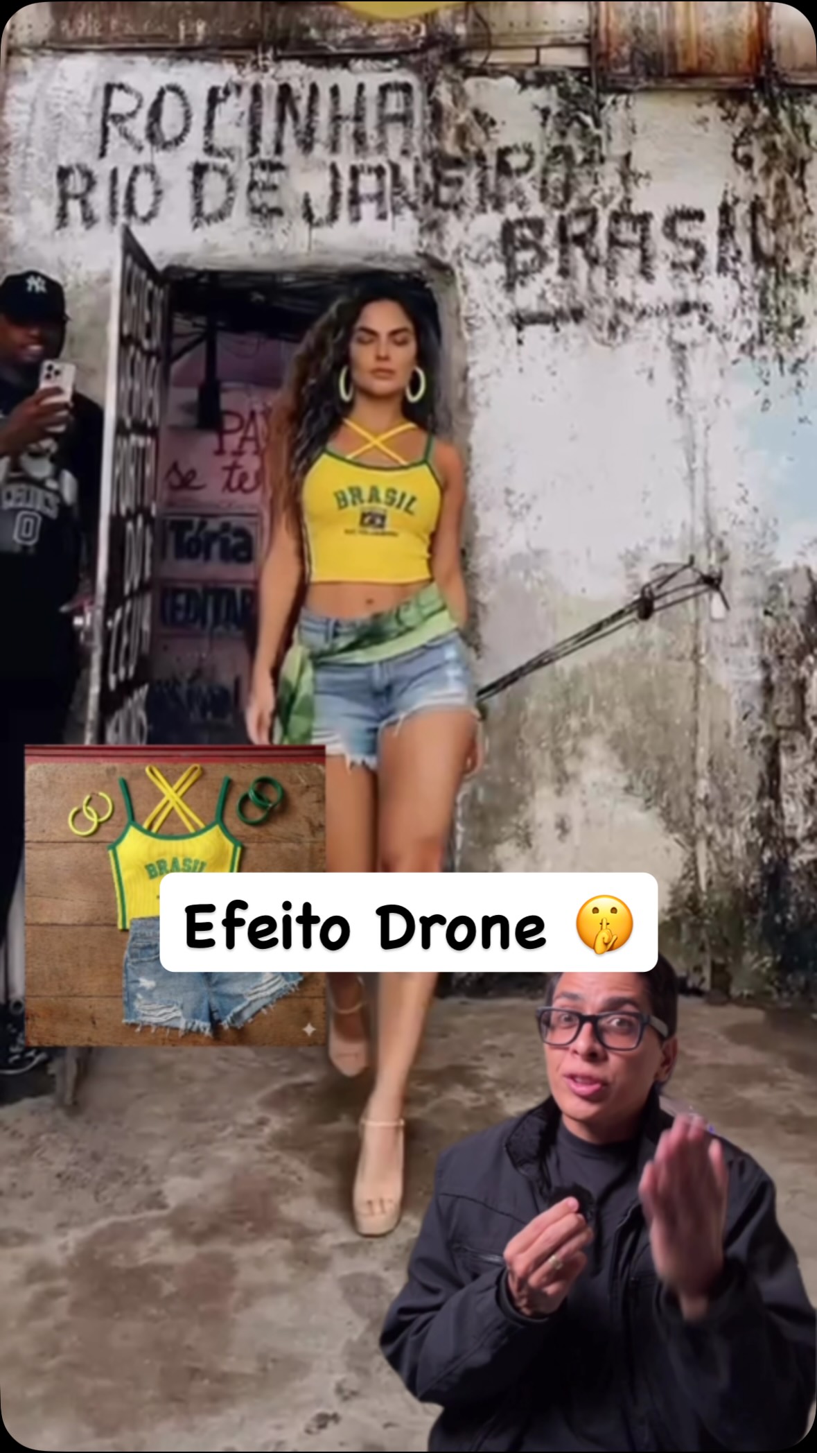
How bruno.ia1 Made This Brazil Street Fashion Drone Effect — and How to Recreate It
This image succeeds because it does not behave like a single-format poster. It combines the visual language of street photography, outfit breakdown graphics, and creator tutorial thumbnails into one cohesive social-media object. The result feels extremely current because it mirrors how modern fashion content is actually consumed online. The viewer is not just looking at a woman stepping out of a doorway. The viewer is looking at a piece of creator content built to stop the scroll, communicate styling value quickly, and feel tied to a real street environment rather than a studio fantasy.
The strongest decision in the layout is the contrast between the worn urban setting and the crisp color logic of the outfit. The stained concrete wall, rough doorway texture, faded signage, and casual street atmosphere create a convincing documentary frame. Inside that frame, the bright yellow Brazil crop top acts as the dominant visual hook. The garment is readable from a distance, while the denim shorts and accessories keep the styling grounded. That tension between rough setting and clear styling is what gives the image energy. It feels practical, fashionable, and social-native at the same time.
For prompt writers, this makes the image especially useful. It demonstrates that social-first fashion content often needs more than just a subject and a background. It needs interpretive signals. In this case, those signals include a sticker-style title, an inset outfit board, and a creator-presenter cutout. These elements tell the viewer immediately that the image belongs to the tutorial or styling-advice category. Without them, the image would still work as a street portrait, but it would lose its short-form creator identity.
Why the Street Setting Matters
The environment is doing more than adding texture. It establishes authenticity. A weathered doorway, cracked concrete, faded signage, and gritty wall surfaces make the fashion look feel lived-in rather than staged. This is important because a tutorial or reel-cover image gains credibility when the clothing appears embedded in a recognizable urban world. The environment should not look luxury-clean or overproduced. It should feel like a place where a creator could actually stand, film, and talk about outfit choices.
In prompt construction, this means the background should be described as a real street frontage with visible wear and layered texture. Those details help the model avoid drifting into generic clean-wall fashion photography. The roughness of the environment also makes the hero color of the shirt work harder. Against a polished studio background, the yellow might feel flatter or less interesting. Against concrete and age, it becomes instantly alive.
The Role of the Yellow Brazil Top
The yellow top is the key color anchor of the composition. It gives the image fast readability in the context where it matters most: a mobile feed. Because the background stays muted and textural, the shirt becomes the easiest thing to identify at thumbnail scale. That is a highly useful lesson for creator-oriented prompt writing. When designing content for social platforms, one hero color often performs better than a more evenly distributed palette.
It is also important that the top is culturally specific rather than generically yellow. By reading as a Brazil-inspired football shirt or sporty crop top, it adds a touch of reference and personality. This gives the styling a clearer identity than a plain bright shirt would. In prompt language, that specificity matters. It helps the viewer understand the outfit category instantly and gives the overall composition a stronger styling proposition.
| Element | Role in the Thumbnail | Prompt Benefit |
|---|---|---|
| Yellow Brazil crop top | Main visual hook | Creates fast mobile readability and gives the image a clear style identity |
| Weathered doorway | Grounding environment | Makes the fashion feel lived-in and urban rather than staged |
| Denim shorts and heels | Complete the look | Keep the outfit recognizable as casual street styling rather than costume |
| Outfit inset board | Adds tutorial structure | Tells the viewer that the image includes styling breakdown or shopping logic |
| Sticker caption | Creates a social-media headline layer | Makes the image read as creator content rather than simple portraiture |
| Presenter cutout | Adds influencer framing | Clarifies the content category as advice, tutorial, or commentary |
Why the Collage Layout Works
One of the most useful things about this image is the way it handles collage without becoming chaotic. The central figure remains the main subject, but the secondary elements clearly organize the image into a tutorial-style composition. The outfit board suggests practical value. The sticker text provides a bold attention cue. The lower-right presenter overlay adds a human guide presence. Together, these elements make the layout feel like something designed for reels, shorts, or creator cover images rather than a traditional poster.
In prompt writing, this means the structure must be intentional. If the inset and sticker elements are described too vaguely, they may turn into clutter. The better approach is to state them as secondary but readable layers, positioned clearly and supporting the fashion focus. A social-media collage succeeds when each element has a function: hero image, instructional cue, creator identity, and color anchor. This image gets that balance right.
Movement and Social Readability
The subject stepping out of the doorway adds subtle motion, which is crucial in a feed environment. Static standing poses often feel flat in short-form content thumbnails, but a forward step or emerging gesture can make the frame feel more immediate. Here, the motion is not dramatic. It is just enough to imply arrival, confidence, and narrative flow. That is exactly the right amount for fashion tutorial content.
Prompt writers should note that motion cues do not always need to be large. A small forward movement, a shift of weight, or a step through a frame can make the difference between a passive image and a scroll-stopping one. Because the subject is moving into the scene rather than simply standing in it, the viewer feels invited into a process: seeing the look, learning the look, and perhaps imagining how to wear the look.
Lighting and Tone Strategy
The image benefits from natural daylight rather than artificial studio polish. Soft outdoor light keeps the wall texture believable and the subject’s outfit readable without turning the image into luxury campaign gloss. That is important because the overall tone should remain approachable. This is creator content, not formal runway advertising. The light should therefore feel practical, clean, and realistic, with enough brightness to separate the yellow top from the environment but not so much that the street loses its texture.
For prompt writing, the lighting should be described as soft daylight or lightly diffused outdoor illumination, with realistic shadows and a readable subject. Avoid spotlight language, glam beauty lighting, or extreme cinematic drama. The success of this composition depends on social believability. It should look like elevated real life, not like an expensive set pretending to be real life.
How to Write This Prompt Clearly
A strong prompt should begin with the central subject and outfit: a confident woman stepping out of a worn street doorway in a bright yellow Brazil-inspired crop top, denim shorts, hoop earrings, and neutral heels. Then define the environment: weathered urban wall textures, faded signage, rough concrete, daylight realism. After that, establish the creator-thumbnail structure: outfit inset board, sticker-style caption, and presenter cutout layered into a vertical 9:16 social-media cover. Finally define the overall style as street-fashion creator promo, documentary-meets-editorial, readable and mobile-first.
This order matters because it prevents the image from drifting into either plain street portraiture or overcomplicated collage noise. When the subject and outfit are named first, the style remains fashion-centered. When the creator elements are described after that, the composition becomes structurally social-native. A good prompt sequence helps the generator organize both the aesthetic and the information hierarchy.
Common Failure Modes
The most common failure in this type of prompt is over-cleaning. If the street environment becomes too pristine, the image loses authenticity. Another failure is letting the inset and sticker elements overpower the subject, which turns the composition into cluttered UI rather than fashion content. It is also easy for the yellow top to lose its intensity if the surrounding palette becomes too saturated. These are all issues that should be actively prevented in the prompt.
A good negative prompt should therefore remove luxury studio backdrops, artificial spotlighting, unreadable text, warped anatomy, overdesigned props, muddy wall texture, and unnecessary background objects. The image should remain gritty, legible, and practical. The tutorial feeling should come from layout clarity, not from excessive graphic overproduction.
Reusable Creator Thumbnail Template
A reusable version of this prompt might read like this: a fashion creator reel-cover featuring a woman in one strong hero garment color stepping out of a textured urban doorway, combined with an outfit breakdown inset, sticker-style headline, and small presenter overlay, rendered in soft natural daylight with mobile-first composition and documentary street realism. Then append a negative section that removes clutter, unreadable overlays, studio polish, and background emptiness.
This template is valuable because it can be adapted across many looks and neighborhoods while keeping the same creator-content structure. Change the hero garment color, swap the street setting, simplify or sharpen the collage overlays, or alter the presenter cutout style. As long as the hierarchy remains clear, the result will still feel like native social fashion content rather than a confused hybrid.
Final Creative Takeaway
The strongest lesson in this image is that social-media fashion art is often about category clarity as much as visual beauty. The viewer should know immediately that this is style advice, tutorial content, or creator guidance. That clarity comes from layout decisions, not just styling. The yellow top catches attention, the street gives credibility, and the overlays explain the format. Together they create a highly readable social object.
For prompt writers, this image demonstrates how to merge street authenticity and creator logic without sacrificing style. If the clothing is clear, the environment is honest, and the graphic elements are purposeful, even a relatively simple outfit image can become a very strong short-form content cover. That is what makes this prompt pattern so useful: it understands both fashion and platform language at the same time.