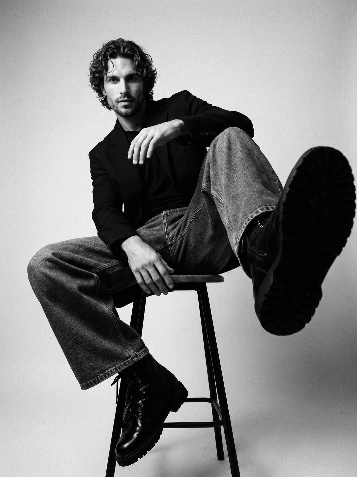
This image works because it turns perspective distortion into attitude. The subject is not performing an elaborate expression or using a dramatic set; instead, the oversized boot in the foreground does the heavy lifting. That single decision creates scale aggression, fashion confidence, and visual hierarchy all at once. The portrait feels bold not because it is crowded with ideas, but because one formal gesture is pushed far enough to become memorable.
The strongest choice is the seating pose. The stool gives the body structure, but the subject refuses stiffness. One arm drapes, the legs spread into an asymmetrical shape, and the torso settles back just enough to feel effortless. That tension between structure and looseness is what makes the image read as premium menswear rather than simple studio documentation. The model looks composed, not posed to death.
| Signal | Evidence (from this image) | Mechanism | Replication Action |
|---|---|---|---|
| Foreground dominance | The right boot sole occupies a huge portion of the frame | Foreshortening creates instant graphic power and depth | Use one near-camera body element to establish hierarchy in minimalist portraits |
| Relaxed authority | The body leans back casually while maintaining direct gaze and control | Ease in pose communicates confidence more effectively than overt aggression | Direct menswear portraits toward composure and ownership, not forced intensity |
| Material separation | Blazer, denim, leather boots, and skin all read distinctly in monochrome | Tonal clarity replaces color as the main design tool | Specify fabric and surface differences clearly when working in black and white |
| Studio restraint | The backdrop is empty and the stool is the only prop | Minimal environments amplify pose and styling instead of competing with them | Strip away set dressing when perspective and wardrobe already carry the image |
The monochrome treatment is particularly effective because it sharpens the image’s priorities. Without color, the viewer pays more attention to silhouette, fabric weight, and the relationship between face and footwear. That is why the portrait feels editorial rather than merely casual. It asks to be read through form. The light-gray seamless background acts almost like a page margin, giving the figure room to project into the frame.
| Observed Style Choice | What It Does | Why It Matters |
|---|---|---|
| Black-and-white palette | Removes distraction and emphasizes shape, texture, and pose | Supports a fashion-magazine reading instead of lifestyle casualness |
| Large boot sole near lens | Creates forceful spatial drama | Makes the portrait memorable with one simple exaggeration |
| Loose denim with tailored blazer | Balances polish and ease in the styling | Gives the image a contemporary menswear feel |
| Minimal stool setup | Provides structure without stealing attention | Keeps the portrait clean and compositionally legible |
From a prompt-engineering perspective, the key is to describe this as a low-angle editorial menswear portrait built around foreshortening. If you only prompt a seated man in studio clothing, you will lose the image’s defining feature. The lens relationship between the boot and the face is the concept. The prompt must protect that relationship with explicit language about one boot dominating the foreground while the subject remains composed in the background plane.
| Prompt Technique | Use In This Image | Practical Benefit |
|---|---|---|
| Perspective-first prompting | The boot sole is treated as a key compositional event, not an incidental detail | Preserves the image’s most memorable visual hook |
| Pose-role definition | The subject is relaxed, seated, and self-possessed rather than aggressively posed | Keeps the portrait within luxury-fashion territory |
| Prop minimization | The stool is the only support object in the frame | Prevents clutter and lets the body line remain the focus |
| Monochrome texture cue | Different materials are called out as important in grayscale | Improves tonal richness when color is absent |
If you iterate on portraits like this, protect the hierarchy first: boot, face, torso, stool, then backdrop. Once that sequence is stable, you can experiment with tighter crops, heavier grain, or a rougher expression. But the image does not need much more. Its effectiveness comes from formal clarity. One exaggerated foreground element and one composed fashion pose are enough.
The broader lesson is that strong editorial portraits often emerge from a single dominant spatial idea. Here that idea is simple: let one boot come too close to the lens. Everything else is disciplined around that choice. When the rest of the frame stays clean, the exaggeration becomes style instead of distortion.