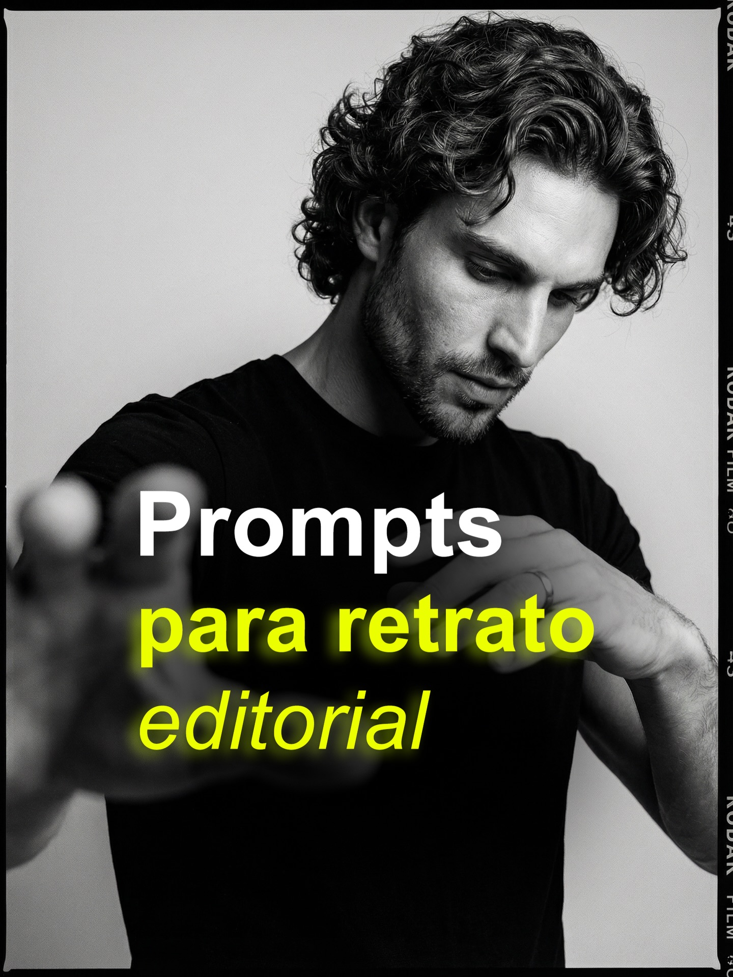
This image works because it combines two different jobs in one frame without letting them fight each other. It is both a strong editorial portrait and a functional cover graphic for educational content. The portrait gives the post authority, while the large text overlay tells the viewer exactly what they are about to get. Many social covers lean too far in one direction, becoming either visually striking but unclear, or informative but forgettable. This one maintains both functions at once.
The strongest decision is the foreground hand blur. That blur is not an accident or a gimmick. It creates depth, tension, and tactile immediacy inside an otherwise minimal portrait. Without it, the frame would become a fairly standard black-and-white studio image. With it, the portrait gains physical presence and a subtle sense of interruption, as if the subject is reaching into the viewer’s space while still remaining emotionally withdrawn.
| Signal | Evidence (from this image) | Mechanism | Replication Action |
|---|---|---|---|
| Editorial authority | The monochrome portrait is sharply lit, minimally styled, and emotionally restrained | Fashion-editorial visual language gives the educational post instant credibility | Use clean black-and-white portraiture when you want informational content to feel premium |
| Depth through gesture | The foreground hand is heavily blurred while the face remains the psychological center | Depth-of-field contrast adds movement and visual sophistication | Introduce one intentional foreground intrusion to make static portraits feel dimensional |
| Text-portrait integration | The headline sits boldly over the chest area without destroying facial readability | Smart overlay placement preserves both message and mood | Place educational text in low-risk image zones, not over eyes or key expression areas |
| Analog framing cue | The visible Kodak-style border suggests film and contact-sheet culture | Film references add taste signaling and editorial nostalgia | Use border treatments when you want to imply photography culture rather than raw digital output |
The monochrome palette is doing more than adding mood. It removes distraction and lets the viewer focus on structure: curls, jawline, hand blur, t-shirt silhouette, and type. That reduction is especially valuable in a cover slide. Social posts are usually consumed quickly, often at small size. By stripping the image down to grayscale plus one strong text color accent, the design becomes easier to scan and more memorable.
| Observed Style Choice | What It Does | Why It Matters |
|---|---|---|
| Black-and-white portrait base | Creates seriousness and editorial polish | Helps the post feel like a photography resource, not casual creator chatter |
| Blurred reaching hand | Adds spatial drama and interruption | Prevents the cover from feeling static or generic |
| Bold central typography | Clarifies the topic instantly | Makes the image useful as a cover, not just attractive as a portrait |
| Film-border edge treatment | Signals analog-photo literacy and visual taste | Upgrades the post from plain social card to editorial-inspired artifact |
From a prompt-engineering perspective, the key is to define the image as a portrait cover, not simply as a portrait. The text, film border, and gesture are all structural elements. If you only prompt a monochrome man with a blurred hand, you may get a good fashion image, but you will lose the educational-card utility. Likewise, if you only prompt a social-media cover about editorial portrait prompts, you may end up with a generic thumbnail. The image works because the editorial photo carries the cover design, and the cover design sharpens the purpose of the photo.
| Prompt Technique | Use In This Image | Practical Benefit |
|---|---|---|
| Dual-role prompting | The image is specified as both editorial portrait and educational carousel cover | Preserves visual quality while ensuring topic clarity |
| Depth-control wording | The hand blur is protected as intentional foreground design | Stops the model from misreading blur as an accident |
| Overlay-safe composition | The face stays clear while text occupies the center-lower zone | Allows typography and portrait to coexist without damage |
| Analog aesthetic cue | The Kodak-style border is treated as a meaningful design layer | Improves taste signaling and editorial coherence |
If you iterate on images like this, preserve the hierarchy first: face, hand blur, text block, border. Once that foundation holds, you can experiment with different actors, stronger grain, alternate phrases, or tighter crops. What you should not do is overload the frame with more props or louder styling. The image is strong because it feels rigorous and selective. Every addition should justify itself against that standard.
The broader lesson is that instructional social content becomes more memorable when it borrows the authority of established visual cultures. Here, editorial portraiture and analog film language make a prompt-reference post feel curated and desirable. That is why the cover works: it does not just tell you the topic. It makes the topic look worth caring about.