How cyborggirll Made This Before After Scene Transformation AI Art — and How to Recreate It
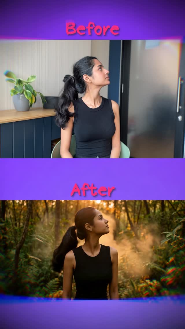
This image works because it reduces AI transformation down to one instantly readable contrast. The viewer does not need to guess what changed. The subject stays the same. The pose stays the same. The clothing stays the same. Only the world changes. That makes the point of the image obvious in less than a second.
The Core Hook
The strongest hook is continuity. Before-and-after content performs best when the “before” and “after” are visibly connected. Here, the same body angle and same upward glance act like a visual spine running through both panels. Because the person stays stable, the environmental shift feels more dramatic and more believable.
The second hook is contrast in emotional atmosphere. The top frame is ordinary, neutral, and practical. The bottom frame is cinematic, warm, and immersive. That is exactly the kind of upgrade story social audiences understand: same person, elevated visual world.
Signal Table
| Signal | Evidence (from this image) | Mechanism | Replication Action |
|---|---|---|---|
| Instant transformation clarity | The layout uses a direct stacked before/after structure | Clear comparison reduces viewer effort and improves click speed | Use strict side-by-side or top-bottom alignment when demonstrating AI changes |
| Identity continuity | The woman’s pose, outfit, and profile remain almost identical across both panels | Consistency makes the change feel intentional and impressive | Lock the subject and pose before changing the environment |
| Atmosphere upgrade | The lower panel transforms a normal room into a glowing cinematic jungle | Environmental elevation creates aspiration and visual drama | Make the after-state emotionally richer, not just technically different |
| Simple labels | The words “Before” and “After” remove ambiguity | Minimal language improves immediate comprehension | Use the fewest possible words when the visual contrast already carries the message |
| Same-subject storytelling | The transformation reads like one person entering another visual reality | This increases emotional participation more than a random style collage | Treat the before/after like one narrative event, not two unrelated images |
Aesthetic Read
The image is effective because it is disciplined. Many transformation covers try to show too much: more filters, more arrows, more labels, more visual chaos. This one stays simple. It knows that the emotional value is already embedded in the contrast between the plain room and the golden jungle.
The lower panel is especially strong because it does not only add greenery. It adds atmosphere. The haze, warmth, and depth give the transformed scene a cinematic quality. That makes the “after” feel aspirational rather than merely different.
Where This Format Transfers Well
This structure works for style transfers, location swaps, lighting upgrades, cinematic remasters, outfit-preserving background changes, AI photo enhancement demos, and “same subject, new world” comparisons. It is especially useful when creators want to prove the impact of a tool quickly without lengthy explanation.
The transferable principle is simple: preserve identity, transform context, and make the contrast emotionally meaningful.
Prompt Technique Breakdown
| Prompt chunk | What it controls | Swap ideas (EN, 2–3 options) |
|---|---|---|
| same woman in the same pose across both panels | Locks continuity and transformation credibility | same man at desk before and after; same runner in city and on moon; same portrait in room and palace |
| neutral indoor before-state | Creates the baseline for comparison | office cubicle; bedroom corner; simple hallway |
| cinematic nature after-state | Supplies the dramatic payoff and emotional uplift | sunlit desert; neon city street; moonlit castle garden |
| before/after label bands | Ensures fast comprehension in-feed | day/night labels; raw/edited; original/transformed |
| minimal comparison layout | Prevents clutter and keeps the transformation legible | side-by-side crop; split-screen swipe style; clean stacked panels |
Remix Playbook
Lock four things first: one subject, one pose, one baseline environment, and one transformed environment. Those are the structural anchors. If you change too many variables at once, the comparison loses meaning because the viewer cannot tell what the tool or prompt actually did.
Use a one-change rule for iteration. Change only the target environment, or the lighting mood, or the label language, or the panel orientation. For example, keep the same woman and pose, but move from jungle transformation to moonlit cyber city. Or keep the same environments, but switch from a stacked layout to a side-by-side crop. Controlled changes make before/after series easier to trust and easier to follow.
If a version feels weak, improve alignment before improving style. If it feels cluttered, remove every annotation except the two labels. The best result should make viewers feel the transformation immediately without needing explanation.